Visualising quality of life in New Zealand
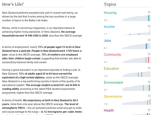
On May 24, the OECD launched a fascinating new interactive visual tool which allows you to compare quality of life: Better life Index. Rather than just focussing on GDP and economic statistics, this index allows you to compare lives across 34 countries, based on 11 topics: housing, income, jobs, community, education, environment, governance, health, life satisfaction, safety and work-life balance.
One of the unique features of the tool is that you can define what “better life” means for you by giving your own personal weight to the importance of each of these topics and find out how countries stack up. You can then share it with others by email, Facebook or Twitter and see which country best meets your criteria.
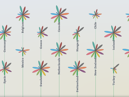
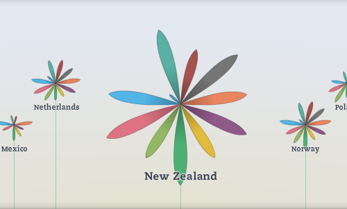
The data is presented in a beautiful and original format: by using flowers for each country, with a petal for each topic. The length of the petal represents the country’s score for that topic and the width represents the importance you’ve assigned to that topic. Each topic is based on multiple variables and the definitions are clearly explained, along with the ability to download all the data for yourself into Excel.
So, what does quality of life look like for New Zealand?
Overall, our flower looks quite healthy but what is that tiny little petal there? Go explore!
You can compare New Zealand to Australia (or any of the other OECD countries), and find out if New Zealand has the best quality of life you’re looking for!
Rachel Cunliffe is the co-director of CensusAtSchool and currently consults for the Department of Statistics. Her interests include statistical literacy, social media and blogging. See all posts by Rachel Cunliffe »


Fantastic representation of the stats — would love to see the media getting their heads around that sort of display.
13 years ago
[…] Stefaner who worked on the OECD Better life project and Google’s Think Quarterly – both previously blogged about here on Stats Chat; Ben […]
13 years ago