Adjusting for smoking?
Today the Herald is reporting that soft drinks give you asthma and COPD. To be fair, the problems with this story are mostly not the Herald’s fault (except for the headline).
The research paper found that asthma and COPD are more common in people who drink a lot of soft drinks. The main concern with findings like these is that smoking has a huge effect on COPD, and obesity has a fairly large effect, so you would worry that the correlation is just due to smoking and weight. [Or, if you believe some of the other recent new stories, due to bottle-feeding as a baby].
The researchers attempted to remove the effect of smoking and overweight, but their ability to do this is fairly limited. The idea of regression adjustment is that you can estimate what someone’s risk would have been with a different level of smoking or weight, and so you can extrapolate to make the soft-drink and non-soft-drink groups comparable. In this case the data came from a telephone survey, and the information they used for adjustment is a three-level smoking variable (never, former, current) and a two-level overweight variable based on self-reported height and weight (BMI < 25 or >25). If duration of smoking or amount of smoking is important, or if weight distinctions within “overweight” are important, their confounding effects will still be present in the final estimates.
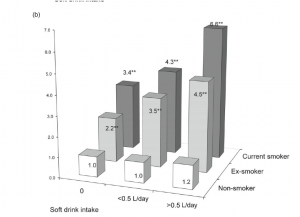
I can’t resist showing you the graph of COPD risks from the paper, which is an excellent example of why not to use fake 3d in graphs. The 3d layout makes it harder to compare the bars — a fairly reliable indication of a bad graph is that it is so unreadable that the data values need to be printed there too.

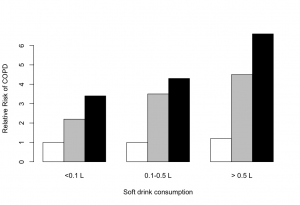
A 2d barchart will almost always be better than a 3d barchart, and this is no exception. The comparisons are clearer, and in particular it is clear how big the effect of smoking really is. It’s only in never-smokers that we have a precise description of smoking, and these are the only group that doesn’t show a trend.
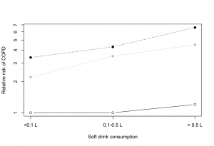
But even the 2d barchart is misleading here. The key rules for a barchart are that zero must be a relevant value, and that uncertainty must be relatively unimportant. Zero relative risk is an impossible value — the “null” value for relative risk is 1.0 — and there is a lot of uncertainty in these numbers (although unfortunately the researchers don’t tell us how much). A dot chart is better, with a logarithmic scale for relative risk so that the `null’ value is 1 rather than 0.

Thomas Lumley (@tslumley) is Professor of Biostatistics at the University of Auckland. His research interests include semiparametric models, survey sampling, statistical computing, foundations of statistics, and whatever methodological problems his medical collaborators come up with. He also blogs at Biased and Inefficient See all posts by Thomas Lumley »
