What’s wrong with this picture?
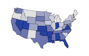
It’s not just the NZ media that has problems with denominators. This graph from the Washington Post shows where US Federal health reform money is being spent. And, surprise, surprise, there’s more money being spent in states with large populations.
The map is actually from the Kaiser Family Foundation, and they even have a cute interactive version that lets you look at different subcategories of funding. What they don’t let you do is standardize by any useful denominator: population, health care expenditure,… They do let you look at the map both in dollars and in fraction of the total, but, not surprisingly, it looks exactly the same on both scales.
Fortunately it isn’t hard to find the populations of US states, and R lets us draw pretty maps. Below is the same map coloured according to per-capita Federal health reform funding, which looks almost completely different.
Thomas Lumley (@tslumley) is Professor of Biostatistics at the University of Auckland. His research interests include semiparametric models, survey sampling, statistical computing, foundations of statistics, and whatever methodological problems his medical collaborators come up with. He also blogs at Biased and Inefficient See all posts by Thomas Lumley »

