November 6, 2012
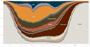
What do people do all day?
An interactive graphic from the New York Times, using data from the American Time Use Survey, where a representative sample of people is phoned up and asked what they did the previous day.
Compare the NY Times graphic to the charts produced by the Bureau of Labor Statistics, which are much less fun to explore, but do present some useful comparisons in simple formats.
Thomas Lumley (@tslumley) is Professor of Biostatistics at the University of Auckland. His research interests include semiparametric models, survey sampling, statistical computing, foundations of statistics, and whatever methodological problems his medical collaborators come up with. He also blogs at Biased and Inefficient See all posts by Thomas Lumley »
