Avoiding midlife uncertainty
Stuff and the Herald have the identical AP story, so you can read either one
Chimpanzees in a midlife crisis? It sounds like a setup for a joke. But there it is, in the title of a report published in a scientific journal: ‘Evidence for a midlife crisis in great apes.
The researchers asked handlers to estimate ‘well-being’ for 508 great apes: 172 orang-utans, the rest, chimpanzees. They fitted a statistical model to look for a decrease in mid-life followed by an increase, and got dramatic graphs
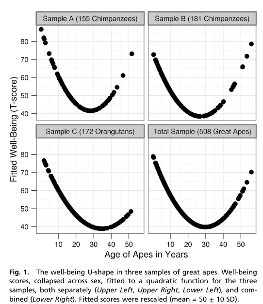
The x-axis is in years, showing the trough of despondency in the mid-thirties. The y-axis isn’t in anything — the curves were rescaled to look similar and the numbers are arbitrary.
The reason the curves look so dramatic is partly the higher-than-wide shape of the graph, but mostly the lack of any indication of uncertainty. The data are actually consistent with a wide range of flatter or steeper U-shapes and with the `mid-life’ crisis happening anywhere over quite a range of years. I can’t be more precise than that, because the researchers don’t even provide the necessary information to compute the uncertainty in the curve [they give uncertainties in regression coefficients, but not correlations between them].
However, they do have an appendix that looks at chopping up age into five-year bands and estimating the midlife crisis that way. They don’t give a graph, but they do give enough information to draw one. It’s not as impressive.

The U-shaped pattern does seem to probably be real (though the extent to which the so-called mid-life crisis is really the apes’ problem rather than than the handlers’ problem isn’t clear), but the graphs in the research paper are overselling it. Badly.
[Update: the intervals in the plot are +/- 1.4 standard errors for the coefficient. This should be in the ballpark for a 95% interval for the mean for that age group]
Thomas Lumley (@tslumley) is Professor of Biostatistics at the University of Auckland. His research interests include semiparametric models, survey sampling, statistical computing, foundations of statistics, and whatever methodological problems his medical collaborators come up with. He also blogs at Biased and Inefficient See all posts by Thomas Lumley »
Wouldn’t a horizontal line at about 50 go through all those intervals?
11 years ago
Yes. That still gives a decrease in early life, because the coefficients in the banded model (with age<5 as the reference level) are less than zero.
There's not strong evidence of a U-shape, but I think there is some.
There is strong evidence of a quadratic term, which isn't the same thing, of course. There could be a decrease in early life that just flattens out later, but it looks to me as if it does go up in later life. I'd be more confident if I had the data or at least the variance-covariance matrix of the coefficients.
It's not entirely trivial to test for a U-shape. For a simple analysis I probably would have gone with a one-knot linear spline and looked at the hypothesis that the first slope was negative and the second was positive. A simple three-band age model with pre-specified cutpoints would have been even more straightforward and more convincing.
Drawing graphs that give some reasonable idea about the uncertainty in the quadratic seems a minimum threshold. The graph is even worse than it looks at first glance, because the fitted values are scaled to have the same standard deviation in each panel.
11 years ago