January 11, 2013
With friends like these…
Thomas Lumley (@tslumley) is Professor of Biostatistics at the University of Auckland. His research interests include semiparametric models, survey sampling, statistical computing, foundations of statistics, and whatever methodological problems his medical collaborators come up with. He also blogs at Biased and Inefficient See all posts by Thomas Lumley »
Gee….I don’t know where to start with: the order of the year? the time interval? the scale?
I think what the he/she try to do is rank the Temp. by order….but still does’t explain why these years?
11 years ago
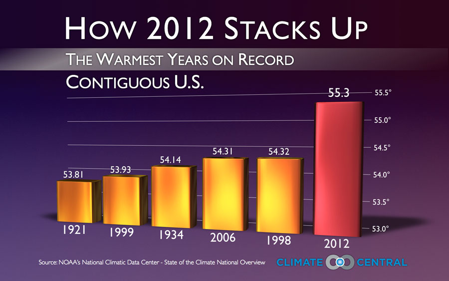
A quote from an Associated Press article on the US heat record of 2012: “What has scientists so stunned is how far above other hot years 2012 was. Nearly all of the previous 117 years of temperature records were bunched between 51 and 54 degrees, while 2012 was well above 55”
I think this chart illustrates that concept quite well. 2012 was an outlier.
11 years ago