14-dimensional graphics
An interesting attempt to graph the recovery from the Great Recession, from the Atlanta Federal Reserve Bank (via)
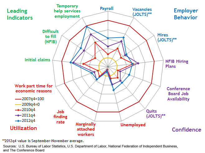
The outer circle shows 13 economic indicators at the peak of the boom, and the inner yellow circle shows the bottom of the recession. You can see that the ‘leading indicators’, that is, things that tend to move ahead of the rest of the economy, are improving quite a lot. Employer behaviour and confidence indicators are up a bit, but the employment indicators are still stuck at recession levels. If the leading indicators really are ‘leading’, the rest of the circle should be expanding relatively soon.
This graph will get confusing when there are many time periods or when the patterns are not strong. You could probably handle a larger number of time periods by having the older ones fade to grey or some such, but it still won’t be clear unless there’s a dramatic pattern.
Also, the 13 economic variables are in a particular order around the circle, and with some graphs like this, the visual effect can be quite sensitive to the order; clearly a bad thing.
Thomas Lumley (@tslumley) is Professor of Biostatistics at the University of Auckland. His research interests include semiparametric models, survey sampling, statistical computing, foundations of statistics, and whatever methodological problems his medical collaborators come up with. He also blogs at Biased and Inefficient See all posts by Thomas Lumley »