Ordinal graphics
Graphics guru Edward Tufte has the lovely phrase “Pravda School of Ordinal Graphics” for a graphic style which forgets that numbers have a magnitude as well as an order. Ben Brooks points us to the Herald’s effort
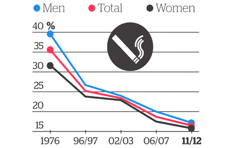
In the misinformation stakes this is a pretty venial sin, but it’s so unnecessary. It’s not hard to compute the time lag between 1976 and 1996 or between 2002 and 2006, and to realize they aren’t the same. The decrease isn’t slowing down as the graph suggests; it’s pretty much a straight line. The truncation of the vertical axis is more of a style thing: if the horizontal axis had been accurate, one could have argued that expanding the vertical scale to show changes in trend was more important. But if that was the rationale, you’d need to get the horizontal scale right.
And if you think of it as an infographic rather than conveying quantitative information there’s another problem: if you have a graphic where two of the colours are pink and blue, and two of the groups are ‘men’ and ‘women’….
Thomas Lumley (@tslumley) is Professor of Biostatistics at the University of Auckland. His research interests include semiparametric models, survey sampling, statistical computing, foundations of statistics, and whatever methodological problems his medical collaborators come up with. He also blogs at Biased and Inefficient See all posts by Thomas Lumley »