Bad news, good graphic
From NIWA, soil moisture across the country (via @nzben on Twitter), compared to the same time last year and to the average for this date.
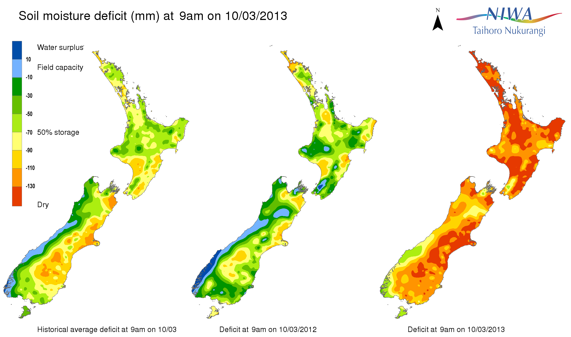
Update: If I had to be picky about something: that light blue colour. It doesn’t really fit in the sequence.
Update: Stuff also has a NIWA map, and theirs looks worse, but it’s based on rainfall over just the past three weeks (and, strangely, labelled “Drought levels over the past six days”)
Thomas Lumley (@tslumley) is Professor of Biostatistics at the University of Auckland. His research interests include semiparametric models, survey sampling, statistical computing, foundations of statistics, and whatever methodological problems his medical collaborators come up with. He also blogs at Biased and Inefficient See all posts by Thomas Lumley »
Maybe it means flooding. :->
… but looking at the scale, I think maybe it does, if you go over carrying capacity of the soil than it must be a flood.
11 years ago
Run-off, but not necessarily flood — depends how heavy the rain is.
11 years ago