April 17, 2013
Visualising New York income inequality
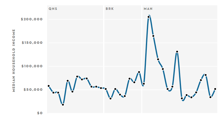
From the New Yorker, a set of graphs showing how median household income varies along each subway line, based on the census tract containing each station.
Here’s the graph if you take the A-train:
(via @brettkeller)
Thomas Lumley (@tslumley) is Professor of Biostatistics at the University of Auckland. His research interests include semiparametric models, survey sampling, statistical computing, foundations of statistics, and whatever methodological problems his medical collaborators come up with. He also blogs at Biased and Inefficient See all posts by Thomas Lumley »