A good graph
StatsChat spends a lot of time criticizing bad graphs. Here’s a simple but good graph, from the Calculated Risk blog
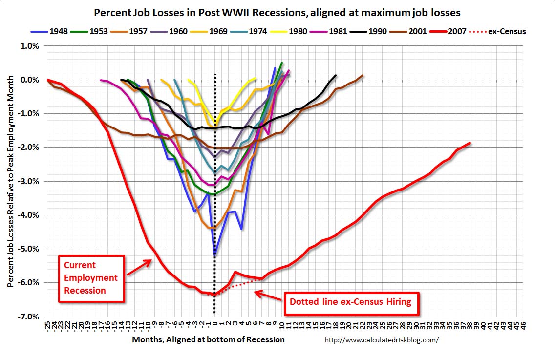
The graph shows employment during US recessions, aligned at the point of maximum job loss. It clearly demonstrates that the current Great Recession is very different from all the other post-WWII recessions, both in depth and in duration.
It would be easy to quibble with some design choices in the graph, but it fulfills the basic requirements admirably: the real difference is visually dramatic, and it wouldn’t be visually dramatic if it weren’t real.
Thomas Lumley (@tslumley) is Professor of Biostatistics at the University of Auckland. His research interests include semiparametric models, survey sampling, statistical computing, foundations of statistics, and whatever methodological problems his medical collaborators come up with. He also blogs at Biased and Inefficient See all posts by Thomas Lumley »