There’s more people than there used to be
James Curran drew my attention to this graph, from daily-infographic (original source not given, but appears to be Reddit) showing weather-related deaths in the US
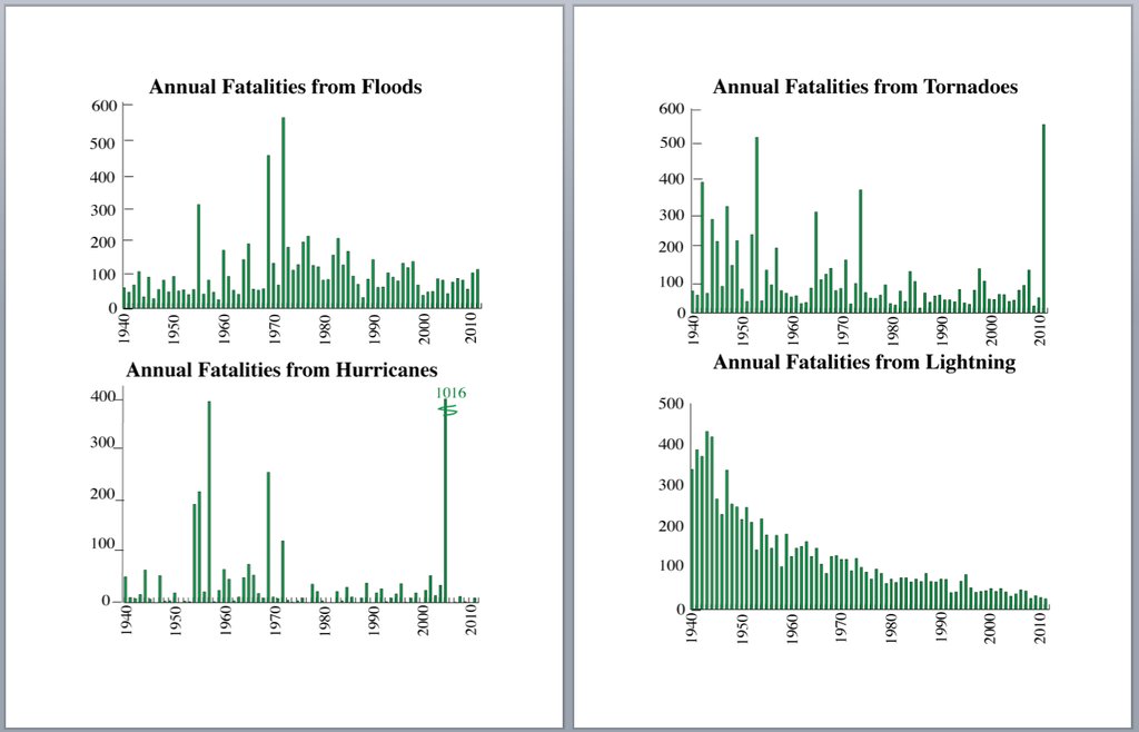
The decrease in lightning deaths is impressive, but it doesn’t look as though there is much decline in tornado deaths, and apparently an increase in flood deaths. Why isn’t forecasting helping more? Business Insider Australia also found this graph and was confused
You can pick out some major weather events — Katrina, floods, different major fatal hurricanes — from the chart, but the most interesting one is definitely lightening deaths.
While the other systems are generally sporadic, lightning fatalities have declines.
The explanation is simple: there are a lot more people now than in 1940 (about 2.5 times as many), so although the death rate has gone down, the number of deaths has stayed fairly stable. The National Severe Storms Lab (in Norman, Oklahoma, where they know from severe weather) gives this graph of death rates from tornados over more than a century
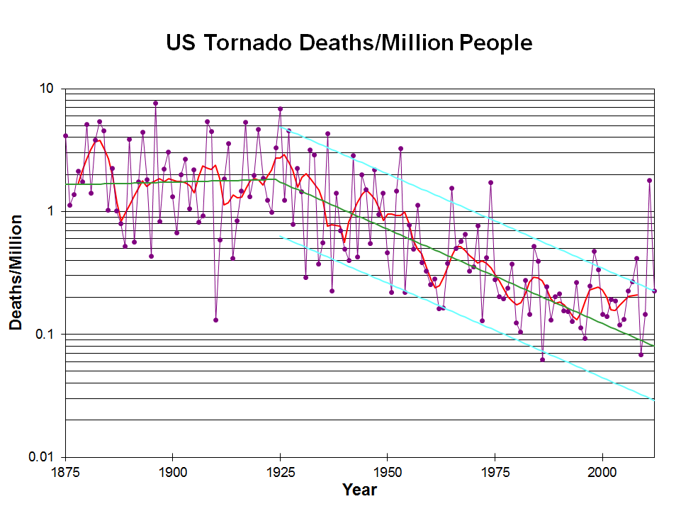
It would be even better to standardize by the population of the tornado-affected region, but that would be more difficult to define. It would also be better to remove some of the clutter from the graph: lose the grid lines and just have the points and a smooth curve. The message is still clear.
Deaths per million people were roughly steady until 1925, and have been decreasing since then, though the decrease may have levelled off. The combination of sensible scaling by population, using a logarithmic scale, and adding a smoother and fitted line makes it easy to see the real trend in safety. The first graph shows the danger of “letting the data speak for themselves”.
Thomas Lumley (@tslumley) is Professor of Biostatistics at the University of Auckland. His research interests include semiparametric models, survey sampling, statistical computing, foundations of statistics, and whatever methodological problems his medical collaborators come up with. He also blogs at Biased and Inefficient See all posts by Thomas Lumley »
Isn’t absolute numbers of deaths rather than death rates?
On this page, although it is old information, said possible reasons for the number of deaths declining was “fewer persons living and working in rural areas, improved warning systems, increased public education about safety regarding lightning, and improved medical care.”
http://wonder.cdc.gov/wonder/prevguid/m0052833/m0052833.asp
11 years ago
The lightning deaths decrease is obvious even in total numbers of deaths.
The decrease in tornado deaths is only obvious in the death rates, and was apparently missed both by the person who originally drew the graphs, and in the BI report. And in the Seattle Post-Intelligencer, which reprinted the BI report.
11 years ago