3d bar graphs: just say no.
Or perhaps “OMG NO!!!”
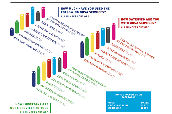
This example (click to embiggen) comes from The Critic, the magazine of Otago University Students Association and has been nominated for Stat of the Week. It accompanies a reasonable story about satisfaction with services provided by OUSA. There are some good points: for example, the colour coding means that you can easily tell which bars in the three graphs refer to the same OUSA service. What you can’t easily do is compare services for levels of satisfaction. For example, in the right-hand set of bars, is the magenta bar taller than, shorter than, or the same as the dark blue bar? Are you sure? How about the light blue and green bars? Also, if the questions were on a 1 to 5 scale, the bars should start at one, not at zero.
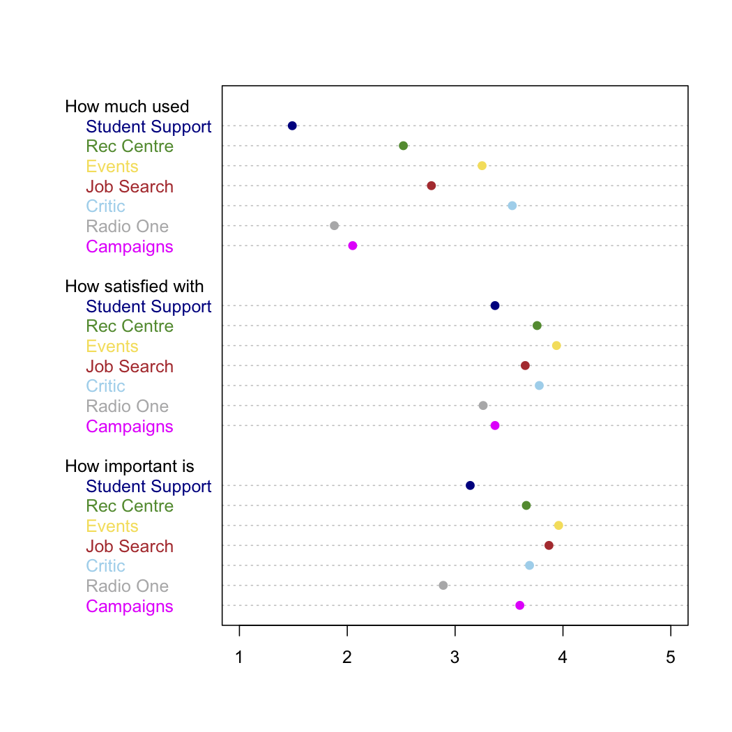
Here’s a version that’s less pretty but actually lets you compare the numeric values. I kept the same colour-coding, although more sedate colours would have been easier to read
Thomas Lumley (@tslumley) is Professor of Biostatistics at the University of Auckland. His research interests include semiparametric models, survey sampling, statistical computing, foundations of statistics, and whatever methodological problems his medical collaborators come up with. He also blogs at Biased and Inefficient See all posts by Thomas Lumley »
Fair criticism of the Critic’s graphics, however, your remake is absolutely horrendous. 3D Bar graph over that any day!
11 years ago