Different colours, one people?
A beautiful map from the Cooper Center for Demographics at the University of Virginia, showing 300 million dots, one for each person in the United States, coloured by the census-reported race/ethnicity categories.
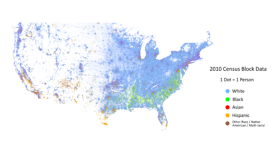
As we’ve pointed out before, the most obvious feature in the map is the change in population density across the north-south ‘dry line’, but it’s the other features that are of most interest. The larger black population across the south-east, and the greater diversity of the cities are obvious.
There’s also a zoomable version of the map for you to explore. Here’s part of Seattle, where I used to live, which is the purple splotch at the top left of the whole-US map
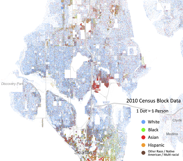
At this smaller scale there’s a lot more clumping by race, with black and Hispanic people living at the top and bottom of the map. Oh, and that odd-shaped spot in the middle? That’s the University of Washington, so those are university students.
(via Luis Apiolaza on Twitter)
Thomas Lumley (@tslumley) is Professor of Biostatistics at the University of Auckland. His research interests include semiparametric models, survey sampling, statistical computing, foundations of statistics, and whatever methodological problems his medical collaborators come up with. He also blogs at Biased and Inefficient See all posts by Thomas Lumley »