Burning issue
I’m in Sydney at the moment, so this is topical, as well as being an illustration of maps, infographics, and internet fact-checking.
From Paul Rosenzweig on Twitter, allegedly a map of the bushfires shown on NBC News in the US
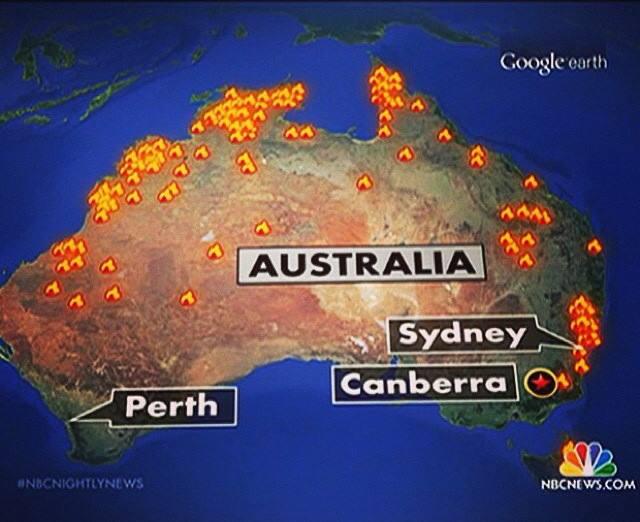
People in Australia think this map is hilarious/outrageous depending on personality — the current emergency was just in New South Wales. That was my reaction too. But the NBC News blog gets this right, which is a bit confusing
However, @Aus_ScienceWeek, the people who run National Science Week, point out that the map looks rather like the appropriate subsection of NASA’s satellite-based fire map from mid-September
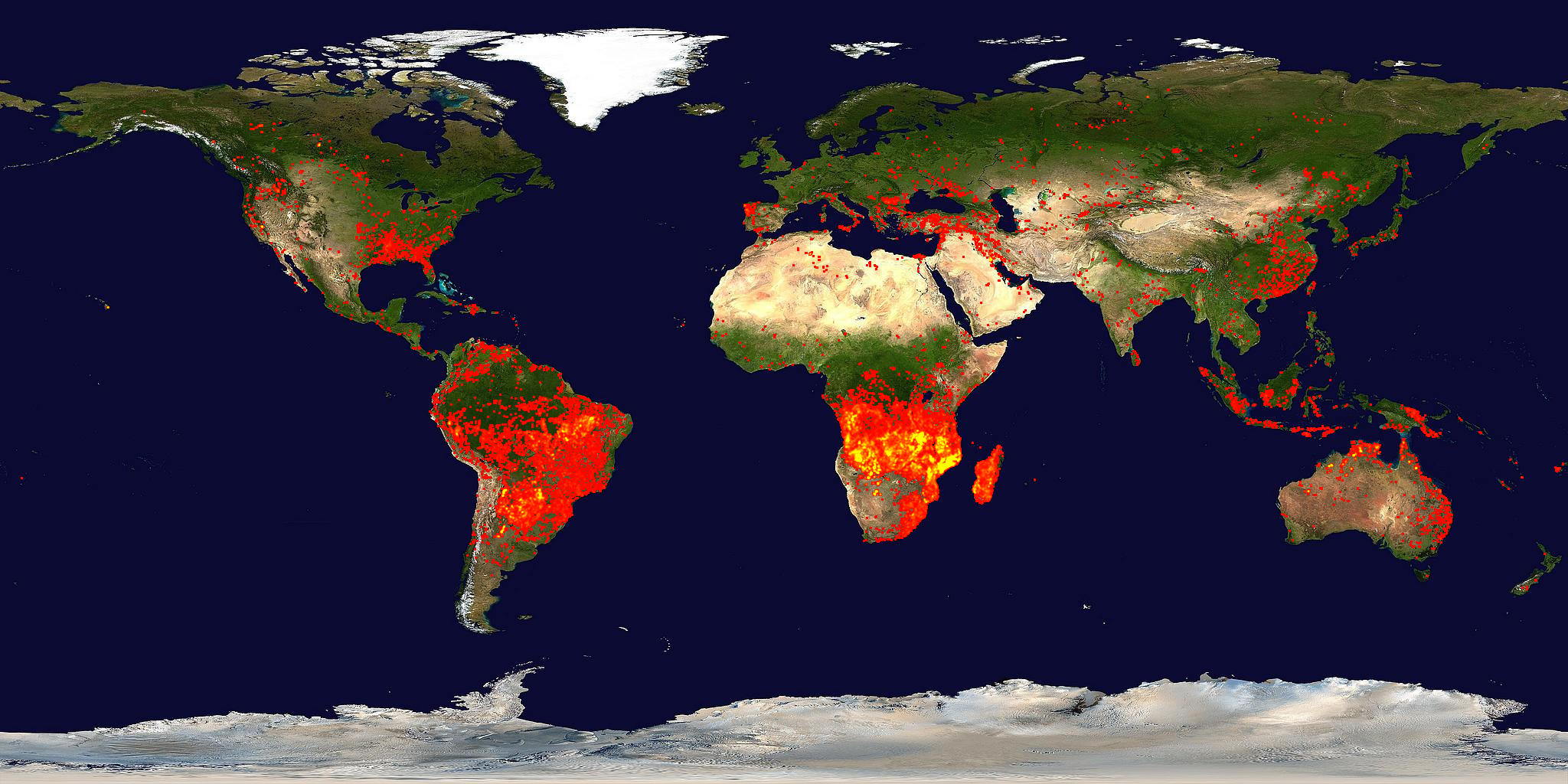
so it might well be correct in the sense that there actually fires in those places, though still wrong as a description of the emergency.
Thomas Lumley (@tslumley) is Professor of Biostatistics at the University of Auckland. His research interests include semiparametric models, survey sampling, statistical computing, foundations of statistics, and whatever methodological problems his medical collaborators come up with. He also blogs at Biased and Inefficient See all posts by Thomas Lumley »