What people die of
The Institute for Health Metrics, at my previous university in Seattle, has a new tool for visualising the causes of death and disability across the world with interactive graphics.
This pair of maps is for cancer in women.
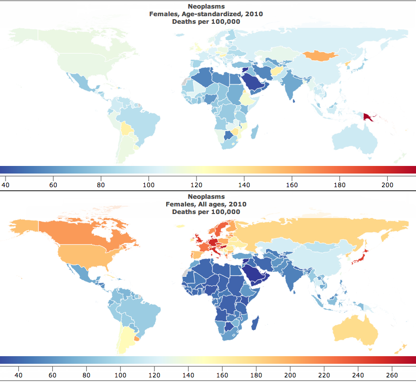
The lower map is just cancer deaths per 100,000 women. That’s the easiest sort of number to obtain, but the problem with it is obvious: the orange and red countries are mostly just the places where the female population is older than average.
The upper map is age-standardised deaths per 100,000 women. That is, you take the rate in your country for women of a particular age, say 72 years old , and multiply by the proportion of 72-year olds in the UN’s standard reference population. When you do this for each year of age and add up the results, you get an estimate of what the cancer rate differences really are like, averaged over ages.
The map looks completely different after standardising by age. In particular, there’s a lot less variation between countries. The lowest rate is in Saudi Arabia, which is wealthy enough to afford good medical care but still has low rates of many cancer risk factors in women. The highest rate is Papua New Guinea, which has very high rates of cervical cancer (affecting younger women than many cancers).
Thomas Lumley (@tslumley) is Professor of Biostatistics at the University of Auckland. His research interests include semiparametric models, survey sampling, statistical computing, foundations of statistics, and whatever methodological problems his medical collaborators come up with. He also blogs at Biased and Inefficient See all posts by Thomas Lumley »
What do you think about the quality of those estimates from the GBD project?
10 years ago
Well, they are probably as good as you can reasonably get, but I’d be surprised if, eg, age-standardised cancer deaths were as low as that in sub-Saharan Africa. That may be part of the reason Papua New Guinea is an outlier, if cancer is diagnosed and reported more consistently there.
10 years ago