Diversification
There’s a story on NPR news about college advertising brochures.
Pippert and his researchers looked at more than 10,000 images from college brochures, comparing the racial breakdown of students in the pictures to the colleges’ actual demographics. They found that, overall, the whiter the school, the more diversity depicted in the brochures, especially for certain groups.
When you look at the research paper it turns out that’s not quite right. The main data table (Table 3) is
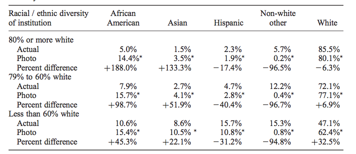
What it shows is that the proportion of African-American students in photos in the brochure is actually pretty much constant, regardless of the proportion at the university. It’s the exaggeration that increases for whiter campuses. It would have been nice to see this in a graph (and also perhaps see White+Asian pooled), but sociology doesn’t routinely do graphs (Kieran Healy has a paper trying to get them to)
Interestingly, the 15% or so proportion of African-American students in photos is above the proportion in the population as a whole (12.4%), but is very close to the proportion in the 16-19 age band, which includes the target audience for these brochures. That may well be just a coincidence, since there’s enough geographical variation that basically no-one is exposed to what the US population proportion looks like.
Thomas Lumley (@tslumley) is Professor of Biostatistics at the University of Auckland. His research interests include semiparametric models, survey sampling, statistical computing, foundations of statistics, and whatever methodological problems his medical collaborators come up with. He also blogs at Biased and Inefficient See all posts by Thomas Lumley »
I suspect you’d find something quite similar with NZ universities. When I worked at UoA, we were always encouraged to find “diverse” students to represent our department; our brochures were typically more diverse than the reality of our lecture theatres.
10 years ago
There is an obvious problem in that identifying someones ethnicity/ies by an image is unlikely to give the same answer as asking the person themselves for their ethnicity/ies.
For example – people used to ask if me if my father was Maori, going by his looks, but his ancestors for at least 3 generations are all of UK origin (but further back there is a suspicious Englishman called “William Brown” of unknown origins). If pressed, my Dad will say he is Black Irish.
10 years ago
There is a problem, I think it’s less serious than you might expect in this specific case of Black vs non-Black in the US, perhaps because it is such a strong social division. Less than 5% of married Blacks have a White spouse, and even for people under 18, only 5.6% of the population identify as multiracial.
The paper does talk a lot about this limitation. Unfortunately, they don’t seem to have done things like having two independent assessments and comparing inter-rater agreement. It would also have been nice to get something reasonably representative such as graduation-ceremony photos and compare proportions estimated from the photo to the self-report data.
Still, the results are dramatic enough that I’d expect the pattern to hold up.
10 years ago
Back in the days of apartheid South Africa I remember reading a story of twin girls – one was classified as white and the other as black because of their skin colouring. It was unusual enough to make the papers here but it wasn’t a rare event for siblings to be differently classified.
I don’t think it’s a bad thing for their to be more minorities represented in the brochures than in the student population – the college wants to show their range of students in order to encourage anyone to attend.
10 years ago