How dangerous is the rest of the world?
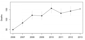
Both Stuff and the Herald have stories today based on MFAT statistics on consular assistance provided for deaths and accidents overseas. The basic message is that deaths overseas are increasing.
Both sites have interactive graphics: Stuff has a clicky map, and the Herald has barplots where you can select a country. A very nice feature of the Herald story is that they have more data, and a link to let you download it. They got the data under the Official Information Act, which is an impressive-sounding way of saying they asked MFAT for it (as Graeme Edgeler has pointed out, even ringing up some departmental office and asking what time they’re open is an Official Information Act request.)
From the extended data it’s clear that consular assistance for deaths is up a lot over time. That’s a much bigger increase than the number of trips overseas, and the increase looks pretty similar if you exclude Australia, which is unrepresentative because so many Kiwis actually live there. I don’t have any real idea why this is happening, and apparently neither do the journalists.
It’s interesting to look at how dangerous foreign travel is based on these data. For Thailand, the story in Stuff quotes 115000 trips and 18 deaths in the 9 months to September 2013. That gives a mortality rate of 0.16 per 1000 trips. The annual mortality rate for New Zealand as a whole is 6.8 per 1000 people per year, but travellers tend to be younger and healthier than average. For twentysomethings, the annual mortality rate is about 0.6 per 1000 per year, so the average trip uses up at most 3 months worth of mortality risk — travelling to Thailand is dangerous, but not very dangerous. Even then, we can’t be sure that it’s Thailand that is dangerous: other contributing explanations could be that people do riskier things while they are there, or that the sort of people who travel to Thailand are prone to taking more risks. The figure for all countries is about half that for Thailand, though it’s less reliable because of the difficulty in knowing how to handle Australia.
The figures for deaths while travelling should be fairly reliable — I’d expect most deaths of travellers to require some consular assistance — but the figures for accidents are obviously less complete. That didn’t stop Stuff saying
But according to the figures, deaths far outnumber accidents and injuries for New Zealanders across the globe.
The phrase “according to the figures” is doing a lot of work in that sentence, if you want to be able to say it with a straight face.
Update: Luis Apiolaza tracked down data(XLS) on deaths of visitors to NZ. Mortality is about 0.05-0.07 per 1000 trips. Visitors are safer here than we are abroad.
Thomas Lumley (@tslumley) is Professor of Biostatistics at the University of Auckland. His research interests include semiparametric models, survey sampling, statistical computing, foundations of statistics, and whatever methodological problems his medical collaborators come up with. He also blogs at Biased and Inefficient See all posts by Thomas Lumley »