Onward and upward
This graph (from Clark Williams-Derry via Andrew Gelman) shows US national traffic forecasts over time (the straight lines) and the reality (the black line)
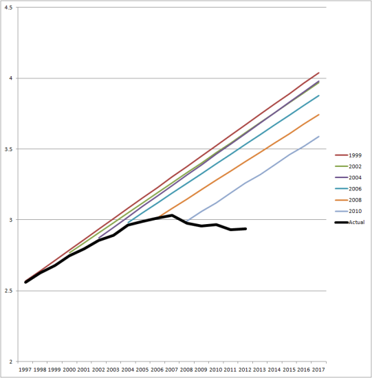
Initially, the straight-line extrapolation would have made sense, but for the past five years or so it’s been increasingly obvious that it’s bogus. Some of the fall off from expectations is due to the US recession, but people in the US seem to just be driving less than forecast.
It would be interesting to see this sort of graph for NZ data.
Thomas Lumley (@tslumley) is Professor of Biostatistics at the University of Auckland. His research interests include semiparametric models, survey sampling, statistical computing, foundations of statistics, and whatever methodological problems his medical collaborators come up with. He also blogs at Biased and Inefficient See all posts by Thomas Lumley »
Well, there is the New Zealand Household Traffic Survey at http://www.transport.govt.nz/research/travelsurvey/
glancing through I see road vehical kilometres travelled seems to have been static at around 40 billion km/year since 2006. Equally the number of journeys to school involving being a passenger in a car doesn’t seem to be increasing. Household expenditure on transport is static as a percentage. Total km tavelled by car static. Prettymuch everything seems to be static.
10 years ago
Transportblog have some good examples of this, including local ones.
10 years ago
Hey, linky no work. Try again: http://transportblog.co.nz/2012/10/23/is-nzta-cooking-the-books-on-a-5-billion-project/
10 years ago
Auckland Transport Blog have covered this off a lot.
For Auckland
http://transportblog.co.nz/2013/09/05/auckland-vehicle-ownership-and-vkt/
Younger people are also less likely to get a license seemingly, and outside of Auckland, driving appears to be dropping off more steeply.
http://transportblog.co.nz/2013/10/17/others-starting-to-notice-that-young-people-are-driving-less/
10 years ago