Evils of Axis
A scary chart showing how the stock market looks just like it did before the big crash that started the Great Depression:
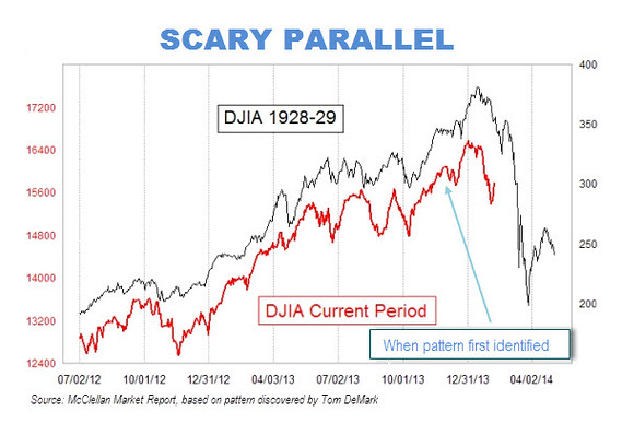
Or perhaps not
Scary parallel my arse. pic.twitter.com/omyovAKQaX
— Paweł Morski (@Pawelmorski) February 11, 2014
That is, if you scale the charts so that the vertical scale corresponds to the same proportional rise and fall for both of them, and extend them up to the day of publication rather than stopping in mid-January, the similarity vanishes.
How do we know which scaling is right? It depends on whether you think the detailed day-to-day shape of stock market fluctuations is much more important than the size of the fluctuations. And on whether you think it’s still January.
Thomas Lumley (@tslumley) is Professor of Biostatistics at the University of Auckland. His research interests include semiparametric models, survey sampling, statistical computing, foundations of statistics, and whatever methodological problems his medical collaborators come up with. He also blogs at Biased and Inefficient See all posts by Thomas Lumley »