Visualising bad things: axes down or up?
There’s a good chance you’ve seen this graph and formed an opinion about it already
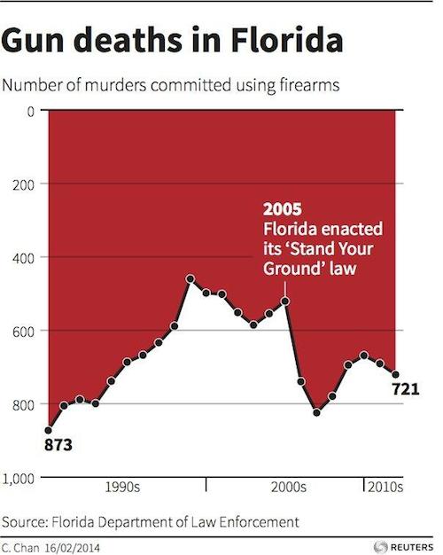
There certainly hasn’t been any shortage of comment about it, blaming the Florida Department of Law Enforcement for trying to reverse the apparent impact of the law change.
Andy Kirk, at Visualizing Data, has a couple of posts about the chart that you should read. It turns out that the designer of the chart wasn’t the Florida government, it was the C. Chan whose name appears at the bottom left. She designed the chart to try to show the big increase after 2005. She just likes having the y-axis increase downwards for bad things, inspired by this example
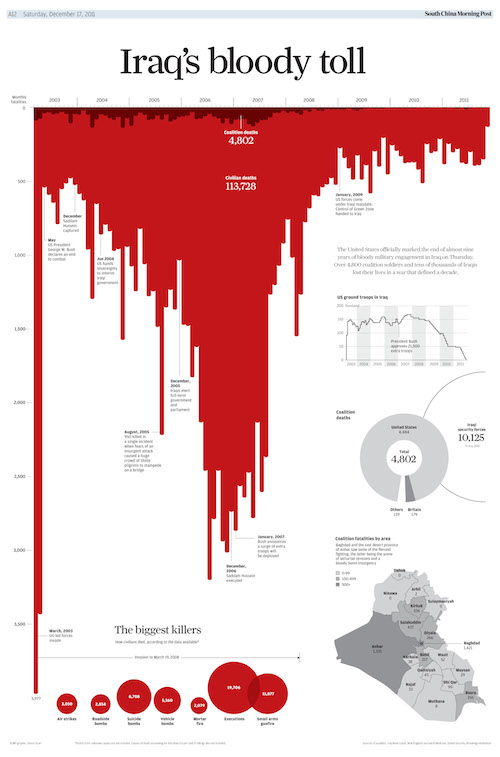
It’s interesting to look at why it’s obvious that the red area is the data in this graph, but not obvious in the first graph. Part of it is the title reference to blood, and the fact that the bars can be seen as dripping. Another important clue is that the labels and additional graphs are on the white part of the graph, making it look like background; in the Florida graph the label is on the red section. Finally, the Iraq graph is not tied down at the bottom; the Florida graph has the x-axis at the bottom. The Florida graph is like those faces/goblet ambiguous pictures; for many people it doesn’t have strong enough visual cues for foreground and background to overcome the basic expectation that up is up. A previous example of thoughtful design conflicting with prior expectations about the zero-line for the y-axis was ‘attack of the 14ft cat‘ from last year
I played around with these ideas, and came up with this revision, using a shadow and moving the x-axis to the top (I tried moving the label to the white section, but it didn’t seem to help)
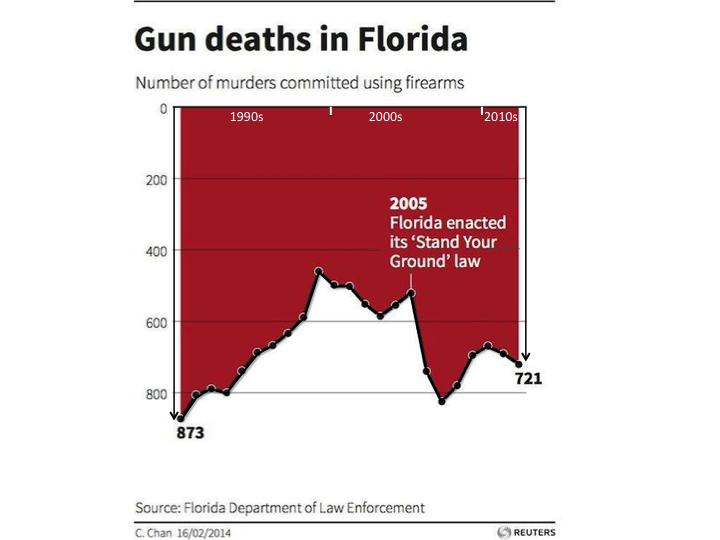
I think it’s a bit easier to see that the red is the foreground here, but it still isn’t really compelling that the red is the data.
Thomas Lumley (@tslumley) is Professor of Biostatistics at the University of Auckland. His research interests include semiparametric models, survey sampling, statistical computing, foundations of statistics, and whatever methodological problems his medical collaborators come up with. He also blogs at Biased and Inefficient See all posts by Thomas Lumley »