Marriage equality maps
The US Supreme Court declined to review seven same-sex marriage decisions today. The StatsChat-relevant aspect is the flurry of maps this prompted:
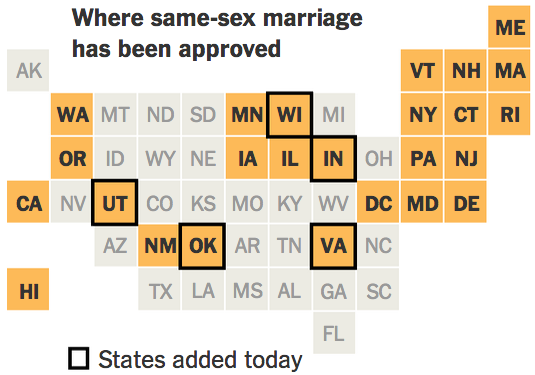
I think the New York Times (via Twitter) is my favorite version: the square statebins use geography just as an index to make states easier to find, and (in contrast to the last statebins I linked to) they’ve moved Alaska to the right place
Buzzfeed uses Mark Monmonier’s state map outline, which is cleverly distorted to allow the smaller states to be visible while maintaining shape and position. The colour scheme is awful, though.
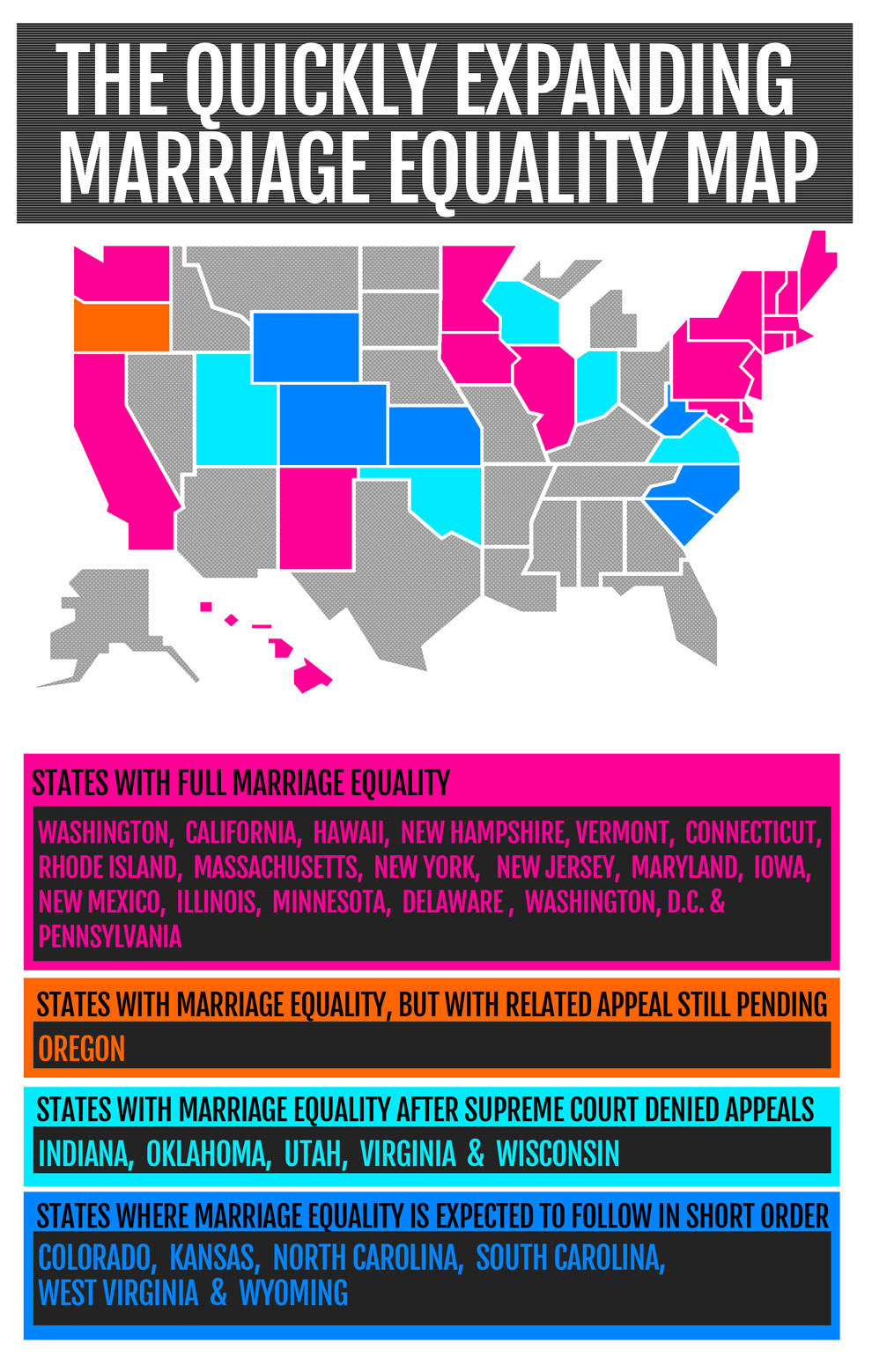
Time magazine has a conventional map, but a useful three-level colour scale
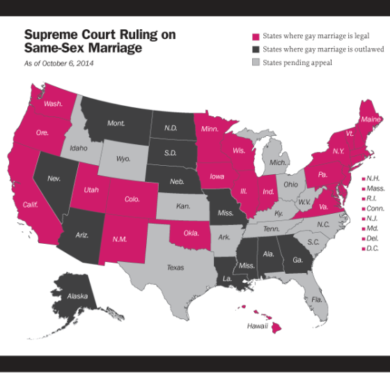
USA Today used three maps to show three aspects of the situation, which gets around the colour-scale problem, but doesn’t allow simultaneous comparison
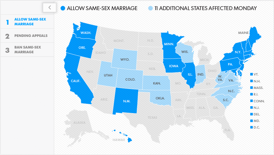
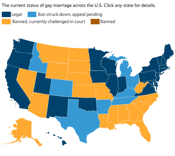
Mother Jones magazine (and Slate) have a map where clicking on a state gives the history. I’m not completely happy with the colour scheme, but it’s better than Buzzfeed.
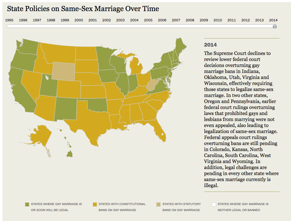
Pew Research have a map with slider to show changes over time. The colours are tasteful, but apart from the green, really not helpful
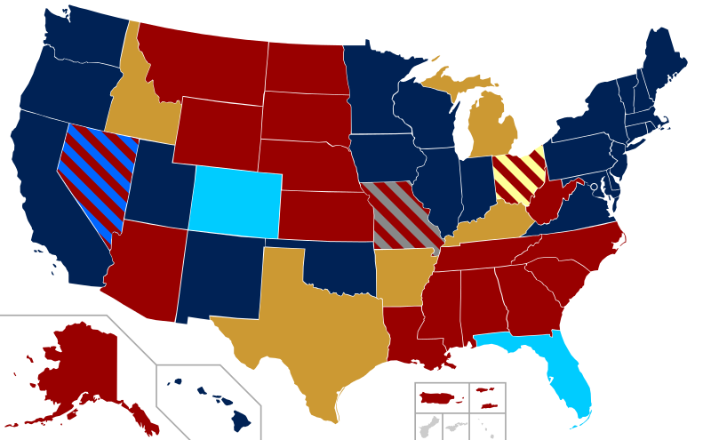
Wikipedia is trying to put too much information on one map, and it really, really doesn’t work.
And, while the data encoding in this one from MakeItEqual.org is hard even for most US people to read, the symbolism is very clever

Thomas Lumley (@tslumley) is Professor of Biostatistics at the University of Auckland. His research interests include semiparametric models, survey sampling, statistical computing, foundations of statistics, and whatever methodological problems his medical collaborators come up with. He also blogs at Biased and Inefficient See all posts by Thomas Lumley »
Just a quick note: clicking on small image of Buzzfeed map opens Time.com. It seems that website addresses mixed up.
10 years ago
Ta. Fixed now.
10 years ago