National income map
From the Herald’s data blog again, an interactive map of household incomes across the country, by Chris McDowall.
This is a dot map, with one dot for each household. The locations aren’t exact, since that sort of information isn’t publicly available; they are placed randomly within the Census meshblock (which presumably explains the household in the middle of the old Mangere Bridge in the example below).
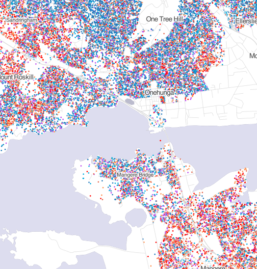
Dot maps handle varying population density much better than shaded maps: if you zoom out, you can see that typical household income is not even a thing in most of the geographical area of NZ, but if you zoom in on a city, like Auckland, or a small town, like Raetihi or Ohakune, you can see the patterns of income.
You can’t do everything with dots, though. Firstly, they only work where there really is a location for each number. If you wanted to map air pollution or land value, the reality is spread out, not localised.
More interesting, though, is the comparison with this map from StatsNZ over household income over time in Auckland
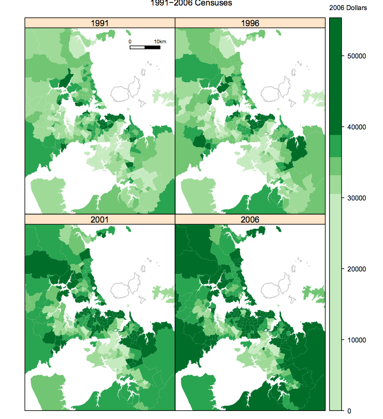
A single household income is localised at a single point, but a change between two censuses isn’t. If you used different dot locations for the four census times, some of the visual change would just be noise from the dot locations, but if you used the same dot locations you’d be implying that those specific households had those specific income changes.
Thomas Lumley (@tslumley) is Professor of Biostatistics at the University of Auckland. His research interests include semiparametric models, survey sampling, statistical computing, foundations of statistics, and whatever methodological problems his medical collaborators come up with. He also blogs at Biased and Inefficient See all posts by Thomas Lumley »
That’s a bit too un-anonymous. In Seatoun (Wgtn) once meshblock is all blue, no matter where the dots are placed giving away every household’s income. Another Seatoun meshblock has only two oranges (the rest dark blue, 1 purple) and it should be easy enough to work out which households those are using google street view or more roughly using house valuations from city councils.
9 years ago
That’s the level of information StatisticsNZ distributes. The map isn’t adding anything.
9 years ago
On the plus side, some of the meshblocks with very few houses (e.g. the ones in the same meshblock as Wgtn airport) aren’t displayed.
Out of interest, if you ask for a display of household telephone status, will it give you a new set of map positions or the same map positions as for income.
It might be an interesting masters project to try and re-create information about households from administration data and/or publicly available data and then give this info to a sample of households and get them to see how well it is matched.
9 years ago
I went and had a look at the data. I thought the base data was per household but it’s per meshblock.
It means it can’t be cross-tabulated on GIS co-ordinate.
9 years ago
Yes, exactly. The coordinates are just randomly sampled from the meshblock by the map designer.
9 years ago