Not enough pie
From James Lee Gilbert on Twitter, a pie chart from WXII News (Winston-Salem, North Carolina)
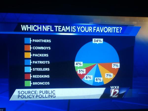
This is from a (respectable, if pointless) poll conducted in North Carolina. As you can clearly see, half of the state favours the local team. Or, as you can clearly see from the numbers, one-third of the state does.
If you’re going to use a pie chart (which you usually shouldn’t), remember that the ‘slices of pie’ metaphor is the whole point of the design. If the slices only add up to 70%, you need to either add the “Other”/”Don’t Know”/”Refused” category, or choose a different graph.
If your graph makes it easy to confuse 1/3 and 1/2, it’s not doing its job.
Thomas Lumley (@tslumley) is Professor of Biostatistics at the University of Auckland. His research interests include semiparametric models, survey sampling, statistical computing, foundations of statistics, and whatever methodological problems his medical collaborators come up with. He also blogs at Biased and Inefficient See all posts by Thomas Lumley »