Maps, colours, and locations
This is part of a social media map, of photographs taken in public places in the San Francisco Bay Area
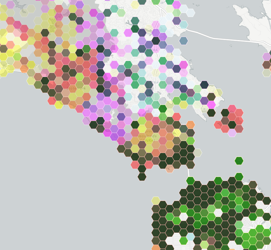
The colours are trying to indicate three social media sites: Instagram is yellow, Flickr is magenta, Twitter is cyan.
Encoding three variables with colour this way doesn’t allow you to easily read off differences, but you can see clusters and then think about how to decode them into data. The dark green areas are saturated with photos. Light green urban areas have Instagram and Twitter, but not much Flickr. Pink and orange areas lack Twitter — mostly these track cellphone coverage and population density, but not entirely. The pink area in the center of the map is spectacular landscape without many people; the orange blob on the right is the popular Angel Island park.
Zooming in on Angel Island shows something interesting: there are a few blobs with high density across all three social media systems. The two at the top are easily explained: the visitor centre and the only place on the island that sells food. The very dense blob in the middle of the island, and the slightly less dense one below it are a bit strange. They don’t seem to correspond to any plausible features.
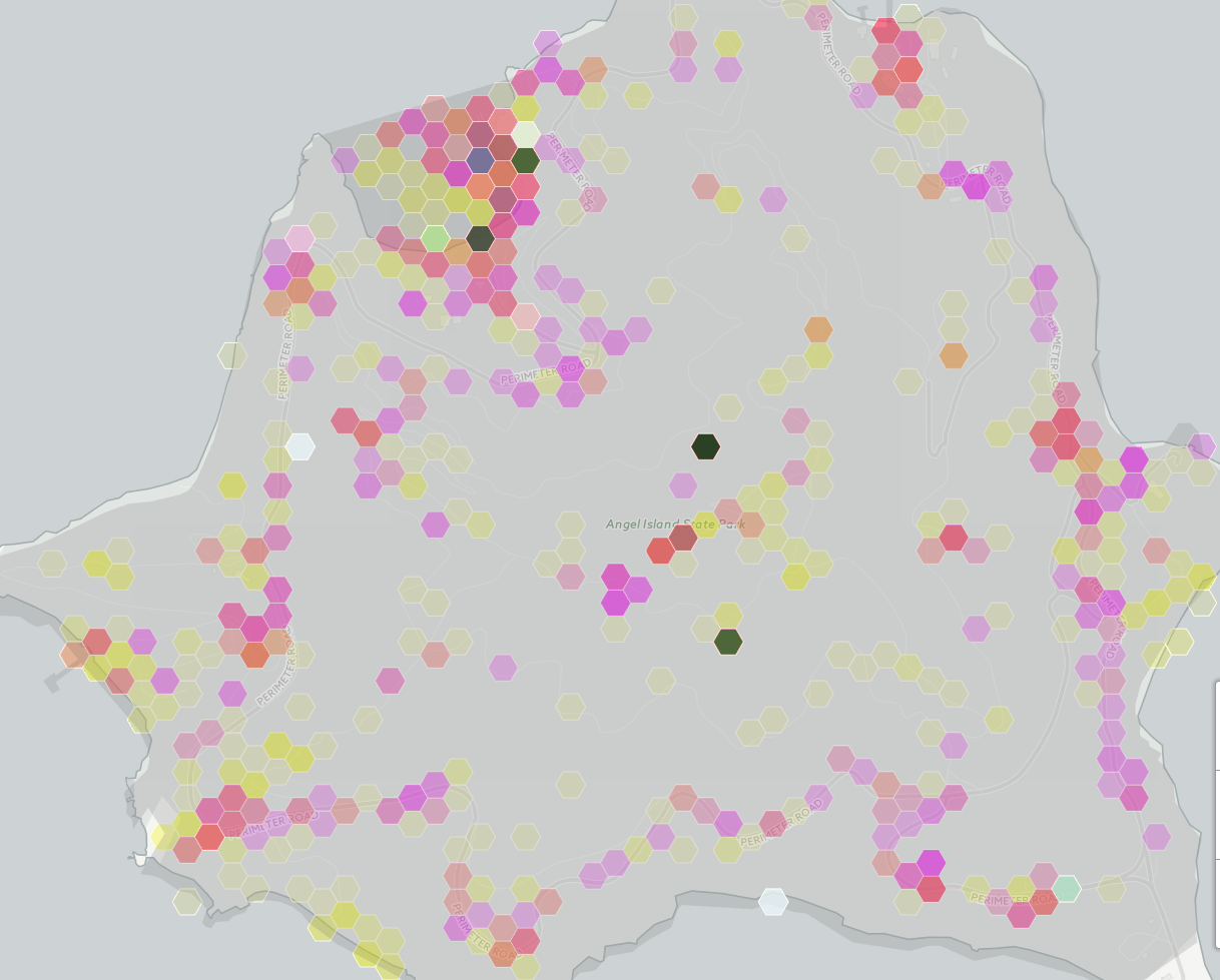
My guess is that these are a phenomenon we’ve seen before, of locations being mapped to the center of some region if they can’t be specified precisely.
Automated data tends to be messy, and making serious use of it means finding out the ways it lies to you. Wayne Dobson doesn’t have your cellphone, and there isn’t a uniquely Twitter-worthy bush in the middle of Angel Island.
Thomas Lumley (@tslumley) is Professor of Biostatistics at the University of Auckland. His research interests include semiparametric models, survey sampling, statistical computing, foundations of statistics, and whatever methodological problems his medical collaborators come up with. He also blogs at Biased and Inefficient See all posts by Thomas Lumley »
Looking at the geography I suspect the lower, heavy dot is people stopping to take photos of Alcatraz which is due south.
Putting the orange man down on google earth at that spot, it looks like it’s also the start of a steep upward climb so it also could be people taking a breather and playing with social media. (And there’s Bay fog so Alcatraz can’t be seen)
9 years ago
I don’t buy it. The central spot is a single location right down to maximum zoom. In contrast, the two spots with an obvious explanation break down into clumps of separate locations when you zoom in.
Yes, people might be taking a breather, but why would somewhere that precise be so uniquely tweetable compared to all the other places on the island — like the summit, for example?
9 years ago
(You can see the walking paths at one level of zoom on the hexmap and they can be seen on google earth so it’s relatively easy to find places.)
The path just around and at the summit has isolated groups of benches where people can stop to rest and so their social media captures are going to be spread out along the ridge to the summit.
At the lower (i.e. south) high density point, the only view is due south to Alcatraz because of the shape of the hills running down to the sea. It looks like it would be quite a nice shot – foreground island, across the sea to Alcatraz – when there is no sea mist that is.
9 years ago