Evils of Axis
First, from Mother Jones magazine, via Twitter
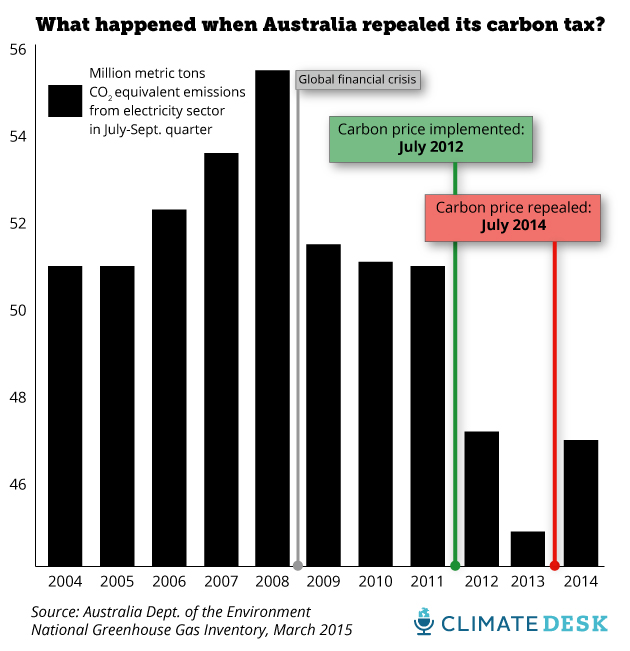
The impact of the carbon tax looks impressive, but this is a bar chart — it starts at zero and they’ve only shown the top fifth of it.
They do link to the data, the quarterly Greenhouse Gas Inventory update. In that report, Figure 8 is
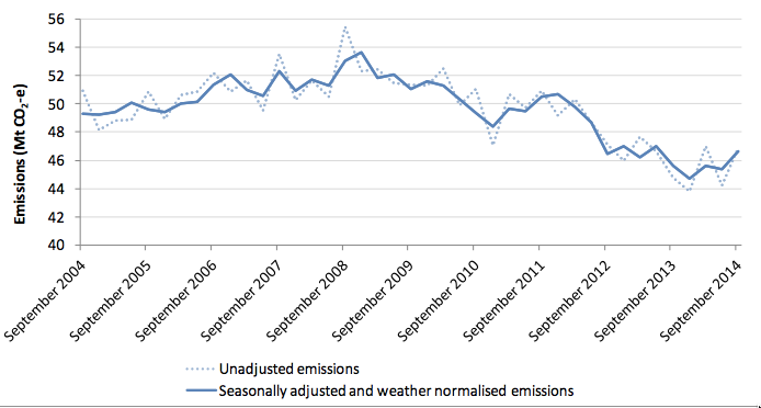
The dotted line is the same data as the bar chart, except that the dotted line has data for every quarter and the bar chart has data only for the July-September quarter each year. And the line chart has a wider range on the vertical axis — it doesn’t go down to zero, but it isn’t a bar chart, so it doesn’t have to. The other point about the line chart is that there’s a solid line there as well. The solid line is adjusted for seasonal variation and weather. If you wanted to know about real changes in how Australians are using energy, that’s the line you’d use.
Second, a beautiful map of CO2 emissions from fossil fuel combustion, from the Washington Post via Flowing Data
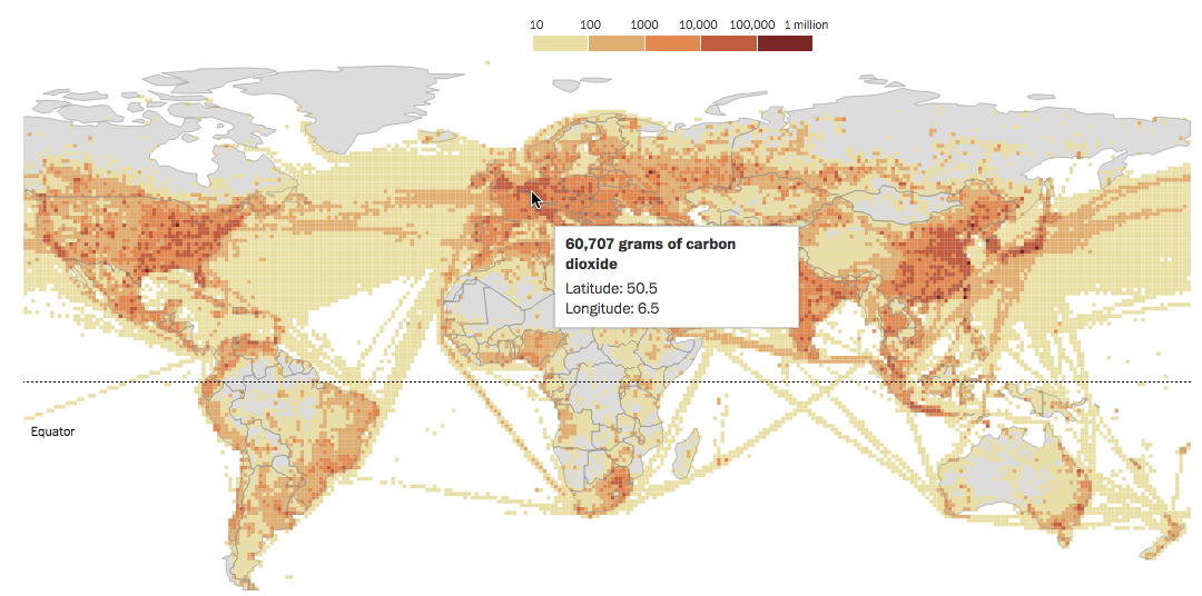
The ‘vertical’ scale here is a colour scale; what’s misleading is that it’s a logarithmic scale. The map makes it look as if a large fraction of CO2 emission comes from transporting stuff through empty areas, but the pale beige indicates emissions thousands of times lower than in the urban/suburban areas. Red ink isn’t anywhere close to being proportional to CO2.
Thomas Lumley (@tslumley) is Professor of Biostatistics at the University of Auckland. His research interests include semiparametric models, survey sampling, statistical computing, foundations of statistics, and whatever methodological problems his medical collaborators come up with. He also blogs at Biased and Inefficient See all posts by Thomas Lumley »