June 2, 2015
Improving pie-charts
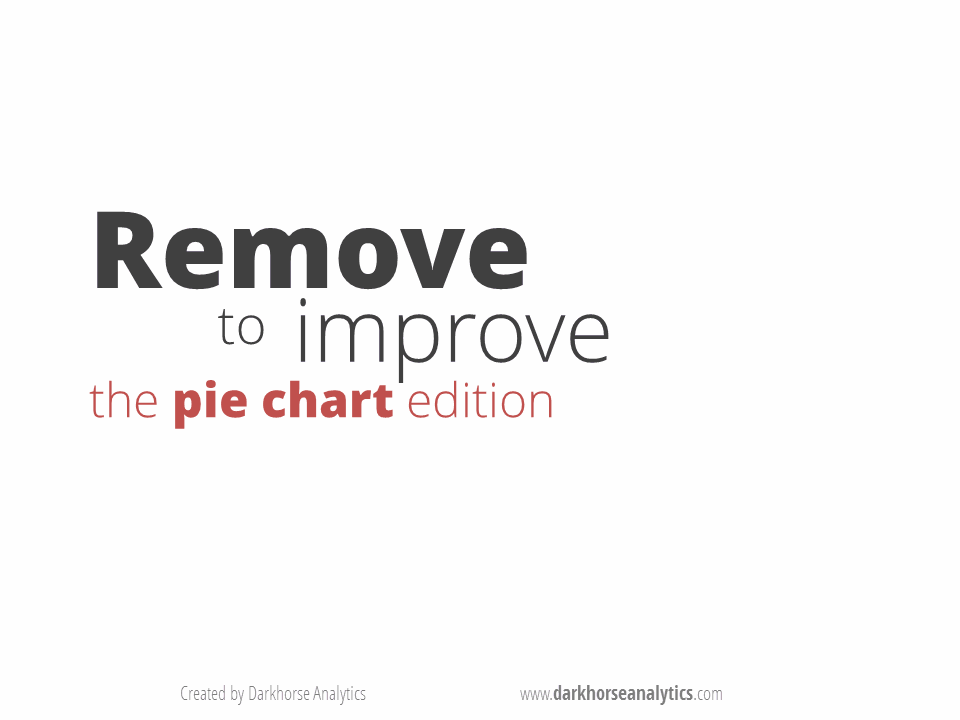
We’ve seen animations of this sort from Darkhorse Analytics before, but this one is special. It shows how to remove unnecessary components from a pie chart to produce something genuinely useful, though, sadly, the procedure doesn’t work for all pie charts.
Click on the picture to start the animation
(via @JennyBryan)
Thomas Lumley (@tslumley) is Professor of Biostatistics at the University of Auckland. His research interests include semiparametric models, survey sampling, statistical computing, foundations of statistics, and whatever methodological problems his medical collaborators come up with. He also blogs at Biased and Inefficient See all posts by Thomas Lumley »
For a moment I was sure the lines were going to go too…
9 years ago
Ha! That really was special.
9 years ago