Pie chart of the week
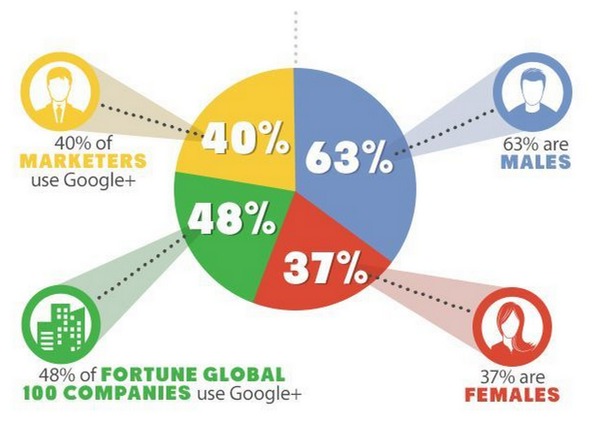
A year-old pie chart describing Google+ users. On the right are two slices that would make up a valid but pointless pie chart: their denominator is Google+ users. On the left, two slices that have completely different denominators: all marketers and all Fortune Global 100 companies.
On top of that, it’s unlikely that the yellow slice is correct, since it’s not clear what the relevant denominator even is. And, of course, though most of the marketers probably identify as male or female, it’s not clear how the Fortune Global 100 Companies would report their gender.
From @NoahSlater, via @LewSOS, originally from kwikturnmedia about 18 months ago.
Thomas Lumley (@tslumley) is Professor of Biostatistics at the University of Auckland. His research interests include semiparametric models, survey sampling, statistical computing, foundations of statistics, and whatever methodological problems his medical collaborators come up with. He also blogs at Biased and Inefficient See all posts by Thomas Lumley »