Evils of axis
From One News, tweeted by various people:
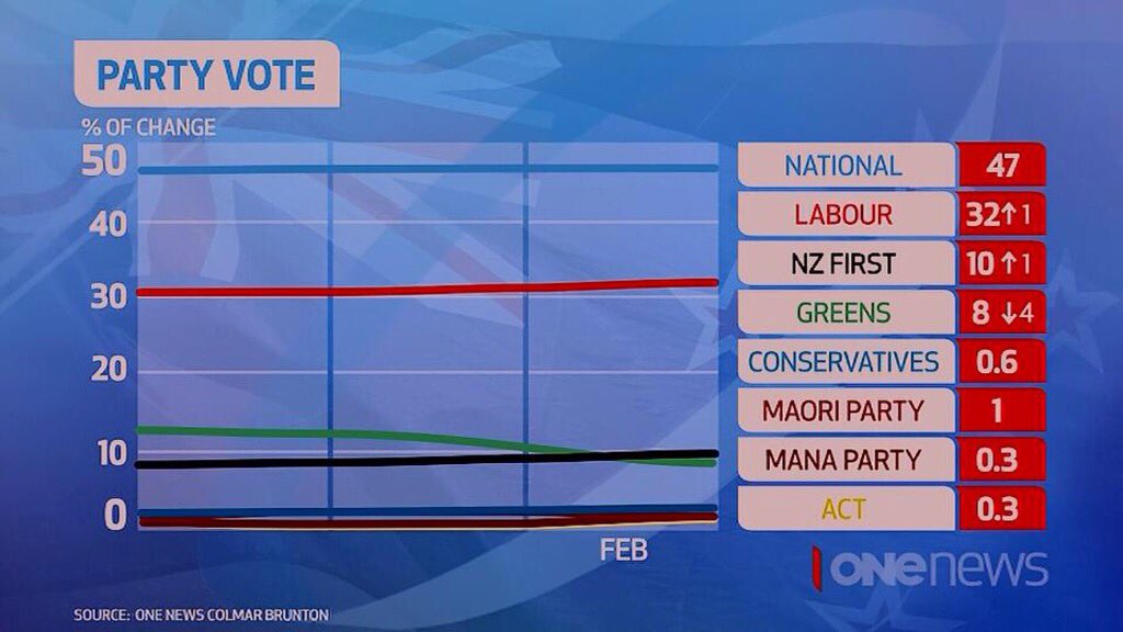
The y-axis label is wrong: this has nothing to do with change, it’s percent support.
The x-axis label is maximally unhelpful: we can guess that the most recent poll is in February, but what are the earlier data? You might think the vertical divisions are months, but the story says the previous poll was in October.
Also, given that the measurement error is large compared to the expected changes, using a line graph without points indicating the observations is misleading.
Overall, the graph doesn’t add to the numbers on the right, which is a bit of a waste.
Thomas Lumley (@tslumley) is Professor of Biostatistics at the University of Auckland. His research interests include semiparametric models, survey sampling, statistical computing, foundations of statistics, and whatever methodological problems his medical collaborators come up with. He also blogs at Biased and Inefficient See all posts by Thomas Lumley »
Since the election:
ONCB Polls: Feb,Apr,May,Jul,Sep,Oct,Feb
N: 49,49,48,47,47,47,47
L: 31,31,31,32,32,31,32
G: 10,9,10,13,12,12,8
NZF: 6,7,7,7,7,9,10
The line for Labour increases from 31 to 32, meaning the graph must only go back to the previous poll in October. But the line for the Green Party starts at 13, that’s July! NZF’s line starts on 8. The last time CB had them on 8 is just before the Sept 2014 election!
8 years ago
Colmar Brunton’s graph isn’t perfect either. Varying widths between years.
http://www.colmarbrunton.co.nz/images/160222_ONE_News_Colmar_Brunton_Poll_report_13-17_Feb_2016.pdf
8 years ago
True, but it’s a whole lot better than One News’s effort.
8 years ago