Compared to what?
Two maps via Twitter:
From the Sydney Morning Herald, via @mlle_elle and @rpy
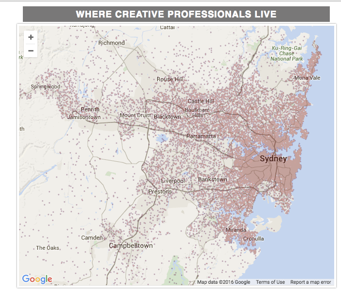
The differences in population density swamp anything else. For the map to be useful we’d need a comparison between ‘creative professionals’ and ‘non-creative unprofessionals’. There’s an XKCD about this.
Peter Ellis has another visualisation of the last election that emphasises comparisons. Here’s a comparison of Green and Labour votes (by polling place) across Auckland.
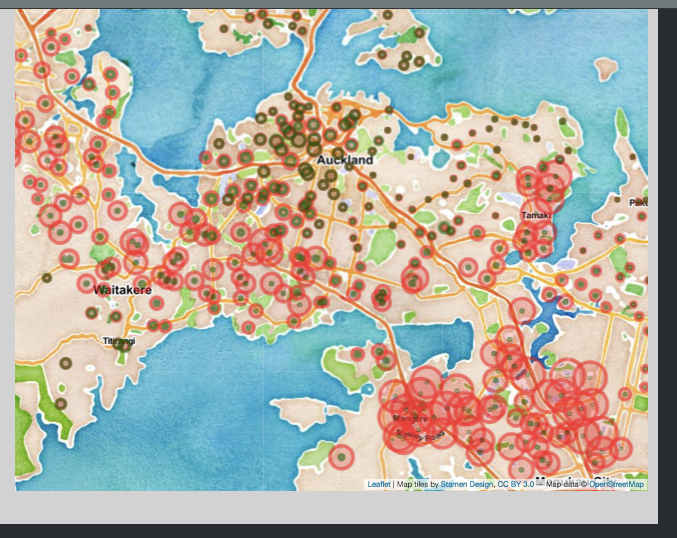
There’s a clear division between the areas where Labour and Green polled about the same, and those where Labour did much better
Thomas Lumley (@tslumley) is Professor of Biostatistics at the University of Auckland. His research interests include semiparametric models, survey sampling, statistical computing, foundations of statistics, and whatever methodological problems his medical collaborators come up with. He also blogs at Biased and Inefficient See all posts by Thomas Lumley »
Thanks, nice!
I do apologise for the red-green thing, for colour blind people who want to compare Labour and the Greens…
8 years ago
It seems that Greens voters are those with better jobs and houses than labour voters we look at similar maps with income and house prices
8 years ago
It’s a little more complicated. Quite a bit of the city-centre apartment population is low-income students and other young people — the ‘house price’ comparison is misleading because so much of the housing is rental apartment buildings.
Education is probably a better predictor, though if you wanted to generalise to ‘have or expect to have better jobs and houses’ that might also fit.
8 years ago
if we just look out west, we can see green being almost equal to labour in te Atatu (a higher price area than henderson ranui down the road). Similar effect in the eastern bays, and lower north shore.
The inner city suburbs may have priced out students, who are replaced by young wage earners who can afford the rent and night time hospitality prices
8 years ago
Mashblock (http://www.mashblock.co.nz/meshblock/mb0436600) has meshblock-level statistics, and there are quite a lot of low income people in the city centre.
8 years ago
I’ve done more analysis on this issue now, available at http://ellisp.github.io/blog/2016/04/16/nzelect4/ The evidence suggests “more complicated” is the answer.
8 years ago