Suboptimal ways to present risk
Graeme Edgeler nominated this, from PBS Frontline, to @statschat as a bad graph
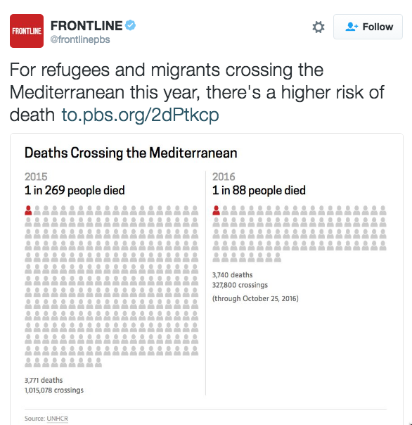
It’s actually almost a good graph, but I think it’s trying to do too many things at once. There are two basic numerical facts: the number of people trying to cross the Mediterranean to escape the Syrian crisis has gone down substantially; the number of deaths has stayed about the same.
If you want to show the increase in risk, it’s much more effective to use a fixed, round denominator — the main reason to use this sort of graph is that people pick up risk information better as frequencies than as fractions.
Here’s the comparison using the same denominator, 269, for the two years. It’s visually obvious that there has been a three-fold increase in death rate.


It’s harder to convey all the comparisons clearly in one graph. A mosaic plot would work for higher proportions, which we can all hope doesn’t become a relevant fact.
Thomas Lumley (@tslumley) is Professor of Biostatistics at the University of Auckland. His research interests include semiparametric models, survey sampling, statistical computing, foundations of statistics, and whatever methodological problems his medical collaborators come up with. He also blogs at Biased and Inefficient See all posts by Thomas Lumley »
I’d suggest that rates are not the most important thing here anyway. The critical facts are – 1st less people are crossing (probably a good thing?) and – 2nd for each of the last two years, around 3700 people trying to escape have drowned. That’s 3700 mothers, fathers, girls, boys and babies – leaving desperate families even more traumatised. Presenting the numbers as a rate is too clever by half. But I’m still very curious as to what is going on – has the quality of boats got even worse? Are some kind of deterent measures making it more dangerous? Etc etc
7 years ago