The amazing pizzachart
From YouGov (who seem to already be regretting it).
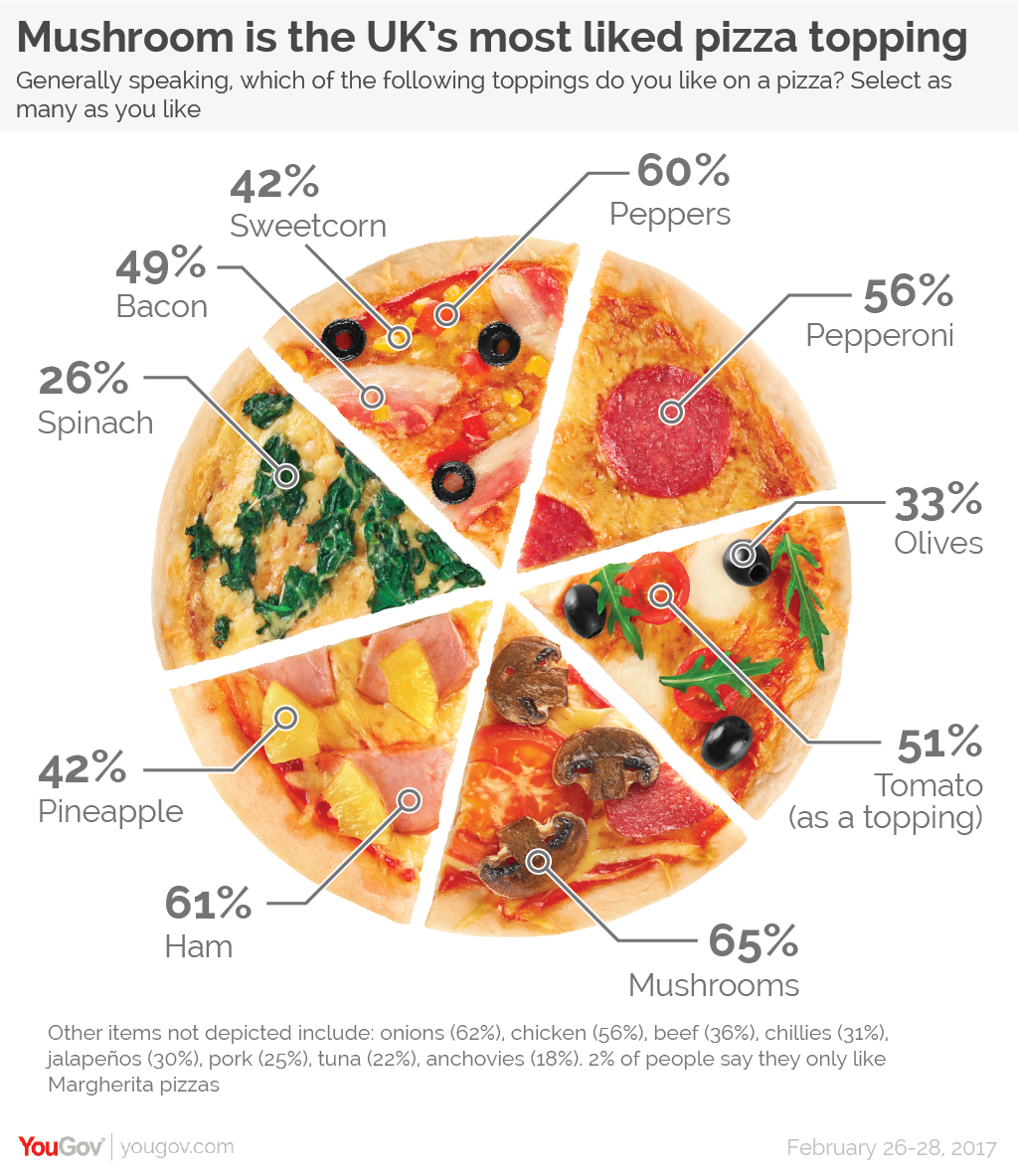
This obviously isn’t a pie chart, because the pieces are the same size but the numbers are different. It’s not really a graph at all; it’s an idiosyncratically organised, illustrated table. It gets worse, though. The pizza picture itself isn’t doing any productive work in this graphic: the only information it conveys is misleading. There’s a clear impression given that particular ingredients go together, when that’s not how the questions were asked. And as the footnote says, there are a lot of popular ingredients that didn’t even make it on to the graphic.
Thomas Lumley (@tslumley) is Professor of Biostatistics at the University of Auckland. His research interests include semiparametric models, survey sampling, statistical computing, foundations of statistics, and whatever methodological problems his medical collaborators come up with. He also blogs at Biased and Inefficient See all posts by Thomas Lumley »
Um, yes it’s not a graph. It’s a picture of a pizza.
And yes it is adding productive value, it’s a much more entertaining depiction of common pizza toppings than other ways of presenting the data, those which only a statistician would bother even glancing at.
I do have one big issue with it though. Everyone knows pizzas are cut into 8 not 6.
7 years ago
But cutting it into 8 would have required showing prawns, which would have been confusing since they weren’t a popular response
(at least if I’m right about the source)
7 years ago