Graph of the day
Literally, this time. I got this from Andrew Gelman, but it’s too good not to share. It’s originally from the Wall Street Journal
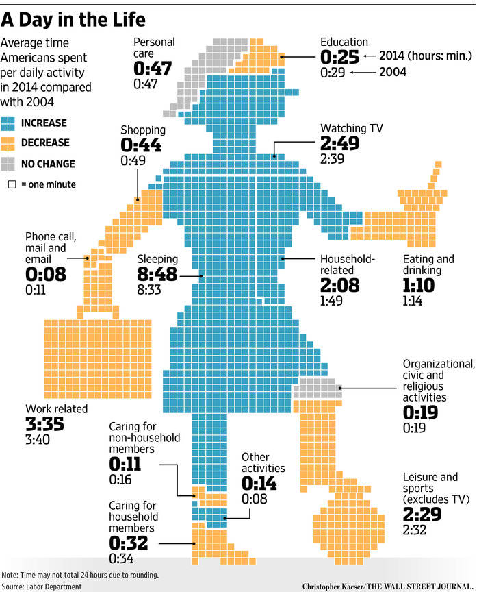
Apart from the attempts to make the body part representative of the activity, the unwisdom of playing soccer in high heels, and the mystery of what it actually is that she’s eating or drinking (a martini? an icecream?), there are some generalisable graphical points.
First, comparison of area between different shapes is hard, and so isn’t a good way to display data: it’s not immediately clear whether the Knee of Religion is larger than the Forehead of Education or the Shoe of Caring.
Second, trying to code the direction of change with colour means you can’t use colour (consistently) to distinguish categories.
Third, some of the figures aren’t very helpful because they average over everyone: only about 60% of the adult population is in paid employment, and only a small proportion are in education. For people who work or study the time spent is a lot more than the average, for everyone else it’s zero.
And finally, if you have to write all the numbers on the graph, the graph isn’t doing its job.
Thomas Lumley (@tslumley) is Professor of Biostatistics at the University of Auckland. His research interests include semiparametric models, survey sampling, statistical computing, foundations of statistics, and whatever methodological problems his medical collaborators come up with. He also blogs at Biased and Inefficient See all posts by Thomas Lumley »
This is very cool
9 years ago
These body standards are not okay, like let’s be real this chick is American so she is most likely a hell of a lot more curvey
9 years ago