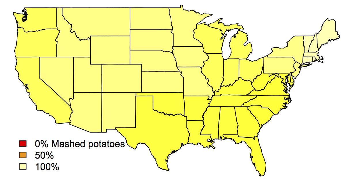
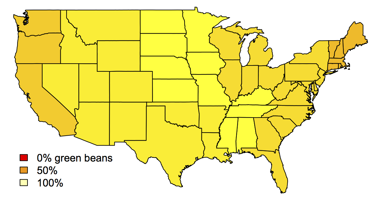
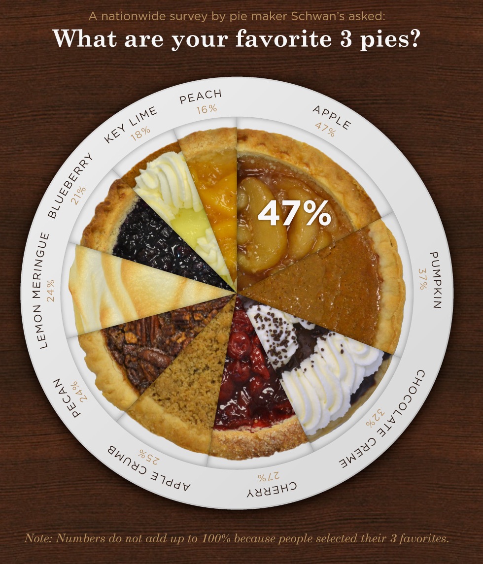
Search results for sgi (8)

November 21, 2020

Thanksgiving risks

It’s quite difficult to exaggerate how bad the US coronavirus epidemic is. The Washington Post has managed.  They have a map showing the probability that a gathering of 10 local people for Thanksgiving will include at least one Covid case. They say

At the county level nationwide, the average estimated risk of running into a coronavirus-positive person at a 10-person gathering is just a hair under 40 percent. 

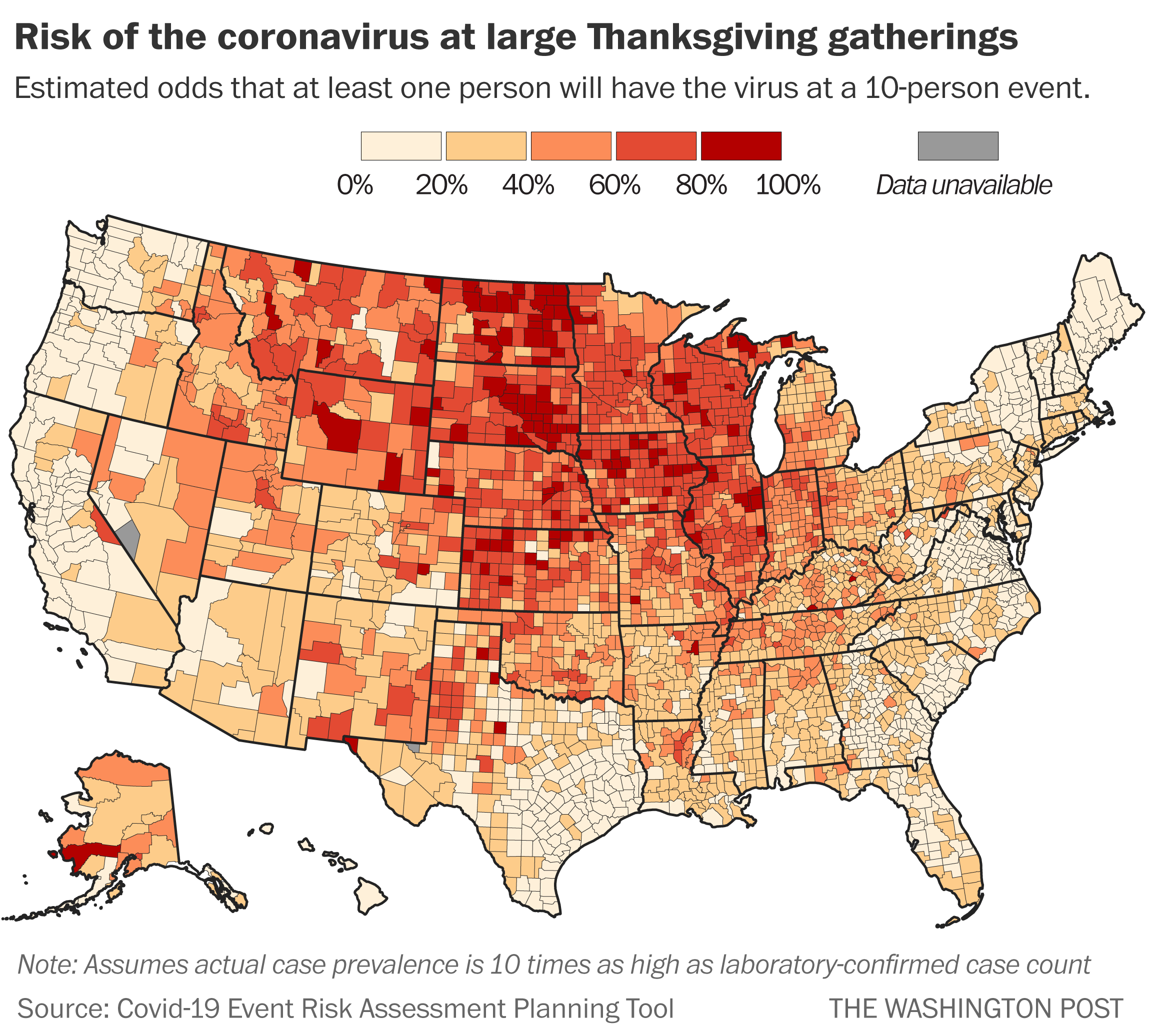
As the note on the map says, it assumes the actual case prevalence is 10 times the number of people with positive tests.  That’s a bit high — it comes from much earlier in the year, when testing was rarer).  It’s also a bit high if we assume that obviously unwell people (who are included in the prevalence estimate) are more likely to skip the celebration.

On top of that, though, the calculations (based on this paper) assume Covid infection status for the 10 participants is independent.  That was a reasonable approximation for the original paper, which looked at public gathering.  It’s not a great assumption for Thanksgiving, where people tend to attend in household groups.  The ‘effective’ gathering size will be less than the number of individuals, and closer to the number of households participating. So, if the prevalence is 1%, the risk based on three independent households is about 3%; the risk based on 10 independent people is about 10%. The truth will lie somewhere between.

And, as you can tell from looking at the map, there’s something wrong with saying the nationwide average risk is 40%, since 0-20% range includes nearly all the high-population parts of the US. The 40% is an average of counties, with no easy way to translate it into a risk for people.

Why am I pointing this out, when the map only strengthens the sensible public-health advice to stay the fuck away from Thanksgiving dinners? Because it is not true that 40% of the ten-person Thanksgiving gatherings in the US (and the vast majority of those in the Dakotas) should expect to come down with Covid this week, and people will notice that it wasn’t true. The truth doesn’t just matter for ethical reasons, it matters for any effective risk communication that isn’t just a one-shot attempt.

November 25, 2016

Thanksgiving

It’s well into Thanksgiving Day in the US now, and that’s a nice tradition to export. So, today, I’m thankful for geophysics.

In the Late Bronze Age, it made perfect sense that earthquakes were caused by God or gods getting upset. That, on a larger scale, is how people often behave, and whether we are made in God’s image or he in ours, you’d expect some similarities.  And when an earthquake destroys a city, well, whether you think God is more offended by homosexuality or homelessness, by not giving enough to the temple or not giving enough to the poor, there’s going to be something in any major city to piss him off.

Now we have maps like this one from GNS Science:
kaikoura-earthquake-faults-e1479265716143
and this one, which I made for a very early StatsChat post, showing all sufficiently-large earthquakes from 1973 to mid-2011.

moonmap1

Working from travellers’ tales in the Middle East it would be impossible to see the patterns, but technologies including GPS, helicopters, the internet, and a worldwide network of seismometers makes them much clearer. Earthquakes mostly happen along a small set of lines, and scientists can measure the strains in the rock around those lines that lead to the earth rupturing.  The global pattern, together with a vast network of other evidence, fits an explanation where whole continents are pushed around on the Earth by convection deep inside, bumping and grinding as they collide. It doesn’t fit an explanation based on human behaviour being different in different places — even though that might seem a less grandiose explanation before we got the data.

There’s a lot we don’t know about earthquakes, but we understand them well enough to make high-risk/low-risk predictions, to describe the patterns of aftershocks, to do tsunami warnings (on a good day), and to buy and sell earthquake insurance.  We don’t know exactly why one building is destroyed and another is spared, but there aren’t any mysteries about it: it’s the sort of thing we could work out given time and money.

Science isn’t a pure good; there are many things we can go with more knowledge of the world, and the blue circles on the world map above show some seismic events that are the result of human action. But even they have become less frequent.

And now that God has gotten out of the natural-disaster business, many people in this country don’t believe in him, and those that do still believe mostly (with sad exceptions) have a higher opinion of him than their ancestors did.

December 10, 2021

Briefly

  • From Ars Technica, Report reveals which sealed NES games are the rarest of the rare. This is relevant because most of the story is about selection bias “Wata’s sealed-NES report, for instance, only shows one graded, sealed copy of Jeopardy!, a game that most collector’s regard as pretty common.
    This disparity could be because sealed copies of Jeopardy! happen to be much rarer than open boxes or loose carts. Or it could simply be that almost no one has bothered going through the time, expense, and hassle of going to Wata for a professional grade on a relatively ignorable game like Jeopardy!.
  • Phillip Bump, of the Washington Post, is starting a newsletterHow to read this chart
  • NZ police release an independent report on facial recognition technology
  • The police, and various other agencies, have asked the Ministry of Health for data from Covid contact tracing. They were (correctly) turned down.
  • According to UK supermarket chain Tesco, via Wales Online,  33% of people in London and 39% of 18-24 year olds in the UK celebrate Thanksgiving. I’m reasonably sure this isn’t true, but it doesn’t seem possible to find out any more about where they got the numbers.
  • NZ Herald, Nov 22 “Auckland CBD sinking into anarchy and resembling 1980s New York, city leaders told. Newsroom, Dec 6, “yeah nah”
November 27, 2018

Setting the record straight?

Brian Wansink, a prominent food researcher from Cornell, was forced to retire earlier this year. Andrew Gelman has some good perspectives. Wansink’s research was on contextual effects on eating — eg, the impact of plate size — and a bunch of these papers have now been retracted.

This week, Wired has a Thanksgiving-themed article about his research. It includes this quote from an email he sent to colleagues ahead of his retirement

“We may believe that our papers have been unfairly retracted. But what they can’t retract is the impact these have had on people’s lives and the impact they will continue to have.”

That’s a perfect summary of the problems with studies that over-promise and are over-publicised.  Whether the research was done well or not, it’s going to stick.  Subsequent developments — whether modifications, replication failures, or retractions — never get the impact of the original claim.

November 23, 2017

State caricatures

This map of most disproportionately consumed Thanksgiving side dishes, from 538, is circulating again

538-thanks

As I’ve pointed out before, these aren’t the most commonly eaten in each state, they’re the ones that are most different from the rest of the country — a sort of caricature of the nation’s food geography. It’s actually worse than that, since this is from a relatively small poll and didn’t even record what state people were in, just what region.

Since 538 makes their data available, we can do other maps. Here’s the most commonly consumed side-dish

thanks

It’s much less interesting, but even this overstates the geographic variation.

Here, on a red-to-yellow heat scale, is the proportion of respondents who have mashed potatoes
tato

and green beans/green bean casserole
beans

There’s nothing necessarily wrong with the ‘most disproportionate’ map, as long as you recognise what it’s doing. But saying, as 538 did, “When you get past the poultry and check out the side dishes, though, the regional distinctions really come out” tends to hide that point.

May 26, 2013

Late autumn piechart-of-the-week

It’s getting on for winter here, and last Thursday was the fourth Thursday in the month before the winter solstice — the season for Thanksgiving weekend.  To celebrate, a pie chart from DegreeSearch.org, whose blog usually contains advice for students, but occasionally branches out into feats of infographic creativity.

pie-chart

April 23, 2013

When ‘self-selected’ isn’t bogus

Two opportunities for public comment that will expire soon, and where StatsChat readers might have something to say

  • Stats New Zealand wants to hear from people who use Census data.  They have a questionnaire on how you use the data, and how this might be affected if they change the Census in various ways. It’s open until Friday May 3
  • Public submissions on the new ‘legal highs’ bill close on Wednesday May 1.  The bill is here. You can make a submission here.  The Drug Foundation have a description and recommendations here

This sort of public comment is qualitative, rather than quantitative.  Neither the Select Committee nor Stats New Zealand is likely to count up the number of submissions taking a particular view and use this as a population estimate, because that would be silly.  What they should be aiming for is a qualitatively exhaustive sample, one that includes all the arguments for or against the bill, or all the different ways people use Census data.

November 29, 2012

Happy little tweeps

Via Stuff, Twitter heat maps composed by SGI, showing positive and negative sentiment on Twitter on particular topics.

This one is from the US election, and it shows the good and bad aspects of the heatmap.  Since the information is in the colour scale, you don’t have the problem we saw earlier this week


On the other hand, you do have the problem that high population density regions are the ones that show up — giving a perhaps-misleading impression in this image that there was overwhelmingly more positive sentiment than negative about the US election results.

[update: wrong map initially]