If you’re a house
From the Herald
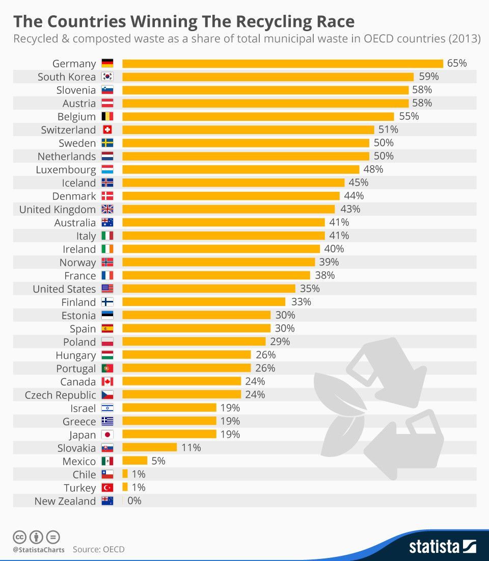
Nationwide 63.2 per cent of people today live in their own home – the lowest rate since the 61.2 per cent recorded at the 1951 Census – whereas 33 per cent live in a rental.
From Newstalk ZB
A shade over 63 percent of people today are living in their own home.
That’s the lowest rate since 1951 when it was 61 percent.
From Newshub
Dwelling and household estimates data released on Tuesday shows that as of December 2016, 63.2 percent of people live in their own home.
One News don’t have text up yet, but their story has the same claim.
As David Welch points out in a stat-of-the-week nomination, that’s not what the number means: 63.2% is the percentage of homes occupied by at least one of their owners. It’s the home ownership rate if you’re a house, rather than if you’re a person.
The proportion of people living in those households isn’t easy to work out — on one hand, single-person households tend to be renters; on the other hand, overcrowded households are often renters too. StatsNZ does provide the proportion of individuals who own their home, which is rather lower, at about 50%. But that’s not the number the news stories want, either. That’s the proportion of people 20 and older who, personally, own or part-own their homes. Living in a home owned by your parents, or your partner, or your child, doesn’t count.
That last sentence also illustrates why ‘home ownership’ is harder to define than you might think, just like unemployment. Should a 22-year-old living with parents count towards home ownership? If not, should they count in the denominator as not home ownership, or should we just be looking at owning vs renting? How about an elderly person living with one of their children?
It would be helpful if the proportion of people living in owner-occupied households was published regularly, but it wouldn’t answer all the questions. As an easier step, it would also be useful if the media accurately described the number they used.