Posts filed under Denominator? (87)

July 31, 2015

Doesn’t add up

Daniel Croft nominated a story on savings from switching power companies for Stat of the Week.  The story says

The latest Electricity Authority figures show 2.1 million consumers have switched providers since 2010, saving $164 on average for the year. In 2014, 385,596 households switched over, collectively saving $281 million.

and he argues that this level of saving without any real harm to the industry shows there was serious overcharging.  It turns out that there’s another reason the story is relevant to StatsChat. The savings number is wrong, and this is clear based on other numbers in the story.

A basic rule of numbers in journalism is that if you have two numbers, you can usually do arithmetic on them for some basic fact-checking.  Dividing $281 million by 385,596 gives an average saving of over $700 per switching household. I find that a bit hard to believe — it’s a lot bigger than the ads for whatsmynumber.org.nz suggest.

Looking at the end of the story, we can see average savings for people who switched in each region of New Zealand.  The highest is $318 for Bay of Plenty. It’s not possible for the national average to be more than twice the highest regional average. The numbers are wrong somewhere.

We can compare with the Electricity Authority report, which is supposed to be the source of the numbers.  The number 281 appears once in the document (ctrl-F is your friend):

If all households had switched to the cheapest deal in 2014 they collectively stood to save $281 million.

So, the $281 million total isn’t the estimated total saving for the 385,596 households who actually switched, it’s the estimated total saving if everyone switched to the cheapest available option — in fact, if they switched every month to the cheapest available option that month — and if they didn’t use more electricity once it was cheaper, and if prices didn’t increase to compensate.

All the quoted savings numbers are like this, averages over all households if they switched to the cheapest option, everything else being equal, rather than data on the actual switches of actual households.
 

July 20, 2015

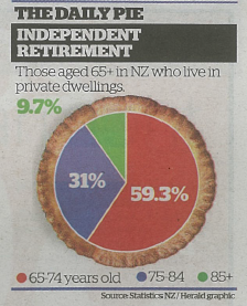
Pie chart of the day

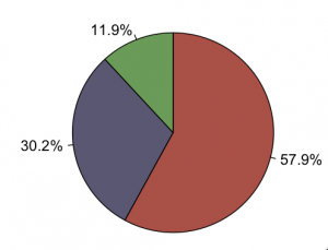
From the Herald (squashed-trees version, via @economissive)

CKUXF6iUsAAWPr-

For comparison, a pie of those aged 65+ in NZ regardless of where they live, based on national population estimates:

CKUbriWVAAAWbpT

Almost all the information in the pie is about population size; almost none is about where people live.

A pie chart isn’t a wonderful way to display any data, but it’s especially bad as a way to show relationships between variables. In this case, if you divide by the size of the population group, you find that the proportion in private dwellings is almost identical for 65-74 and 75-84, but about 20% lower for 85+.  That’s the real story in the data.

July 8, 2015

Stolen car statistics

Both the Herald and Stuff are covering the AA Insurance list of most-stolen car brands. They have both made it clear what the ranking on the list actually means – -what the denominator is:

“It’s not that there are more Honda Torneos on the road than any other car,” said AA Insurance customer relations manager Amelia Macandrew. “It’s the probability of them being stolen that’s far greater than any other car we insure.” (Stuff)

and

To calculate theft incidence rates, AA Insurance measures the number of claims made for each model of car for which 20 or more claims have been made, as a percentage of the total number of policies it holds for that model. (Herald)


It wasn’t as clear in past years: credit to the reporters and to AA Insurance for the improvement.


March 17, 2015

Bonus problems

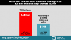
If you hadn’t seen this graph yet, you probably would have soon.

bonuses CAQYEF4UYAA5PqA

The claim “Wall Street bonus were double the earnings of all full-time minimum wage workers in 2014” was made by the Institute for Policy Studies (which is where I got the graph) and fact-checked by the Upshot blog at the New York Times, so you’d expect it to be true, or at least true-ish. It probably isn’t, because the claim being checked was missing an important word and is using an unfortunate definition of another word. One of the first hints of a problem is the number of minimum wage workers: about a million, or about 2/3 of one percent of the labour force.  Given the usual narrative about the US and minimum-wage jobs, you’d expect this fraction to be higher.

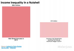
The missing word is “federal”. The Bureau of Labor Statistics reports data on people paid at or below the federal minimum wage of $7.25/hour, but 29 states have higher minimum wages so their minimum-wage workers aren’t counted in this analysis. In most of these states the minimum is still under $8/hr. As a result, the proportion of hourly workers earning no more than federal minimum wage ranges from 1.2% in Oregon to 7.2% in Tennessee (PDF).  The full report — and even the report infographic — say “federal minimum wage”, but the graph above doesn’t, and neither does the graph from Mother Jones magazine (it even omits the numbers of people)

On top of those getting state minimum wage we’re still short quite a lot of people, because “full-time” is defined by 35 or more hours per week at your principal job.  If you have multiple part-time jobs, even if you work 60 or 80 hours a week, you are counted as part-time and not included in the graph.

Matt Levine writes:

There are about 167,800 people getting the bonuses, and about 1.03 million getting full-time minimum wage, which means that ballpark Wall Street bonuses are 12 times minimum wage. If the average bonus is half of total comp, a ratio I just made up, then that means that “Wall Street” pays, on average, 24 times minimum wage, or like $174 an hour, pre-tax. This is obviously not very scientific but that number seems plausible.

That’s slightly less scientific than the graph, but as he says, is plausible. In fact, it’s not as bad as I would have guessed.

What’s particularly upsetting is that you don’t need to exaggerate or use sloppy figures on this topic. It’s not even that controversial. Lots of people, even technocratic pro-growth economists, will tell you the US minimum wage is too low.  Lots of people will argue that Wall St extracts more money from the economy than it provides in actual value, with much better arguments than this.

By now you might think to check carefully that the original bar chart is at least drawn correctly.  It’s not. The blue bar is more than half the height of the red bar, not less than half.

February 16, 2015

Pot and psychosis

The Herald has a headline “Quarter of psychosis cases linked to ‘skunk’ cannabis”, saying

People who smoke super-strength cannabis are three times more likely to develop psychosis than people who have never tried the drug – and five times more likely if they smoke it every day.

The relative risks are surprisingly large, but could be true; the “quarter” attributable fraction needs to be qualified substantially. As the abstract of the research paper (PDF) says, in the convenient ‘Interpretation’ section

Interpretation The ready availability of high potency cannabis in south London might have resulted in a greater proportion of first onset psychosis cases being attributed to cannabis use than in previous studies

Let’s unpack that a little.  The basic theory is that some modern cannabis is very high in THC and low in cannabidiol, and that this is more dangerous than more traditional pot. That is, the ‘skunk’ cannabis has a less extreme version of the same problem as the synthetic imitations now banned in NZ. 

The study compared people admitted as inpatients in a particular area of London (analogous to our DHBs) to people recruited by internet and train advertisements, and leaflets (which, of course, didn’t mention that the study was about cannabis). The control people weren’t all that well matched to the psychosis cases, but it wasn’t too bad.  The psychosis cases were somewhat more likely to smoke cannabis, and much more likely to smoke the high-THC type. In fact, smoking of other cannabis wasn’t much different between cases and controls.

That’s where the relative risks of 3 and 5 come from.  It’s still possible that these are due at least in part to some other factor; you can’t tell from just this sort of data. The atttributable fraction (a quarter of cases) comes from combining the relative risk with the proportion of the population who are exposed.

Suppose ‘skunk-type’ cannabis triples your risk, and 20% of people in the population use it, as was seen for controls in the sample. General UK data (eg) suggest the rate in non-users might be 5 cases per 10,000 people per year. So, in 100,000 people, 80,000 would be non-users and you’d expect 40 cases per year. The other 20,000 would be users, and you’d expect a background rate of 10 cases plus 20 extra cases caused by the cannabis. So, in the 100,000 people, you’d get 70 cases per year, 50 of which would have happened anyway and 20 due to cannabis. That’s not exactly the calculation the researchers did — they used a trick where they don’t need the background rate as long as it’s low, and I rounded more — but it’s basically the same. I get 28%; they got 24%.

The figures illustrate two things. First, the absolute risk increase is roughly 20 cases per 100,000 20,000 people per year. Second, the ‘quarter’ estimate is very sensitive to the proportion exposed. If 5% of people used ‘skunk-type’ cannabis, you can run the numbers again and you get 5 cases due to cannabis out of 55 in 100,000 people: only 9% of cases due to exposure.

Now we’re at the ‘interpretation’ quote from the research paper.  In this South London area, 20% of people have used mostly the high-potency cannabis and 44% mostly have used other types, with 37% non-users. That’s a lot of pot.  Even if the relative risks are correct, the population attributable proportion will be much lower for the UK as a whole (or for NZ as a whole).

Still, the research does tend to support the idea of regulated legalisation, the sort of thing that Mark Kleiman advocates, where limits on THC and/or higher taxes for higher concentrations can be used to push cannabis supply to lower-risk varieties.


February 3, 2015

Spotty coverage

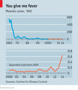
Here’s a graph from the Economist showing the impact of the measles vaccine:

20150131_USC861

The number of measles cases fell from over half a million per year to about 100 per year when the vaccine was introduced. That’s a 99.98% reduction, in a disease that (in a healthy population) kills about two people in a thousand.


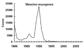
Here’s a graph from the Centers for Disease Control showing that little blip in 1990 on an expanded scale:

meas_fig_03

They say

The most important cause of the measles resurgence of 1989–1991 was low vaccination coverage. Measles vaccine coverage was low in many cities, including some that experienced large outbreaks among preschool-aged children throughout the early to mid-1980s. Surveys in areas experiencing outbreaks among preschool-aged children indicated that as few as 50% of children had been vaccinated against measles by their second birthday, and that black and Hispanic children were less likely to be age-appropriately vaccinated than were white children.

Vaccine coverage isn’t as bad as that now, but the profile of unvaccinated kids is different. Black and Hispanic children are just as likely as white children to have had at least one doses of the measles vaccine, and children in poverty have a rate only 1.5 percentage points lower. Now, a substantial chunk of the problem is parents who are anti-vaccine.

Kieran Healy has an interesting post on the ‘personal belief exemption’ data for kindergarten children in California.  They are only 3.36% of children, but they cluster.  That’s important because US is just on the edge of having high enough vaccine coverage to stop an epidemic from spreading, at least if the unvaccinated were evenly spread through the population. They aren’t:

the number of kindergarteners with PBEs, even in Berkeley, is not huge—about 67 kids out of 850 in the city. But 20 of those 67 are in the same school, and probably the same room.

Anti-vaccine hysteria is more prominent in the US than New Zealand: partly because our mainstream media don’t go in for it, and partly because everything is more prominent in the US. Similarly, reaction to the risks posed by unvaccinated children has been more prominent in the US. However,  New Zealand has a similar rate of measles vaccination. Our schools or early childhood services cannot refuse enrollment based on vaccination (no special paperwork is required as in California), and (like California) can only temporarily exclude unvaccinated children if they are known to have been exposed.

Last year, New Zealand had 283 cases of measles. Scaled for population, last year in NZ was about half as bad as the US in 1990, and about thirty times bigger than the current US outbreak (so far).

January 6, 2015

Foreign drivers, again

The Herald has a poll saying 61% of New Zealanders want to make large subsets of foreign drivers sit written and practical tests before they can drive here (33.9%: people from right-hand drive countries; 27.4% everyone but Australians). It’s hard to tell how much of this is just the push effect of being asked the questions and how much is real opinion.

The rationale is that foreign drivers are dangerous:

Overseas drivers were found at fault in 75 per cent of 538 injury crashes in which they were involved. But although failure to adjust to local conditions was blamed for seven fatal crashes, that was the suspected cause of just 26 per cent of the injury crashes.

This could do with some comparisons.  75% of 538 is 403, which is about 4.5% of all injury crashes that year.  We get about 2.7 million visitors per year, with a mean stay of 20 days (PDF), so on average the population is about 3.3% short-term visitors.

Or, we can look at the ‘factors involved’ for all the injury crashes. I get 15367  drivers of motorised vehicles involved in injury crashes, and 9192 of them have a contributing factor that is driver fault (causes 1xx to 4xx in the Crash Analysis System). This doesn’t include things like brake failures.  So, drivers on average are at fault in about 60% of the injury crashes they are involved in.

Based on this, it looks as though foreign drivers are somewhat more dangerous, but that restricting them is very unlikely to prevent more than, say, 1-2% of crashes. If you consider all the ways we might reduce injury crashes by 1-2%, and think about the side-effects of each one, I don’t think this is going to be near the top of the list.

January 2, 2015

Using the right denominator

We go on and on about denominators on StatsChat: the right way to report things that happen to people is usually a rate per capita rather than a total, otherwise you end up saying that Auckland has the highest number of whatever it is in New Zealand.  You do have to use the right denominator, though.

The Vatican City has the world’s highest crime rate.

That’s because the permanent population is less than 500, but the daily tourist population is about 100 times larger. The right denominator would be the tourist population.

In most countries this isn’t really an issue. For example,  in New Zealand,which has a lot of tourism, short-term visitors are only about 5% of the population. Even in the Cook Islands, residents outnumber tourists.


June 18, 2014

Counts and proportions

Phil Price writes (at Andrew Gelman’s blog) on the impact of bike-share programs:

So the number of head injuries declined by 14 percent, and the Washington Post reporter — Lenny Bernstein, for those of you keeping score at home — says they went up 7.8%.  That’s a pretty big mistake! How did it happen?  Well, the number of head injuries went down, but the number of injuries that were not head injuries went down even more, so the proportion of injuries that were head injuries went up.


To be precise, the research paper found 638 hospitalised head injuries in 24 months before the bike share program, and 273 in the 12 months afterwards. In a set of control cities that didn’t start a bike-share program there were 712 head injuries in the 24 months before the matching date and 342 in the 12 months afterwards. That is, a 14.4% decrease in the cities that added bike-share programs and a 4% decrease in those that didn’t.


June 10, 2014

Eat your greens

Stuff has a story about ‘Powerhouse Fruits and Vegetables”.  They get points for linking to the source, and for pointing out that although

“The rankings provide clarity on the nutrient quality of the different foods

the rankings are quite different from other rankings that are supposed to do the same thing.

They don’t point out that it’s silly to list scores to four digit accuracy when nutrient content varies enough to make the first digit somewhat unreliable.They also don’t point out that these are nutrient scores not per serving, but per 100 Calories of the food. Google thinks watercress has about 11 Calories/100g, so that’s 900g of watercress. The data are for raw watercress — the research paper doesn’t say how much the score goes down if you stir-fry it, Chinese-style.

If you much through a couple of pounds of watercress, it’s not surprising you’d pick up a few nutrients along the way. The applicability of this fact to NZ daily life must be a bit limited, though.