Posts filed under Random variation (139)

August 28, 2015

Trying again

CNbxnQDWgAAXlKL

This graph is from the Open Science Framework attempt to replicate 100 interesting results in experimental psychology, led by Brian Nozek and published in Science today.

About a third of the experiments got statistically significant results in the same direction as the originals.  Averaging all the experiments together,  the effect size was only half that seen originally, but the graph suggests another way to look at it.  It seems that about half the replications got basically the same result as the original, up to random variation, and about half the replications found nothing.

Ed Yong has a very good article about the project in The Atlantic. He says it’s worse than psychologists expected (but at least now they know).  It’s actually better than I would have expected — I would have guessed that the replicated effects would average quite a bit smaller than the originals.

The same thing is going to be true for a lot of small-scale experiments in other fields.

July 24, 2015

Are beneficiaries increasingly failing drug test?

Stuff’s headline is “Beneficiaries increasingly failing drug tests, numbers show”.

The numbers are rates per week of people failing or refusing drug tests. The number was 1.8/week for the first 12 weeks of the policy and 2.6/week for the whole year 2014, and, yes, 2.6 is bigger than 1.8.  However, we don’t know how many tests were performed or demanded, so we don’t know how much of this might be an increase in testing.

In addition, if we don’t worry about the rate of testing and take the numbers at face value, the difference is well within what you’d expect from random variation, so while the numbers are higher it would be unwise to draw any policy conclusions from the difference.

On the other hand, the absolute numbers of failures are very low when compared to the estimates in the Treasury’s Regulatory Impact Statement.

MSD and MoH have estimated that once this policy is fully implemented, it may result in:

• 2,900 – 5,800 beneficiaries being sanctioned for a first failure over a 12 month period

• 1,000 – 1,900 beneficiaries being sanctioned for a second failure over a 12 month period

• 500 – 1,100 beneficiaries being sanctioned for a third failure over a 12 month period.

The numbers quoted by Stuff are 60 sanctions in total over eighteen months, and 134 test failures over twelve months.  The Minister is quoted as saying the low numbers show the program is working, but as she could have said the same thing about numbers that looked like the predictions, or numbers that were higher than the predictions, it’s also possible that being off by an order of magnitude or two is a sign of a problem.


June 11, 2015

Comparing all the treatments

This story didn’t get into the local media, but I’m writing about it because it illustrates the benefit of new statistical methods, something that’s often not visible to outsiders.

From a University of Otago press release about the work of A/Prof Suetonia Palmer

The University of Otago, Christchurch researcher together with a global team used innovative statistical analysis to compare hundreds of research studies on the effectiveness of blood-pressure-lowering drugs for patients with kidney disease and diabetes. The result: a one-stop-shop, evidence-based guide on which drugs are safe and effective.

They link to the research paper, which has interesting looking graphics like this:

netmeta

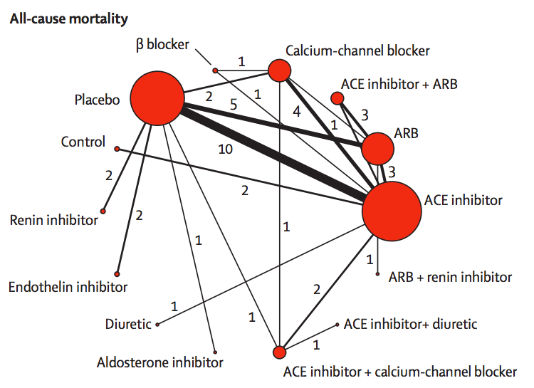
The red circles represent blood-pressuring lowering treatments that have been tested in patients with kidney disease and diabetes, with the lines indicating which comparisons have been done in randomised trials. The circle size shows how many trials have used a drug; the line width shows how many trials have compared a given pair of drugs.

If you want to compare, say, endothelin inhibitors with ACE inhibitors, there aren’t any direct trials. However, there are two trials comparing endothelin inhibitors to placebo, and ten trials comparing placebo to ACE inhibitors. If we estimate the advantage of endothelin inhibitors over placebo and subtract off the advantage of ACE inhibitors over placebo we will get an estimate of the advantage of endothelin inhibitors over ACE inhibitors.

More generally, if you want to compare any two treatments A and B, you look at all the paths in the network between A and B, add up differences along the path to get an estimate of the difference between A and B, then take a suitable weighted average of the estimates along different paths. This statistical technique is called ‘network meta-analysis’.

Two important technical questions remain: what is a suitable weighted average, and how can you tell if these different estimates are consistent with each other? The first question is relatively straightforward (though quite technical). The second question was initially the hard one.  It could be for example, that the trials involving placebo had very different participants from the others, or that old trials had very different participants from recent trials, and their conclusions just could not be usefully combined.

The basic insight for examining consistency is that the same follow-the-path approach could be used to compare a treatment to itself. If you compare placebo to ACE inhibitors, ACE inhibitors to ARB, and ARB to placebo, there’s a path (a loop) that gives an estimate of how much better placebo is than placebo. We know the true difference is zero; we can see how large the estimated difference is.

In this analysis, there wasn’t much evidence of inconsistency, and the researchers combined all the trials to get results like this:

netmeta-ci

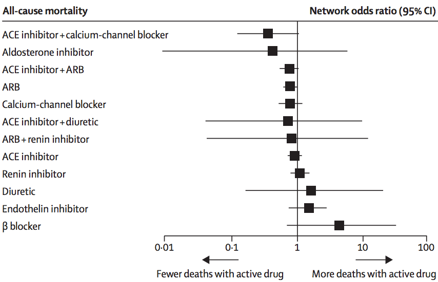
The ‘forest plot’ shows how each treatment compares to placebo (vertical line) in terms of preventing death. We can’t be absolutely sure than any of them are better, but it definitely looks as though ACE inhibitors plus calcium-channel blockers or ARBs, and ARBs alone, are better. It could be that aldosterone inhibitors are much better, but also could be that they are worse. This sort of summary is useful as an input to clinical decisions, and also in deciding what research should be prioritised in the future.

I said the analysis illustrated progress in statistical methods. Network meta-analysis isn’t completely new, and its first use was also in studying blood pressure drugs, but in healthy people rather than people with kidney disease. Here are those results

netmeta-me

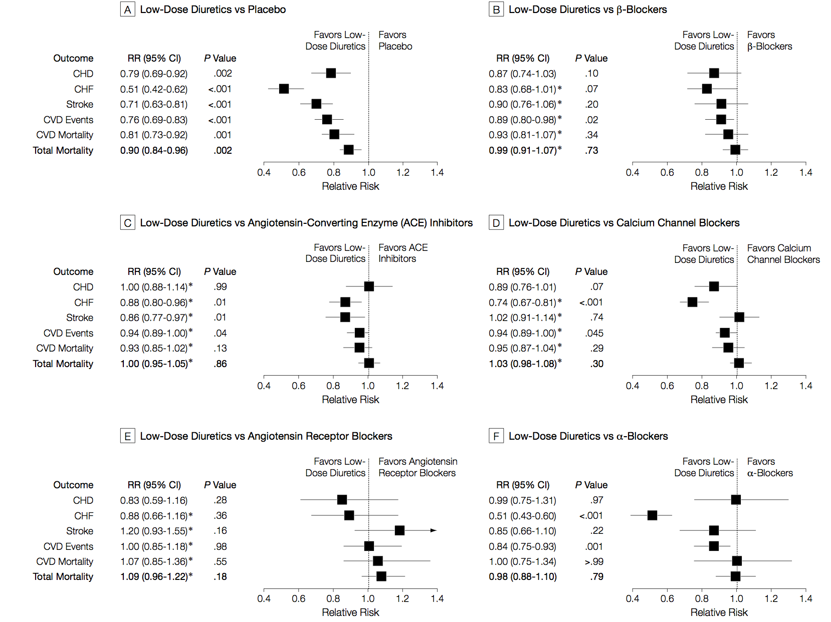
There are different patterns for which drug is best across the different events being studied (heart attack, stroke, death), and the overall patterns are different from those in kidney disease/diabetes. The basic analysis is similar; the improvements since this 2003 paper are more systematic and flexible ways of examining inconsistency, and new displays of the network of treatments.

‘Innovative statistical techniques’ are important, but the key to getting good results here is a mind-boggling amount of actual work. As Dr Palmer put it in a blog interview

Our techniques are still very labour intensive. A new medical question we’re working on involves 20-30 people on an international team, scanning 5000-6000 individual reports of medical trials, finding all the relevant papers, and entering data for about 100-600 reports by hand. We need to build an international partnership to make these kind of studies easier, cheaper, more efficient, and more relevant.

At this point, I should confess the self-promotion aspect of the post.  I invented the term “network meta-analysis” and the idea of using loops in the network to assess inconsistency.  Since then, there have been developments in statistical theory, especially by Guobing Lu and A E Ades in Bristol, who had already been working on other aspects of multiple-treatment analysis. There have also been improvements in usability and standardisation, thanks to Georgia Salanti and others in the Cochrane Collaboration ‘Comparing Multiple Interventions Methods Group’.  In fact, network meta-analysis has grown up and left home to the extent that the original papers often don’t get referenced. And I’m fine with that. It’s how progress works.


June 8, 2015

Meddling kids confirm mānuka honey isn’t panacea

The Sunday Star-Times has a story about a small, short-term, unpublished randomised trial of mānuka honey for preventing minor illness. There are two reasons this is potentially worth writing about: it was done by primary school kids, and it appears to be the largest controlled trial in humans for prevention of illness.

Here are the results (which I found from the Twitter account of the school’s lab, run by Carole Kenrick, who is  named in the story)CGuGbSiWoAACzbe

The kids didn’t find any benefit of mānuka honey over either ordinary honey or no honey. Realistically, that just means they managed to design and carry out the study well enough to avoid major biases. The reason there aren’t any controlled prevention trials in humans is that there’s no plausible mechanism for mānuka honey to help with anything except wound healing. To its credit, the SST story quotes a mānuka producer saying exactly this:

But Bray advises consumers to “follow the science”.

“The only science that’s viable for mānuka honey is for topical applications – yet it’s all sold and promoted for ingestion.”

You might, at a stretch, say mānuka honey could affect bacteria in the gut, but that’s actually been tested, and any effects are pretty small. Even in wound healing, it’s quite likely that any benefit is due to the honey content rather than the magic of mānuka — and the trials don’t typically have a normal-honey control.

As a primary-school science project, this is very well done. The most obvious procedural weakness is that mānuka honey’s distinctive flavour might well break their attempts to blind the treatment groups. It’s also a bit small, but we need to look more closely to see how that matters.

When you don’t find a difference between groups, it’s crucial to have some idea of what effect sizes have been ruled out.  We don’t have the data, but measuring off the graphs and multiplying by 10 weeks and 10 kids per group, the number of person-days of unwellness looks to be in the high 80s. If the reported unwellness is similar for different kids, so that the 700 days for each treatment behave like 700 independent observations, a 95% confidence interval would be 0±2%.  At the other extreme, if 0ne kid had 70 days unwell, a second kid had 19, and the other eight had none, the confidence interval would be 0±4.5%.

In other words, the study data are still consistent with manūka honey preventing about one day a month of feeling “slightly or very unwell”, in a population of Islington primary-school science nerds. At three 5g servings per day that would be about 500g honey for each extra day of slightly improved health, at a cost of $70-$100, so the study basically rules out manūka honey being cost-effective for preventing minor unwellness in this population. The study is too small to look at benefits or risks for moderate to serious illness, which remain as plausible as they were before. That is, not very.

Fortunately for the mānuka honey export industry, their primary market isn’t people who care about empirical evidence.

June 7, 2015

What does 80% accurate mean?

From Stuff (from the Telegraph)

And the scientists claim they do not even need to carry out a physical examination to predict the risk accurately. Instead, people are questioned about their walking speed, financial situation, previous illnesses, marital status and whether they have had previous illnesses.

Participants can calculate their five-year mortality risk as well as their “Ubble age” – the age at which the average mortality risk in the population is most similar to the estimated risk. Ubble stands for “UK Longevity Explorer” and researchers say the test is 80 per cent accurate.

There are two obvious questions based on this quote: what does it mean for the test to be 80 per cent accurate, and how does “Ubble” stand for “UK Longevity Explorer”? The second question is easier: the data underlying the predictions are from the UK Biobank, so presumably “Ubble” comes from “UK Biobank Longevity Explorer.”

An obvious first guess at the accuracy question would be that the test is 80% right in predicting whether or not you will survive 5 years. That doesn’t fly. First, the test gives a percentage, not a yes/no answer. Second, you can do a lot better than 80% in predicting whether someone will survive 5 years or not just by guessing “yes” for everyone.

The 80% figure doesn’t refer to accuracy in predicting death, it refers to discrimination: the ability to get higher predicted risks for people at higher actual risk. Specifically, it claims that if you pick pairs of  UK residents aged 40-70, one of whom dies in the next five years and the other doesn’t, the one who dies will have a higher predicted risk in 80% of pairs.

So, how does it manage this level of accuracy, and why do simple questions like self-rated health, self-reported walking speed, and car ownership show up instead of weight or cholesterol or blood pressure? Part of the answer is that Ubble is looking only at five-year risk, and only in people under 70. If you’re under 70 and going to die within five years, you’re probably sick already. Asking you about your health or your walking speed turns out to be a good way of finding if you’re sick.

This table from the research paper behind the Ubble shows how well different sorts of information predict.

si2

Age on its own gets you 67% accuracy, and age plus asking about diagnosed serious health conditions (the Charlson score) gets you to 75%.  The prediction model does a bit better, presumably it’s better at picking up a chance of undiagnosed disease.  The usual things doctors nag you about, apart from smoking, aren’t in there because they usually take longer than five years to kill you.

As an illustration of the importance of age and basic health in the prediction, if you put in data for a 60-year old man living with a partner/wife/husband, who smokes but is healthy apart from high blood pressure, the predicted percentage for dying is 4.1%.

The result comes with this well-designed graphic using counts out of 100 rather than fractions, and illustrating the randomness inherent in the prediction by scattering the four little red people across the panel.

ubble

Back to newspaper issues: the Herald also ran a Telegraph story (a rather worse one), but followed it up with a good repost from The Conversation by two of the researchers. None of these stories mentioned that the predictions will be less accurate for New Zealand users. That’s partly because the predictive model is calibrated to life expectancy, general health positivity/negativity, walking speeds, car ownership, and diagnostic patterns in Brits. It’s also because there are three questions on UK government disability support, which in our case we have not got.


May 28, 2015

Junk food science

In an interesting sting on the world of science journalism, John Bohannon and two colleagues, plus a German medical doctor, ran a small randomised experiment on the effects of chocolate consumption, and found better weight loss in those given chocolate. The experiment was real and the measurements were real, but the medical journal  was the sort that published their paper two weeks after submission, with no changes.

Here’s a dirty little science secret: If you measure a large number of things about a small number of people, you are almost guaranteed to get a “statistically significant” result. Our study included 18 different measurements—weight, cholesterol, sodium, blood protein levels, sleep quality, well-being, etc.—from 15 people. (One subject was dropped.) That study design is a recipe for false positives.

Think of the measurements as lottery tickets. Each one has a small chance of paying off in the form of a “significant” result that we can spin a story around and sell to the media. The more tickets you buy, the more likely you are to win. We didn’t know exactly what would pan out—the headline could have been that chocolate improves sleep or lowers blood pressure—but we knew our chances of getting at least one “statistically significant” result were pretty good.

Bohannon and his conspirators were doing this deliberately, but lots of people do it accidentally. Their study was (deliberately) crappier than average, but since the journalists didn’t ask, that didn’t matter. You should go read the whole thing.

Finally, two answers for obvious concerns: first, the participants were told the research was for a documentary on dieting, not that it was in any sense real scientific research. Second: no, neither Stuff nor the Herald fell for it.

 [Update: Although there was participant consent, there wasn’t ethics committee review. An ethics committee probably wouldn’t have allowed it. Hilda Bastian on Twitter]

Road deaths up (maybe)

In Australia road deaths are going down but in New Zealand the number has shot up“, says the Herald, giving depressing-looking international comparisons from newly-announced OECD data. The percentage increase was highest in New Zealand The story does go on to point out that the increase reverses a decrease the previous year, suggesting that it might be that 2013 was especially good, and says

An ITF spokesman said New Zealand’s relatively small size made percentage movements more dramatic.”

Overall, it’s a good piece. Two things I want to add: first, it’s almost always useful to see more context in a time series if it’s available. I took the International Road Traffic Accident Database and picked out a group of countries with similar road toll to New Zealand in 2000: all those between 200 and 1000. The list is Austria, Denmark, Finland, Ireland, Israel, New Zealand, Norway, Slovenia, Sweden, Switzerland. Here are the data for 2000 and for 2010-2014; New Zealand is in red.

roaddeaths

There’s a general downward trend, but quite a bit of bouncing around due to random variation. As we keep pointing out, there are lots of mistakes made when driving, and it takes bad luck to make one of these fatal, so there is a lot of chance involved. It’s clear from the graph that the increase is not much larger than random variation.

Calculations using the Poisson distribution (the simplest reasonable mathematical model, and the one with the smallest random variation) are, likewise, borderline. There’s only weak evidence that road risk was higher last year than in 2013. The right reference level, though, isn’t ‘no change’, it’s the sort of decrease that other countries are seeing.  The median change in this group of 10 countries was a 5% decrease, and there’s pretty good evidence that New Zealand’s risk did not decrease 5%.  Also, the increase is still present this year, making it more convincing.

What we can’t really do is explain why. As the Herald story says, some of the international decrease is economic: driving costs money, so people do less of it in recessions. Since New Zealand was less badly hit by recession, you’d expect less decrease in driving here, and so less decrease in road deaths. Maybe.

One thing we do know: while it’s tempting and would be poetic justice, it’s not valid to use the increase as evidence that recent road-safety rule changes have been ineffective. That would be just as dishonest as the claims for visible success of the speed tolerance rules in the past.


May 20, 2015

Weather uncertainty

From the MetService warnings page

7567-14d6e9ea400-14d78eb5c00-14d6f31d538.0

The ‘confidence’ levels are given numerically on the webpage as 1 in 5 for ‘Low’, 2 in 5 for ‘Moderate’ and 3 in 5 for ‘High’. I don’t know how well calibrated these are, but it’s a sensible way of indicating uncertainty.  I think the hand-drawn look of the map also helps emphasise the imprecision of forecasts.

(via Cate Macinnis-Ng on Twitter)

May 6, 2015

All-Blacks birth month

This graphic and the accompanying story in the Herald produced a certain amount of skeptical discussion on Twitter today.

AB2

It looks a bit as though there is an effect of birth month, and the Herald backs this up with citations to Malcolm Gladwell on ice hockey.

The first question is whether there is any real evidence of a pattern. There is, though it’s not overwhelming. If you did this for random sets of 173 people, about 1 in 80 times there would be 60 or more in the same quarter (and yes, I did use actual birth frequencies rather than just treating all quarters as equal). The story also looks at the Black Caps, where evidence is a lot weaker because the numbers are smaller.

On the other hand, we are comparing to a pre-existing hypothesis here. If you asked whether the data were a better fit to equal distribution over quarters or to Gladwell’s ice-hockey statistic of a majority in the first quarter, they are a much better fit to equal distribution over quarters.

The next step is to go slightly further than Gladwell, who is not (to put it mildly) a primary source. The fact that he says there is a study showing X is good evidence that there is a study showing X, but it isn’t terribly good evidence that X is true. His books are written to communicate an idea, not to provide balanced reporting or scientific reference.  The hockey analysis he quotes was the first study of the topic, not the last word.

It turns out that even for ice-hockey things are more complicated

Using publically available data of hockey players from 2000–2009, we find that the relative age effect, as described by Nolan and Howell (2010) and Gladwell (2008), is moderate for the average Canadian National Hockey League player and reverses when examining the most elite professional players (i.e. All-Star and Olympic Team rosters).

So, if you expect the ice-hockey phenomenon to show up in New Zealand, the ‘most elite professional players’, the All Blacks might be the wrong place to look.

On the other hand Rugby League in the UK does show very strong relative age effects even into the national teams — more like the 50% in first quarter that Gladwell quotes for ice hockey. Further evidence that things are more complicated comes from soccer. A paper (PDF) looking at junior and professional soccer found imbalances in date of birth, again getting weaker at higher levels. They also had an interesting natural experiment when the eligibility date changed in Australia, from January 1 to August 1.

soccer

As the graph shows, the change in eligibility date was followed by a change in birth-date distribution, but not how you might expect. An August 1 cutoff saw a stronger first-quarter peak than the January 1 cutoff.

Overall, it really does seem to be true that relative age effects have an impact on junior sports participation, and possibly even high-level professional acheivement. You still might not expect the ‘majority born in the first quarter’ effect to translate from the NHL as a whole to the All Blacks, and the data suggest it doesn’t.

Rather more important, however, are relative age effects in education. After all, there’s a roughly 99.9% chance that your child isn’t going to be an All Black, but education is pretty much inevitable. There’s similar evidence that the school-age cutoff has an effect on educational attainment, which is weaker than the sports effects, but impacts a lot more people. In Britain, where the school cutoff is September 1:

Analysis shows that approximately 6% fewer August-born children reached the expected level of attainment in the 3 core subjects at GCSE (English, mathematics and science) relative to September-born children (August born girls 55%; boys 44%; September born girls 61% boys 50%)

In New Zealand, with a March 1 cutoff, you’d expect worse average school performance for kids born on the dates the Herald story is recommending.

As with future All Blacks, the real issue here isn’t when to conceive. The real issue is that the system isn’t working as well for some people. The All Blacks (or more likely the Blues) might play better if they weren’t missing key players born in the wrong month. The education system, at least in the UK, would work better if it taught all children as well as it teaches those born in autumn.  One of these matters.


March 12, 2015

Variation and mean

A lot of statistical reporting focuses on means, or other summaries of where a distribution lies. Often, though, variation is important.  Vox.com has a story about variation in costs of lab tests at California hospitals, based on a paper in BMJ OpenVox says

The charge for a lipid panel ranged from $10 to $10,169. Hospital prices for a basic metabolic panel (which doctors use to measure the body’s metabolism) were $35 at one facility — and $7,303 at another

These are basically standard lab tests, so there’s no sane reason for this sort of huge variation. You’d expect some variation with volume of tests and with location, but nothing like what is seen.

What’s not clear is how much this is really just variation in how costs are attributed. A hospital needs a blood lab, which has a lot of fixed costs. Somehow these costs have to be spread over individual tests, but there’s no unique way to do this.  It would be interesting to know if the labs with high charges for one test tend to have high charges for others, but the research paper doesn’t look at relationships between costs.

The Vox story also illustrates a point about reporting, with this graph

 F1.large-1

If you look carefully, there’s something strange about the graph. The brown box second from the right is ‘lipid panel’, and it goes up to a bit short of $600, not to $10169. Similarly, the ‘metabolic panel’, the right-most box, goes up to $1000 on the graph and $7303 in the story.

The graph is taken from the research paper. In the research paper it had a caption explaining that the ‘whiskers’ in the box plot go to the 5th and 95th percentiles (a non-standard but reasonable choice). This caption fell off on the way to Vox.com, and no-one seems to have noticed.