Posts filed under Social Media (95)

April 11, 2016

Missing data

Sometimes…often…practically always… when you get a data set there are missing values. You need to decide what to do with them. There’s a mathematical result that basically says there’s no reliable strategy, but different approaches may still be less completely useless in different settings.

One tempting but usually bad approach is to replace them with the average — it’s especially bad with geographical data.  We’ve seen fivethirtyeight.com get this badly wrong with kidnappings in Nigeria, we’ve seen maps of vaccine-preventable illness at epidemic proportions in the west Australian desert, we’ve seen Kansas misidentified as the porn centre of the United States.

The data problem that attributed porn to Kansas has more serious consequences. There’s a farm not far from Wichita that, according to the major database providing this information, has 600 million IP addresses.  Now think of the reasons why someone might need to look up the physical location of an internet address. Kashmir Hill, at Fusion, looks at the consequences, and at how a better “don’t know” address is being chosen.

April 9, 2016

Movie stars broken down by age and sex

The folks at Polygraph have a lovely set of interactive graphics of number of speaking lines in 2000 movie screenplays, with IMDB look-ups of actor age and gender.  If you haven’t been living in a cave on Mars, the basic conclusion won’t be surprising, but the extent of the differences might. Frozen, for example, gave more than half the lines to male characters.

They’ve also made a lot of data available on Github for other people to use. Here’s a graph combining the age and gender data in a different way than they did: total number of speaking lines by age and gender

hollywood

Men and women have similar number of speaking lines up to about age 30, but after that there’s a huge separation and much less opportunity for female actors.  We can all think of exceptions: Judi “M” Dench, Maggie “Minerva” Smith, Joanna “Absolutely no relation” Lumley, but they are exceptions.

March 18, 2016

What they aren’t telling you

Unfiltered.news is a beautiful visualisation of what news topics are less covered in your country (or any selected country) than on average for the world:

unfiltered

For a lot of these topics it will be obvious why they’re just not that relevant, but not always.

(via Harkanwal Singh)

November 1, 2015

Twitter polls and news feeds

aje

I don’t know why this feels worse that the bogus clicky polls on newspaper websites. Maybe it’s the thought of someone actually believing the sampling scheme says something useful. Maybe it’s being in Twitter, where following a news headline feed usually gets you news headlines. Maybe it’s that the polls are so bad: restricting a discussion of Middle East politics to two options with really short labels makes even the usual slogan-based dialogue look good in comparison.

In any case, I really hope this turns out to be a failed experiment, and that we can keep Twitter polls basically as jokes.


October 30, 2015

Pie charts “a menace”, study shows

StatsChat can reveal exclusive study results showing that pie charts are a menace to over 75% of us.

Although these round, delicious, data metaphors have been maligned in the past, this is the first research of its kind, based on newly-available survey technology.

Researchers used an online, multi-wave, respondent-driven sampling scheme to reach thousands of potential respondents. 77% of responses agreed that pie charts are a menace.

threatormenace

Aren’t these new Twitter polls wonderful?

October 22, 2015

Early NZ data visualisation

From the National Library of New Zealand, via Jolisa Gracewood

natlib.govt

Types of motor-vehicle accidents in rural areas vary considerably from those ocourrlng In urban areas, as shown in tho above chart. Tho percentages are based on figures of the Transport Department in respect of accidents causing’ fatalltles during the twelve months, April I, 1932, to March 31, 1933.

The text goes on to say “The black section representing collisions with tram and train forms only I per cent, of the whole, through this type of accident appeals to the popular Imagination’ from its spectacular nature.”  Some things don’t change.

September 21, 2015

It’s bad enough without exaggerating

This UK survey report is being a bit loose with the details, in a situation where that’s not even needed

stem for boys

The survey of more than 4,000 girls, young women, parents and teachers, demonstrates clearly that there is a perception that STEM subjects and careers are better suited to male personalities, hobbies and brains. Half (51 percent) of the teachers and 43 percent of the parents surveyed believe this perception helps explain the low uptake of STEM subjects by girls. [emphasis added]

Those aren’t the same thing at all.  I believe this perception helps explain the low uptake of STEM subjects by girls. Michelle ‘Nanogirl’ Dickinson believes this perception helps explain the low uptake of STEM subjects by girls. It’s worrying that nearly more than half of UK teachers don’t believe this perception helps explain the low uptake of STEM subjects by girls.

On the other hand, this is depressing and actually does seem to be what the survey said:

Nearly half (47 percent) of the young girls surveyed said they believe such subjects are a better match for boys.

as does this

difficult subjects It would fit with NZ experience if a lot of boys felt the same about the difficulty of science and maths, but that wouldn’t actually make it any better.


September 8, 2015

Petitions and other non-representative data

Stuff has a story about the #redpeak  flag campaign, including a clicky bogus poll that currently shows nearly 11000 votes in support of the flag candidate. While Red Peak isn’t my favourite (I prefer Sven Baker’s Huihui),  I like it better than the four official candidates. That doesn’t mean I like the bogus poll.

As I’ve written before, a self-selected poll is like a petition; it shows that at least the people who took part had the views they had. The web polls don’t really even show that — it’s pretty easy to vote two or three times. There’s also no check that the votes are from New Zealand — mine wasn’t, though most of them probably are.  The Stuff clicky poll doesn’t even show that 11,000 people voted for the Red Peak flag.

So far, this Stuff poll at least hasn’t been treated as news. However, the previous one has.  At the bottom of one of the #redpeak stories you can read

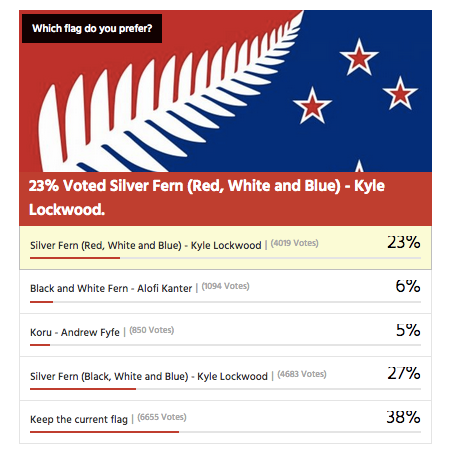
In a Stuff.co.nz poll of 16,890 readers, 39 per cent of readers voted to keep the current flag rather than change it. 

Kyle Lockwood’s Silver Fern (black, white and blue) was the most popular alternate flag design, with 27 per cent of the vote, while his other design, Silver Fern (red, white and blue), got 23 per cent. This meant, if Lockwood fans rallied around one of his flags, they could vote one in.

Flags designed by Alofi Kanter – the black and white fern – and Andrew Fyfe each got 6 per cent or less of the vote

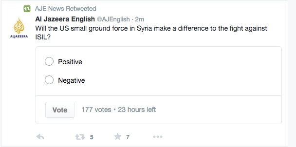
They don’t say, but that looks very much like this clicky poll from an earlier Stuff flag story, though it’s now up to about 17500 votes

flagpoll

You can’t use results from clicky polls as population estimates, whether for readers or the electorate as a whole. It doesn’t work.

Over approximately the same time period there was a real survey by UMR (PDF), which found only 52% of people preferred their favourite among the four flags to the current flag.  The referendum looks a lot closer than the clicky poll suggests.

The two Lockwood ferns were robustly the most popular flags in the survey, coming  in as the top two for all age groups; men and women; Māori; and Labour, National and Green voters. Red Peak was one of the four least preferred in every one of these groups.

Only 1.5% of respondents listed Red Peak among their top four.  Over the whole electorate that’s still about 45000, which is why an online petition with 31000 electronic signatures should have about the impact it’s going to have on the government.

Depending on turnout, it’s going to take in the neighbourhood of a million supporting votes for a new flag to overturn the current flag. It’s going to take about the same number of votes ranking Red Peak higher than the Lockwood ferns for it to get on to the final ballot.

In the Stuff story, Graeme Edgeler suggests “Perhaps if there were a million people in a march” would be enough to change the government’s mind. He’s probably right, though I’d say a million estimated from a proper survey, or maybe fifty thousand in a march should be enough. For an internet petition, perhaps two hundred thousand might be a persuasive number, if there was some care taken that they were distinct people and eligible voters.

For those of us in a minority on flag matters, Andrew Geddis has a useful take

In fact, I’m pretty take-it-or-leave-it on the whole point of having a “national” flag. Sure, we need something to put up on public buildings and hoist a few times at sporting events. But I quite like the fact that we’ve got a bunch of other generally used national symbols that can be appropriated for different purposes. The silver fern for putting onto backpacks in Europe. The Kiwi for our armed forces and “Buy NZ Made” logos. The Koru for when we’re feeling the need to be all bi-cultural.

If you like Red Peak, fly it. At the moment, the available data suggest you’re in as much of minority as me.

August 2, 2015

Pie chart of the week

A year-old pie chart describing Google+ users. On the right are two slices that would make up a valid but pointless pie chart: their denominator is Google+ users. On the left, two slices that have completely different denominators: all marketers and all Fortune Global 100 companies.

On top of that, it’s unlikely that the yellow slice is correct, since it’s not clear what the relevant denominator even is. And, of course, though most of the marketers probably identify as male or female, it’s not clear how the Fortune Global 100 Companies would report their gender.

CLW5t4PWUAAvPNp

From @NoahSlater, via @LewSOS, originally from kwikturnmedia about 18 months ago.

August 1, 2015

NZ electoral demographics

Two more visualisations:

Kieran Healy has graphs of the male:female ratio by age for each electorate. Here are the four with the highest female proportion,  rather dramatically starting in the late teen years.

healy-electorates


Andrew Chen has a lovely interactive scatterplot of vote for each party against demographic characteristics. For example (via Harkanwal Singh),  number of votes for NZ First vs median age

CLSSKS8UMAETS7_