Posts filed under Social Media (95)

July 28, 2015

Recreational genotyping: potentially creepy?

Two stories from this morning’s Twitter (via @kristinhenry)

  • 23andMe has made available a programming interface (API) so that you can access and integrate your genetic information using apps written by other people.  Someone wrote and published code that could be used to screen users based on sex and ancestry. (Buzzfeed, FastCompany). It’s not a real threat, since apps with more than 20 users need to be reviewed by 23andMe, and since users have to agree to let the code use their data, and since Facebook knows far more about you than 23andMe, but it’s not a good look.
  • Google’s Calico project also does cheap public genotyping and is combining their DNA data (more than a million people) with family trees from Ancestry.com. This is how genetic research used to be done: since we know how DNA is inherited, connecting people with family trees deep into the past provides a lot of extra information. On the other hand, it means that if a few distantly-related people sign up for Calico genotying, Google will learn a lot about the genomes of all their relatives.

It’s too early to tell whether the people who worry about this sort of thing will end up looking prophetic or just paranoid.

June 18, 2015

Bogus poll story again

For a while, the Herald largely gave up basing stories on bogus clicky poll headlines. Today, though, there was a story about Gurpreet Singh,  who was barred from the Manurewa Cosmopolitan Club for refusing to remove his turban.

The headline is “Sikh club ban: How readers reacted”, and the first sentence says:

Two thirds of respondents to an online NZ Herald poll have backed the controversial Cosmopolitan Club that is preventing turbaned Sikhs from entering due to a ban on hats and headgear.

In some ways this is better than the old-style bogus poll stories that described the results as a proportion of Kiwis or readers or Aucklanders. It doesn’t make the number mean anything much, but presumably the sentence was at least true at the time it was written.

A few minutes ago I looked at the original story and the clicky poll next to it

turban

There are two things to note here. First, the question is pretty clearly biased: to register disagreement with the club you have to say that they were completely in the wrong and that Mr Singh should take his complaint further. Second, the “two thirds of respondents” backing the club has fallen to 40%. Bogus polls really are even more useless than you think they are, no matter how useless you think they are.

But it’s worse than that. Because of anchoring bias, the “two thirds” figure has an impact even on people who know it is completely valueless: it makes you less informed than you were before. As an illustration, how did you feel about the 40% figure in the new results? Reassured that it wasn’t as bad as the Herald had claimed, or outraged at the level of ignorance and/or bigotry represented by 40% support for the club?


June 5, 2015

Peacocks’ tails and random-digit dialing

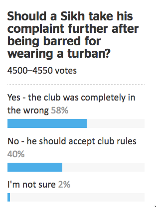
People who do surveys using random-digit phone number dialing tend to think that random-digit dialling or similar attempts to sample in a representative way are very important, and sometimes attack the idea of public-opinion inference from convenience samples as wrong in principle.  People who use careful adjustment and matching to calibrate a sample to the target population are annoyed by this, and point out that not only is statistical modelling a perfectly reasonable alternative, but that response rates are typically so low that attempts to do random sampling also rely heavily on explicit or implicit modelling of non-response to get useful results.

Andrew Gelman has a new post on this issue, and it’s an idea that I think should be taken more further (in a slightly different direction) than he seems to.

It goes like this. If it becomes widely accepted that properly adjusted opt-in samples can give reasonable results, then there’s a motivation for survey organizations to not even try to get representative samples, to simply go with the sloppiest, easiest, most convenient thing out there. Just put up a website and have people click. Or use Mechanical Turk. Or send a couple of interviewers with clipboards out to the nearest mall to interview passersby. Whatever. Once word gets out that it’s OK to adjust, there goes all restraint.

I think it’s more than that, and related to the idea of signalling in economics or evolutionary biology, the idea that peacock’s tails are adaptive not because they are useful but because they are expensive and useless.

Doing good survey research is hard for lots of reasons, only some involving statistics. If you are commissioning or consuming a survey you need to know whether it was done by someone who cared about the accuracy of the results, or someone who either didn’t care or had no clue. It’s hard to find that out, even if you, personally, understand the issues.

Back in the day, one way you could distinguish real surveys from bogus polls was that real surveys used random-digit dialling, and bogus polls didn’t. In part, that was because random-digit dialling worked, and other approaches didn’t so much. Almost everyone had exactly one home phone number, so random dialling meant random sampling of households, and most people answered the phone and responded to surveys.  On top of that, though, the infrastructure for random-digit dialling was expensive. Installing it showed you were serious about conducting accurate surveys, and demanding it showed you were serious about paying for accurate results.

Today, response rates are much lower, cell-phones are common, links between phone number and geographic location are weaker, and the correspondence between random selection of phones and random selection of potential respondents is more complicated. Random-digit dialling, while still helpful, is much less important to survey accuracy than it used to be. It still has a lot of value as a signalling mechanism, distinguishing Gallup and Pew Research from Honest Joe’s Sample Emporium and website clicky polls.

Signalling is valuable to the signaller and to consumer, but it’s harmful to people trying to innovate.  If you’re involved with a serious endeavour in public opinion research that recruits a qualitatively representative panel and then spends its money on modelling rather than on sampling, you’re going to be upset with the spreading of fear, uncertainty, and doubt about opt-in sampling.

If you’re a panel-based survey organisation, the challenge isn’t to maintain your principles and avoid doing bogus polling, it’s to find some new way for consumers to distinguish your serious estimates from other people’s bogus ones. They’re not going to do it by evaluating the quality of your statistical modelling.


June 4, 2015

Round up on the chocolate hoax

Science journalism (or science) has a problem:

Meh. Unimpressed.

Study was unethical


May 27, 2015

We like to drive in convoys

This isn’t precisely statistics, more applied probability, but that still counts.  First, an interactive from Lewis Lehe, a PhD student in Transport Engineering at UC Berkeley. It shows why buses always clump together.

busclump

You might also like his simulations of bottlenecks/gridlock and of congestion waves in traffic (via @flowingdata)


And second, a video from the New York subway system. When a train gets delayed, it holds up all the trains behind it. More surprisingly, the system is set up to delay the train in front of it, to keep the maximum gap between trains smaller.

May 1, 2015

Have your say on the 2018 census


StatsNZ has a discussion forum on the 2018 Census

census

They say

The discussion on Loomio will be open from 30 Apr to 10 Jun 2015.

Your discussions will be considered as an input to final decision making.

Your best opportunity to influence census content is to make a submission. Statistics NZ will use this 2018 Census content determination framework to make final decisions on content. The formal submission period will be open from 18 May until 30 Jun 2015 via www.stats.govt.nz.

So, if you have views on what should be asked and how it should be asked, join in the discussion and/or make a submission


March 23, 2015

Cricket visualisations

Lascarides-Guptill

March 20, 2015

Ideas that didn’t pan out

One way medical statisticians are trained into skepticism over their careers is seeing all the exciting ideas from excited scientists and clinicians that don’t turn out to work. Looking at old hypotheses is a good way to start. This graph is from a 1986 paper in the journal Medical Hypotheses, and the authors are suggesting pork consumption is important in multiple sclerosis, because there’s a strong correlation between rates of multiple sclerosis and pork consumption across countries:

pork

This wasn’t a completely silly idea, but it was never anything but suggestive, for two main reasons. First, it’s just a correlation. Second, it’s not even a correlation at the level of individual people — the graph is just as strong support for the idea that having neighbours who eat pork causes multiple sclerosis. Still, dietary correlations across countries have been useful in research.

If you wanted to push this idea today, as a Twitter account claiming to be from a US medical practice did, you’d want to look carefully at the graph rather than just repeating the correlation. There are some countries missing, and other countries that might have changed over the past three decades.

In particular, the graph does not have data for Korea, Taiwan, or China. These have high per-capita pork consumption, and very low rates of multiple sclerosis — and that’s even more true of Hong Kong, and specifically of Chinese people in Hong Kong.  In the other direction, the hypothesis would imply very low levels of multiple sclerosis among US and European Jews. I don’t have data there, but in people born in Israel the rate of multiple sclerosis is moderate among those of Ashkenazi heritage and low in others, which would also mess up the correlations.

You might also notice that the journal is (or was) a little non-standard, or as it said  “intended as a forum for unconventional ideas without the traditional filter of scientific peer review”.

Most of this information doesn’t even need a university’s access to scientific journals — it’s just out on the web.  It’s a nice example of how an interesting and apparently strong correlation can break down completely with a bit more data.

March 19, 2015

Model organisms

The flame retardant chemicals in your phone made zebra fish “chubby”, says the caption on this photo at news.com.au. Zebra fish, as it explains, are a common model organism for medical research, so this could be relevant to people

591917-2a8735a0-cced-11e4-a716-dcac481e1bbe

On the other hand, as @LewSOS points out on Twitter, it doesn’t seem to be having the same effect on the model organisms in the photo.

What’s notable about the story is how much better it is than the press release, which starts out

Could your electronics be making you fat? According to University of Houston researchers, a common flame retardant used to keep electronics from overheating may be to blame.

The news.com.au story carefully avoids repeating this unsupported claim.  Also, the press release doesn’t link to the research paper, or even say where it was published (or even that it was published). That’s irritating in the media but unforgivable in a university press release.   When you read the paper it turns out the main research finding was that looking at fat accumulation in embryonic zebrafish (which is easy because they are transparent, one of their other advantages over mice) was a good indication of weight gain later in life, and might be a useful first step in deciding which chemicals were worth testing in mice.

So, given all that, does your phone or computer actually expose you to any meaningful amount of this stuff?

The compounds in question, Tetrabromobisphoneol A (TBBPA) and tetrachlorobisphenol A (TCBPA) can leach out of the devices and often end up settling on dust particles in the air we breathe, the study found.

That’s one of the few mistakes in the story: this isn’t what the study found, it’s part of the background information. In any case, the question is how much leaches out. Is it enough to matter?

The European Union doesn’t think so

The highest inhalation exposures to TBBP-A were found in the production (loading and mixing) of plastics, with 8-hour time-weighted-averages (TWAs) up to 12,216 μg/m3 . At the other end of the range, offices containing computers showed TBBP-A air concentrations of less than 0.001 μg/m3 . TBBP-A exposures at sites where computers were shredded, or where laminates were manufactured ranged from 0.1 to 75 μg/m3 .

You might worry about the exposures from plastics production, and about long-term environmental accumulations, but it looks like TBBP-A from being around a phone isn’t going to be a big contributor to obesity. That’s also what the international comparisons would suggest — South Korea and Singapore have quite a lot more smartphone ownership than Australia, and Norway and Sweden are comparable, all with much less obesity.

March 18, 2015

Awful graphs about interesting data


Today in “awful graphs about interesting data” we have this effort that I saw on Twitter, from a paper in one of the Nature Reviews journals.

nrd4570-f2

As with some other recent social media examples, the first problem is that the caption isn’t part of the image and so doesn’t get tweeted. The numbers are the average number of drug candidates at each stage of research to end up with one actual drug at the end. The percentage at the bottom is the reciprocal of the number at the top, multiplied by 60%.

A lot of news coverage of research is at the ‘preclinical’ stage, or is even earlier, at the stage of identifying a promising place to look.  Most of these never get anywhere. Sometimes you see coverage of a successful new cancer drug candidate in Phase I — first human studies. Most of these never get anywhere.  There’s also a lot of variation in how successful the ‘successes’ are: the new drugs for Hepatitis C (the first column) are a cure for many people; the new Alzheimer’s drugs just give a modest improvement in symptoms.  It looks as those drugs from MRSA (antibiotic-resistant Staph. aureus) are easier, but that’s because there aren’t many really novel preclinical candidates.

It’s an interesting table of numbers, but as a graph it’s pretty dreadful. The 3-d effect is purely decorative — it has nothing to do with the represntation of the numbers. Effectively, it’s a bar chart, except that the bars are aligned at the centre and have differently-shaped weird decorative bits at the ends, so they are harder to read.

At the top of the chart,  the width of the pale blue region where it crosses the dashed line is the actual data value. Towards the bottom of the chart even that fails, because the visual metaphor of a deformed funnel requires the ‘Launch’ bar to be noticeably narrower than the ‘Registration’ bar. If they’d gone with the more usual metaphor of a pipeline, the graph could have been less inaccurate.

In the end, it’s yet another illustration of two graphical principles. The first: no 3-d graphics. The second: if you have to write all the numbers on the graph, it’s a sign the graph isn’t doing its job.