Murderous Kiwis
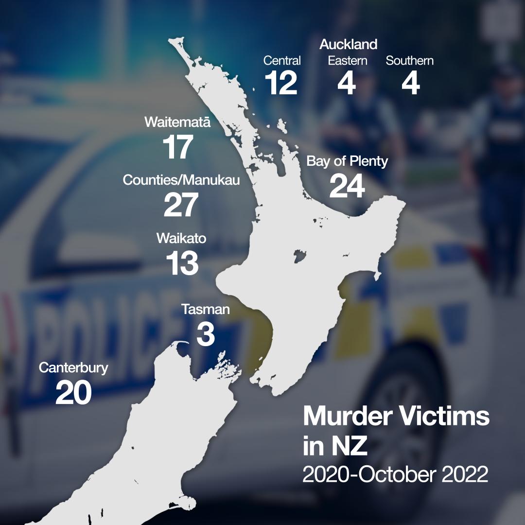
Newshub has a story Map: New Zealand’s murder hotspots revealed.
This is the map
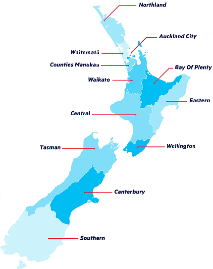
The map (and the text) don’t say what these geographical units are. Based on the context and the presence of “Counties Manukau” as one of them, I would expect them to be police districts: this (just a map, no data) is from the NZ Police website
There’s a few confusing things about the Newshub map, though. We seem to be missing Wellington (in the text, too), along with Auckland City and Northland. The ‘Southern’, ‘Eastern’, and ‘Central’ police districts are under a label ‘Auckland’ at the top right, making them look as though they might be southern, eastern, and central Auckland.
As always, there’s the question of the appropriate denominator. Police districts are large enough that the distinction between the location of the murder and the residence of the victim might not matter too much (in contrast to census area units and assault), and I’m going to assume that the data include homicides in private homes (in contrast to census area units and assault) because that would have been mentioned otherwise. So it seems reasonable to use a general population denominator. This is trickier than I would have expected; it seems quite hard to find the police district populations. If you’re putting in a police OIA request like this one you might want to ask them for populations as well.
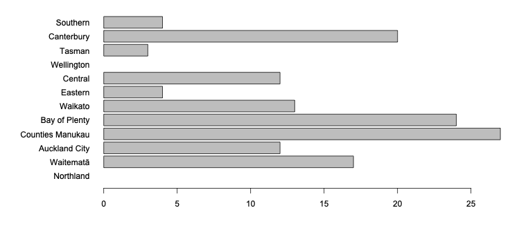
Looking at maps, the police districts seem to (at least approximately) be combinations of DHBs*, so I used the populations of those DHBs. Here are the comparisons just by counts of homicides over nearly three years (we’re missing Wellington and Northland)
And here are the (approximated) rates per thousand people over those three years. You might worry about how well the three Auckland districts can be separated; it wouldn’t be hard to combine them.
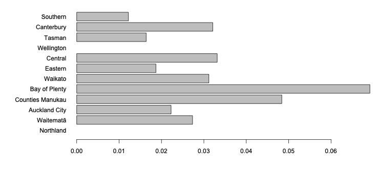
Bay of Plenty looks higher and Canterbury, Counties, and Waitematā look lower when you account for the differences in numbers of people. Comparisons like this usually want rates (how dangerous), not counts (how many), if a relevant denominator is available.
Newshub does get points, though, for correctly saying all these numbers are pretty low by international standards.
* DHB: Deprecated Health Boundary
Thomas Lumley (@tslumley) is Professor of Biostatistics at the University of Auckland. His research interests include semiparametric models, survey sampling, statistical computing, foundations of statistics, and whatever methodological problems his medical collaborators come up with. He also blogs at Biased and Inefficient See all posts by Thomas Lumley »