The missing $30,000
A graph about the current salary negotiations for nurses, tweeted by Andrew Little, the Minister of Health:
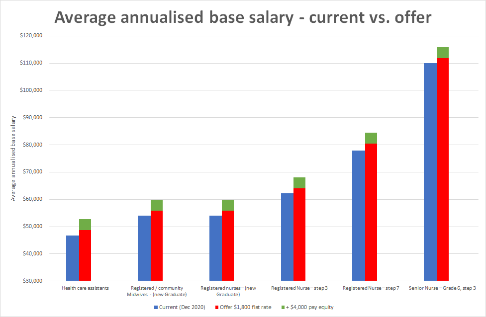
There are many situations when it is entirely proper to draw a graph with a y-axis starting somewhere other than zero. There are essentially no situations where a bar chart should have the axis starting somewhere other than zero (the very occasional exception is when ‘zero’ basically is a number other than zero). There’s a reason for this: in a bar chart, the area (length) of the bar conveys the information, and cutting the feet out from under the bar changes the information.
That’s all very well and good, you say, but is there empirical evidence that real people are misled by truncated bar charts? I’m glad you asked! Yes, there was a research paper published last year, titled “Truncating Bar Graphs Persistently Misleads Viewers”, which found …well, what it says on the label. A truncated graph was misleading; it was still misleading for graphically-sophisticated nerds; and it was still misleading when accompanied by a warning. Truncated bar charts are bad. Don’t use them.
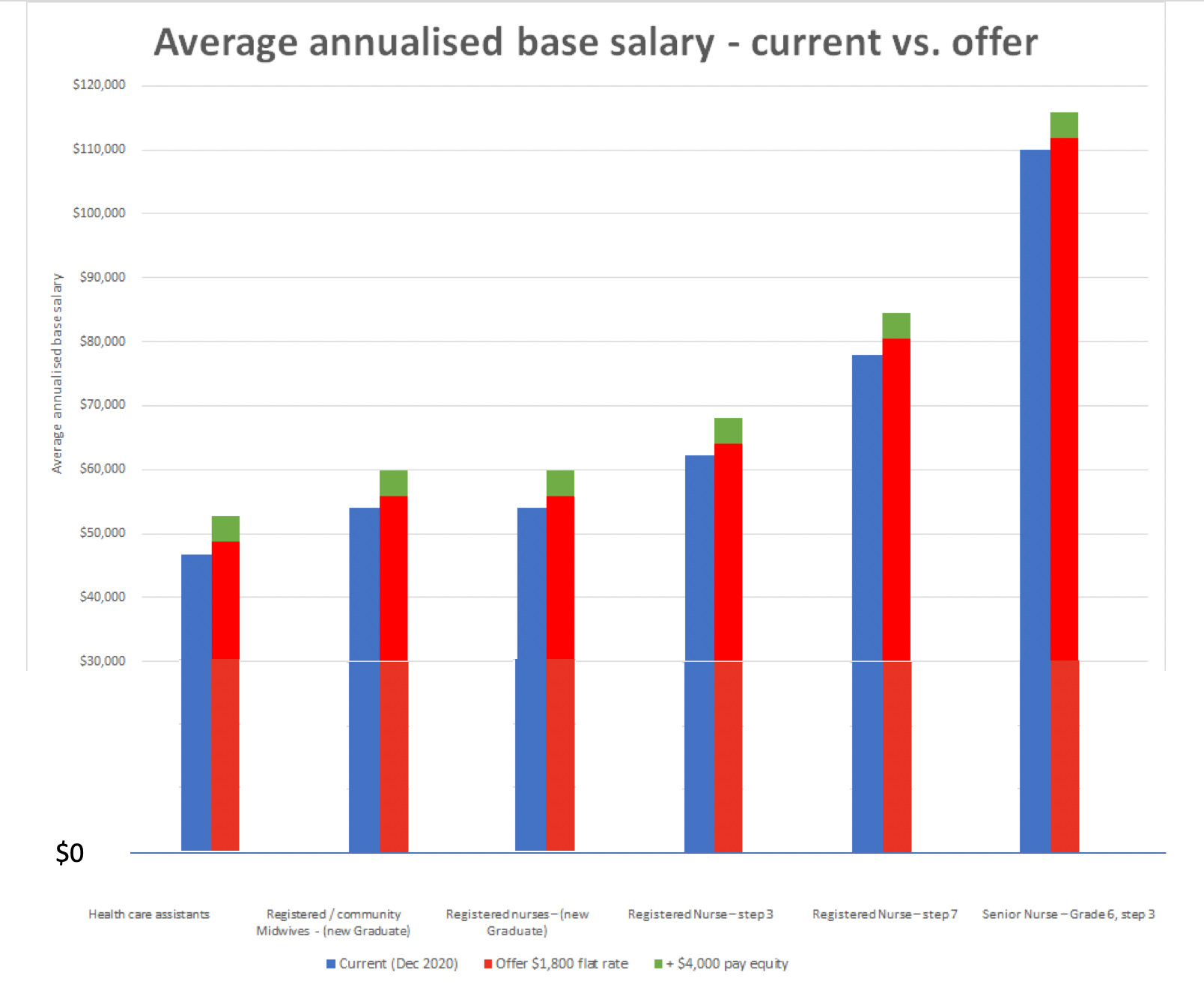
Sticking the missing $30,000 into the bottom of the Minister’s graph gives this:
Thomas Lumley (@tslumley) is Professor of Biostatistics at the University of Auckland. His research interests include semiparametric models, survey sampling, statistical computing, foundations of statistics, and whatever methodological problems his medical collaborators come up with. He also blogs at Biased and Inefficient See all posts by Thomas Lumley »
Yes, it is not good practice. But I am not clear yet what is misleading about it. Basically, everybody is getting a flat rate offer rather than a percentage increase, so that actually helps the people more at the bottom than at the top, at least as I understand it. Can you explain what incorrect impression a reader would get from the truncated compared with the full graph? Either way there is no way of hiding that proportionately the lower people get more.
3 years ago
The original graph would imply visually that the health care assistants, for example, are being offered a 30%+ pay rise. It gives the wrong impression of the size of the increase in percentage terms.
3 years ago