An important graph
From David Hood on Twitter, this graph shows leaving-home-ness in Aotearoa and the West Island, based on Google’s phone mobility data
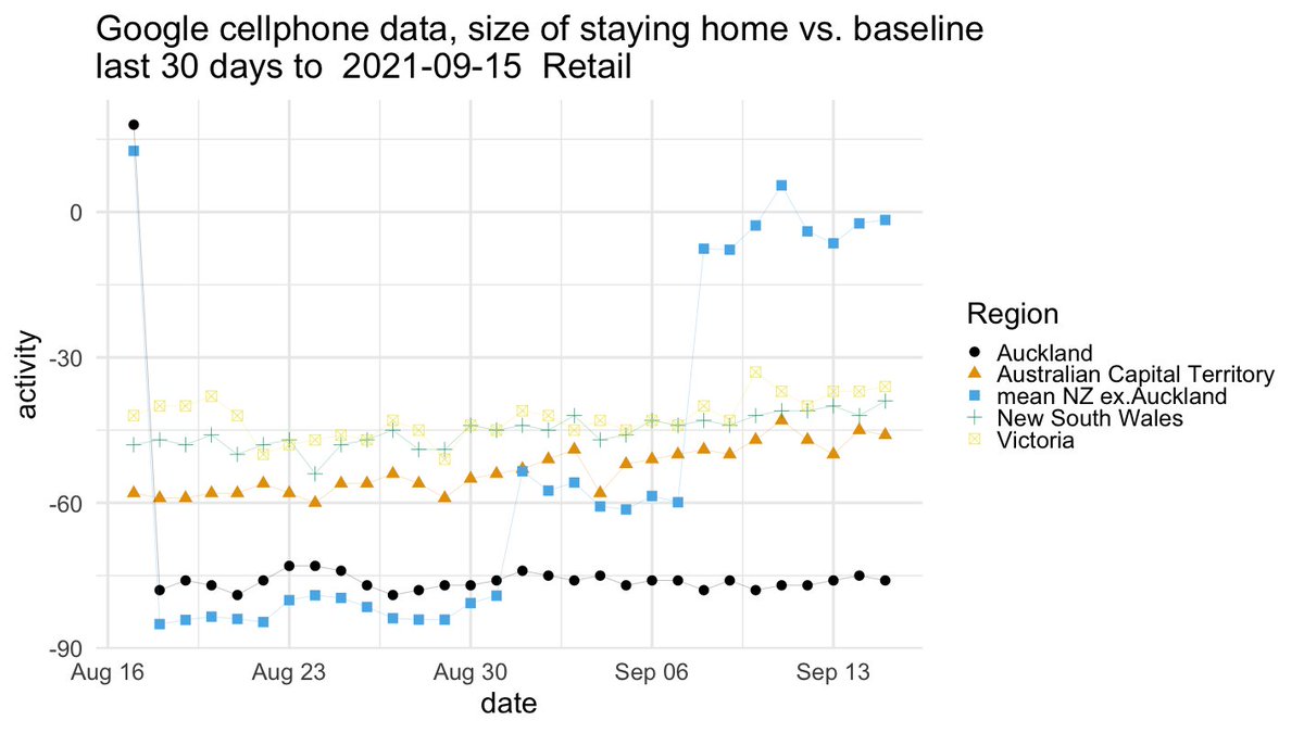
The most important point about the graph, to me, is that the black dots follow a horizontal line (and the blue dots mostly follow a set of three horizontal lines). This says that level 4 restrictions (and level 3, in RoNZ) were not eroding over time. People were staying home just as much at the end as the beginning, even after four weeks and a much reduced case load.
The second important point is that the cluster of blue dots in the middle is a bit below the rest of the middle. Level 3 is slightly more effective, in terms of people staying home, than the Victoria and NSW and ACT restrictions. Level 3 is still a risk: it relies on people being at least as careful about masks and distancing and not accidentally flying to Wanaka as in level 4. Experts seem to be worried that it might be a bad idea, but to pretty much agree it’s still an effort at elimination.
How is that possible, given all the news about level 4 breaks? Well, Auckland is a big place. If 1% of people committed some serious breach of the rules and 1% of that 1% were reported, you’d have 160 reports.
Thomas Lumley (@tslumley) is Professor of Biostatistics at the University of Auckland. His research interests include semiparametric models, survey sampling, statistical computing, foundations of statistics, and whatever methodological problems his medical collaborators come up with. He also blogs at Biased and Inefficient See all posts by Thomas Lumley »