Posts from December 2013 (51)

December 19, 2013

Difficulties in interpreting rare responses in surveys

If some event is rare, then your survey sample won’t have many people who truly experienced it, so even a small rate of error or false reporting will overwhelm the true events, and can lead to estimates that are off by a lot more than the theoretical margin of sampling error.

The Herald has picked up on one of the other papers (open access, not linked) in this year’s Christmas BMJ, which looks at data from the National Longitudinal Study of Youth, in the US. This is an important social and health survey, and the paper is written completely seriously. Except for the topic

Of 7870 eligible women, 5340 reported a pregnancy, of whom 45 (0.8% of pregnant women) reported a virgin pregnancy (table 1). Perceived importance of religion was associated with virginity but not with virgin pregnancy. The prevalence of abstinence pledges was 15.5%. The virgins who reported pregnancies were more likely to have pledged chastity (30.5%) than the non-virgins who reported pregnancies (15.0%, P=0.01) or the other virgins (21.2%, P=0.007).

and

A third group of women (n=244) not included in analysis, “born again virgins,” reported a history of sexual intercourse early in the study but later provided a conflicting report indicating virginity. Reports of pregnancy among born again virgins were associated with greater knowledge of contraception methods with higher failure rates (withdrawal and rhythm methods) and lower interview quality (data not shown), and reports from this group may be subject to greater misclassification error.

The survey had carefully-designed and tested questions, and used computer-assisted interviewing to make participants more willing to answer potentially embarrassing questions. It’s about as good as you can get. But it’s not perfect.

Meet Ashley Hinton, Statistics Summer Scholar 2013-2014

Every year, the Department of Statistics at the University of Auckland offers summer scholarships to a number of students so they can work with our staff on real-world projects. We’ll be profiling the 2013-2014 summer scholars on Stats Chat.

Ashley (right) is working with Dr Paul Murrell on a project entitled  Grid-based graphs in R.

Ashley explains:anhinton_stats

“There’s a wonderful piece of software called graphviz that does a great job of making node and edge graphs that look really good. My research is about expanding an R package called gridGraphviz, which has graphviz lay out a graph, then uses the R ‘grid’ graphics package to draw the graph.

“This research is useful as current node and edge packages in R draw graphs using R’s default ‘graphics’ package. Building a package that uses the ‘grid’ package means we can take advantage of all the flexibility that ‘grid’ allows, including making interactive graphs and exporting our plots in a variety of useful formats. We also hope it will make very good-looking graphs.”

More about Ashley:

“I have a BA in philosophy, and have just finished my second year of a BSc in Statistics. I would like to train to be a high school teacher after I graduate.

“When I finished my compulsory high-school maths classes, I swore I would never use maths again, and set about becoming a philosopher. Much to my surprise, I found that philosophy and logic led me to become very, very interested in mathematics, enough that I decided I wanted to return to university and learn all about it.

“Statistics is, for me, a meeting place of my interest in mathematics and computer programming. It can allow us to produce something that can communicate useful ideas about the world to other people. It’s a form of literacy I honestly had no idea I was missing out on until I came back to learn about it.

“This summer, I’m going to spend a few weeks travelling around the South Island treating myself to some wonderful summer weather.”

December 18, 2013

Briefly

But, of course, time behind the wheel is time not doing anything else, and if we’re going to properly calculate an optimum speed, we really ought to put some monetary value on that, as well.

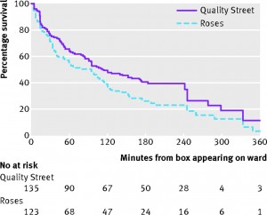
Survival analysis of chocolate in hospital

You may remember StatsChat’s criticism of data quality and analysis in paper about chocolate and Nobel Prizes from a leading medical journal.  Another leading medical journal, BMJ, traditionally has a Christmas issue with not entirely serious papers, typically based on good-quality silly research. One of the past highlights was the systematic review of randomised trials of parachute use.

This year, there’s a survival analysis of chocolate in hospital wards. Survival analysis is the branch of statistics working with the time until an event happens.  Often the event is death, hence the name ‘survival’, but it could be something else bad, such as a heart attack, or something good, such as finding a job.  If you’re a chocolate, it’s being eaten.

survival


The data are a good fit to a constant hazard of consumption, with a rate of just under 1%/minute.  There isn’t any sign of strong heterogeneity — if some chocolates are preferred to others, the preference is either not strong enough or variable enough between people that no chocolates are safe.

Other papers in the Christmas issue include a semi-serious comparison of stem cell size and structure for mice and whales, and the finding that, in Dublin, people called Brady are more likely to have pacemaker treatment for bradycardia (presumably a multiple comparison issue)

December 16, 2013

Briefly

“In any case, the current uncertainty about any benefit from helmet wearing or promotion is unlikely to be substantially reduced by further research” – Ben Goldacre and David Spiegelhalter

  • NZ cartographer Chris McDowall (@fogonwater) “When presented with an unlabelled map depicting a random part of the country, I can identify most places purely on the basis of their shape. But, when I close my eyes, their forms fade away …. The maps on this page are an attempt to translate my head landscapes into cartographic artefacts. I am trying to recreate of what I see when I close my eyes

Stat of the Summer Competition Discussion: December 14 2013 – February 28 2014

If you’d like to comment on or debate any of the Stat of the Summer nominations, please do so below!

Stat of the Summer Competition: December 14 2013 – February 28 2014

This summer, we would like to invite readers of Stats Chat to submit nominations for our Stat of the Summer competition and be in with the chance to win a copy of “Beautiful Evidence” by Edward Tufte:

Here’s how it works:

  • Anyone may add a comment on this post to nominate their Stat of the Summer candidate before midday Friday February 28 2014.
  • Statistics can be bad, exemplary or fascinating.
  • The statistic must be in the NZ media during the period of December 14 2013 – February 28 2014 inclusive.
  • Quote the statistic, when and where it was published and tell us why it should be our Stat of the Summer.

On Monday 3 March 2014 at midday we’ll announce the winner of the Stat of the Summer competition, and restart the weekly competition.

The fine print:

  • Judging will be conducted by the blog moderator in liaison with staff at the Department of Statistics, The University of Auckland.
  • The judges’ decision will be final.
  • The judges can decide not to award a prize if they do not believe a suitable statistic has been posted.
  • Only the first nomination of any individual example of a statistic used in the NZ media will qualify for the competition.
  • Individual posts on Stats Chat are just the opinions of their authors, who can criticise anyone who they feel deserves it, but the Stat of the Week award involves the Department of Statistics more officially. For that reason, we will not award Stat of the Week for a statistic coming from anyone at the University of Auckland outside the Statistics department. You can still nominate and discuss them, but the nomination won’t be eligible for the prize.
  • Employees (other than student employees) of the Statistics department at the University of Auckland are not eligible to win.
  • The person posting the winning entry will receive a copy of “Beautiful Evidence” by Edward Tufte.
  • The blog moderator will contact the winner via their notified email address and request their postal address for the book to be sent to.
  • The competition will commence Saturday 14 December 2013 and continue until midday Friday 28 February 2014.

Giving and receiving

I’ve been looking at our links in and out over the past year.  Leaving out Twitter, Facebook, various RSS readers, and Reddit, we get the most traffic from Kiwiblog and Simply Statistics, with consistent appearances from Observational Epidemiology, Lindsay Mitchell, Learn and Teach StatisticsAndrew Gelman, Public Address, Anti-Dismal, and my other blog.

Unsurprisingly, our largest outward traffic is to Stuff and NZ Herald, in about a 2:3 ratio.  Wikipedia is next, including informative technical references such as the Optional Stopping Theorem,  Berkson’s Paradox, and the Asch conformity experiments, and cultural phenomena you might not have encountered, such as the Bechdel test, Satoshi Kanazawa, and ‘Hitler Has Only Got One Ball’.

The other main media sites you clicked through to were the BBC, the Guardian, the Washington Post, and the New York Times.

December 15, 2013

He knows if you’ve been bad or good

From today’s Herald (or the very similar story at 3News)

A Wellness in the Workplace survey show sickies taken by people who aren’t really ill are estimated to account for 303,000 lost days of work each year, at a cost of $283 million.

Skipping over the estimate of over $900/day for the average cost of a sickie, this is definitely an example where a link to the survey report and some description of methodology might be helpful. The report says

The survey was conducted during the month of
June 2013. In total, 12 associations took part,
sending it out to a proportion of their members.
In addition, BusinessNZ sent the questionnaire
to a number of its Major Companies Group
members. Respondents were asked to report their
absence data for the 12-month period 1 January to
31 December 2012 and provide details of their policies
and practices for managing employee attendance.

In total, 119 responses were received from entities
across the private and public sectors.

which gives more idea about potential (un)representativeness. But most importantly,  while the survey has real data on numbers of absences and on policies, the information on how likely employees were to take sick leave when not sick was just the opinion of their employers. Unless you work for Santa or the NSA, this is going to have a large component of guesswork.

If you’re an employer, and you want to know whether inappropriate use of sick leave is a problem for your organisation, do you want to rely on your own guesses, or on an average of guesses by an anonymous assortment of 119 other organisations around the country?

How much evidence would you expect to see?

[UPDATE: I got the calculations wrong, and was too kind to the MoT and the paper. The time to get good evidence is more like 20 years.]


The Sunday Star-Times has a story saying that the reduction in speed-limit tolerance, which is now on all the time in the summer, hasn’t yet shown evidence of a reduction in road deaths. And they’re right, it hasn’t, despite some special pleading from the Police Minister and Assistant Commissioner David Cliff. We’ve looked at this issue before.

However, it’s also important to ask whether we’d expect to see evidence yet if the policy really worked as promised. The Star-Times goes on to say:

While MOT data shows just 13 per cent of fatal crashes were attributable to speed Land Transport Safety Authority spokesman Andy Knackstedt said there was “a wealth of evidence” that showed even very small reductions in speed led to reductions in fatalities and serious injuries, and that lowering the enforcement tolerance meant lower mean speeds.

So, we should ask whether we’d expect a clear and convincing drop in road deaths if the theory behind the policy was sound. And we wouldn’t.

Let’s see what we should expect if the policy prevented 10% or 20% of the deaths from speeding, which works out to 1.3% or 2.6% of all road deaths.  The number of deaths last year was 286, over 366 days. Under the simplest model for road crash data, a Poisson process that basically assumes different roads and time periods are independent, we can work out how long you’d have to wait to have a 50% chance or an 80% chance of the reduction getting below the margin of error

For a 20% reduction in deaths from speeding it takes about 190 days to have an even-money chance of seeing evidence, and about 390 days to have an 80% chance. For a 10% reduction in deaths from speeding it takes about 380 days for an even-money chance of convincing evidence and 760 days for an 80% chance. Under more complex and realistic models for road deaths it would take longer.

There’s no way that we could expect to see convincing evidence yet, and given the much larger unexplained fall in road deaths in recent years, it will probably never be feasible to evaluate the policy just based on road death counts.  We’re going to have to rely on other evidence: overseas data, information on reductions in speeding, data from non-fatal or even non-injury crashes, and other messier sources.