Redrawing a graph
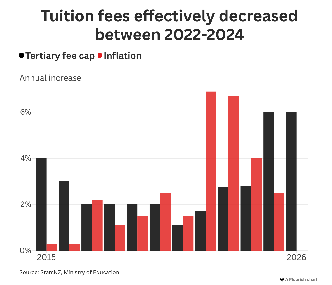
Newsroom has an article about tertiary funding in the new budget. There’s a graph showing how the government fee cap and inflation have competed over the past few years. The graph in the article (ignoring the impact of a fee-free year) is
I find this a bit hard to interpret — it’s not easy to see the cumulative effect of the two changes and work out whether fees have shot ahead or lagged behind. I think this is clearer, showing the cumulative effect of inflation and the (maximum) fee increase; the highlight is the two Covid border-closure years.
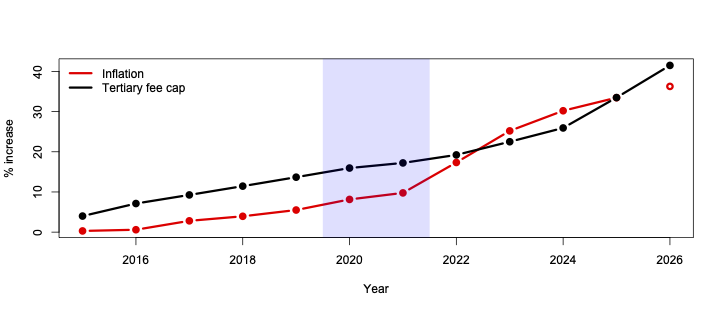
We can see that fees had increased in real terms but had now fallen behind inflation. Based (obviously) on a projection for 2026, fees might be slightly ahead again.
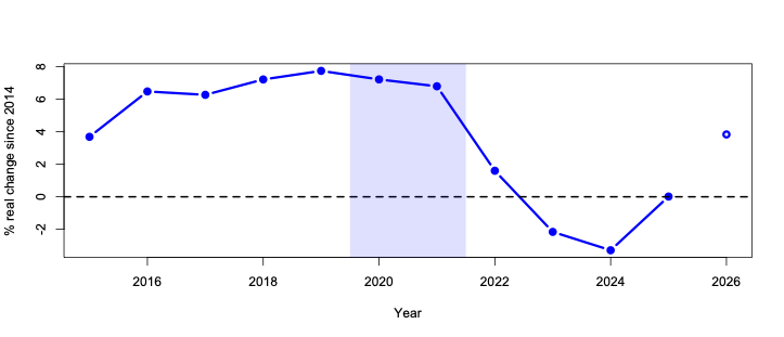
Another option is to use the inflation series to deflate the fee cap and just show the real-terms fee changes. Again, fees were up in real terms, then down, and are right at the 2014 level. Again, this ignores the impact of a fee-free year, which will depend on when one started uni.
What I think this shows is that adding up yearly changes (especially multiplicative ones) in your head is hard, and it’s probably harder than the opposite task of estimating changes in slopes. If you need both scales, you might be better off with a cumulative graph. The big disadvantage of a cumulative graph is that the visual impression can be quite sensitive to when you start adding.
Thomas Lumley (@tslumley) is Professor of Biostatistics at the University of Auckland. His research interests include semiparametric models, survey sampling, statistical computing, foundations of statistics, and whatever methodological problems his medical collaborators come up with. He also blogs at Biased and Inefficient See all posts by Thomas Lumley »