October 20, 2025
Briefly
- It’s World Statistics Day (which only happens every five years). Well, because time zones it’s not actually World Statistics Day for another half-hour as I write this.
- The US Secretary of Health has claimed teenage boys have sperm counts half of those in 65-year old men. Angela Rasmussen looks at this claim. If you think about it, as she points out, there’s no plausible way there could be good worldwide evidence on sperm counts in teenagers — how would you get those data?!
- Backblaze, who sell cloud storage, have periodically reported on the long-term survival of hard drives (and released data, too) — these are the old-fashioned “spinning rust” hard drives, not solid-state drives. Their new report says that drives are getting better, and that they don’t see the “bathtub” risk curve of folklore, where the newest and oldest drives are most likely to fail.
- Consumer Reports has published on heavy metal content in protein powders. They say “more than two-thirds of them contain more lead in a single serving than our experts say is safe to have in a day”. One issue here is that lead can be measured sensitively with modern technology, and is notoriously said to have no safe level, so in a sense all food will have more lead than is safe. Consumer Reports does acknowledge this; their threshold, which one could perhaps describe as ‘not really unsafe’ is 0.5 micrograms per day. I think it’s useful to have some historical context. In the 1980s, the “provisional tolerated weekly intake” was 5 ug/kg/week, or about 250 ug/day for a 70kg adults. For infants, even breast milk added up to 0.5ug/kg/day, well above the modern limit, and formula was much higher. So, yes, we know more about lead now and we’re right to be more scared of it, but there are a lot of people in the world who have been exposed to way more lead than these protein supplements would give you.
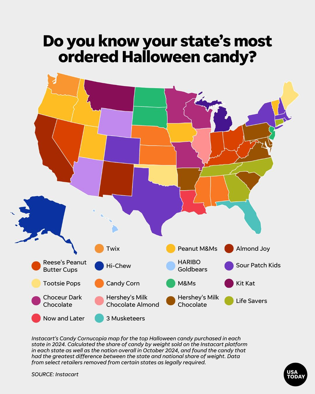
- This map from USA Today is misleadingly labelled, as often happens. It’s what I call a “caricature map”. It doesn’t show each state’s most ordered Halloween candy. It doesn’t even show each state’s most ordered Halloween candy from this specific online retailer. It shows, for each state, which candy is most over-ordered relative to the rest of the country. Like a caricature, where you find the distinctive features of a person’s face and exaggerate them, the map finds what’s different about candy purchases in each state and promotes that to the state norm. These maps aren’t bad — the most common candy/side dish/toy/whatever in each state is often a fairly boring map — but they would be better with an accurate description (this was from USAToday on Bluesky — the story on their website does a bit better).
Thomas Lumley (@tslumley) is Professor of Biostatistics at the University of Auckland. His research interests include semiparametric models, survey sampling, statistical computing, foundations of statistics, and whatever methodological problems his medical collaborators come up with. He also blogs at Biased and Inefficient See all posts by Thomas Lumley »