Pie chart issues
This was on a real-estate agent’s advertising leaflet at a local café
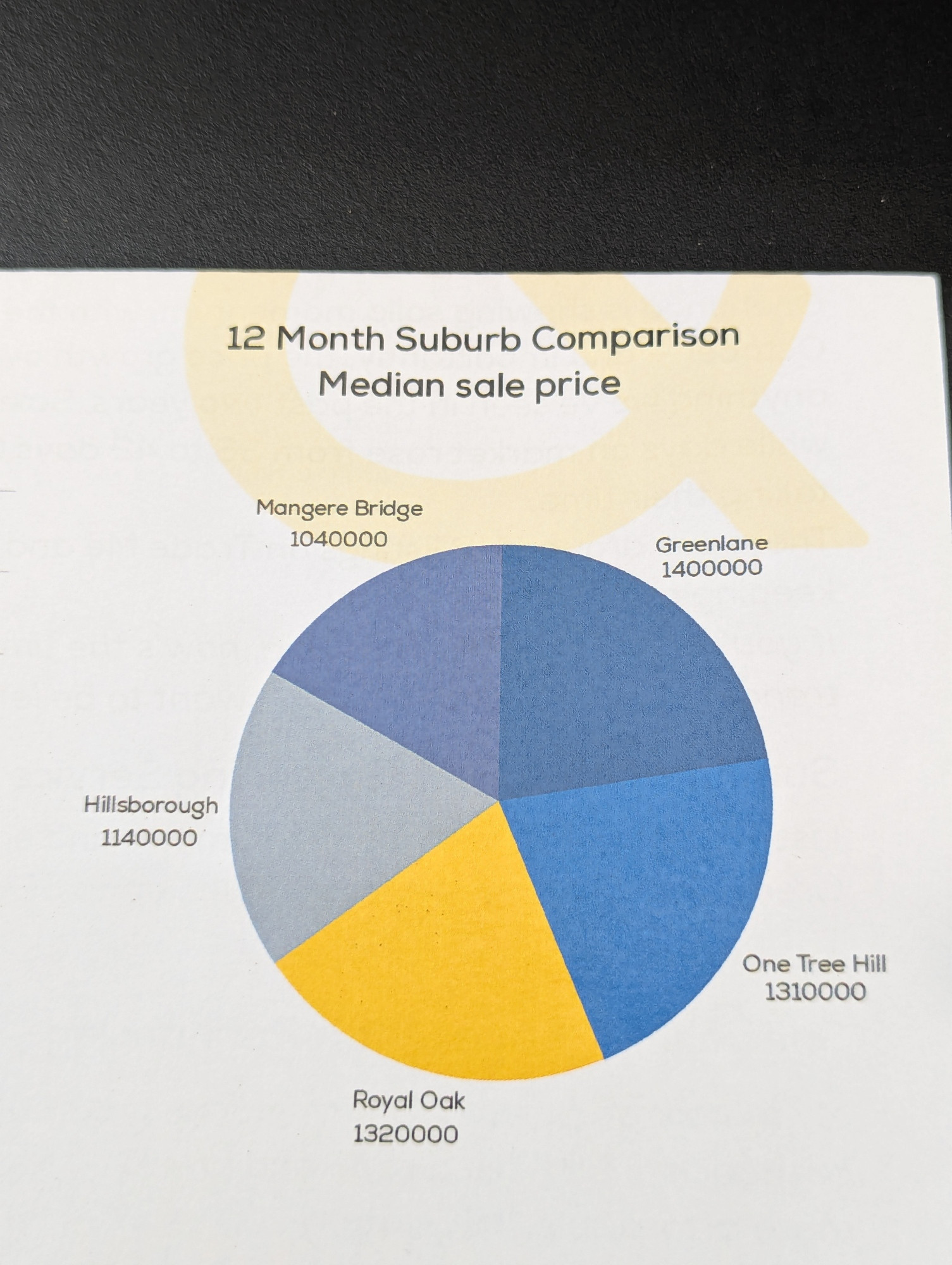
If you aren’t from around here, those are neighbourhoods in south central Auckland.
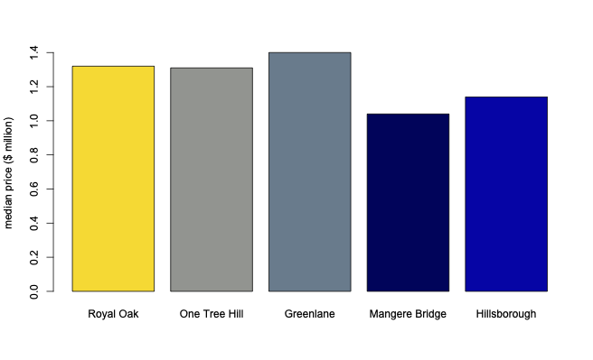
Statisticians often complain about pie charts because it’s hard to make numerical comparisons between the categories, especially compared to a bar chart
The poor visual comparison might actually be a virtue in this case if the point is just that these neighbourhoods are similar. In any case, there’s a deeper problem: pie charts are fundamentally about the relationship between portions and a total — slices and the whole pie. In this example there is no meaningful total that the separate medians are components of. There isn’t a pie for these to be slices of.
Thomas Lumley (@tslumley) is Professor of Biostatistics at the University of Auckland. His research interests include semiparametric models, survey sampling, statistical computing, foundations of statistics, and whatever methodological problems his medical collaborators come up with. He also blogs at Biased and Inefficient See all posts by Thomas Lumley »