Search results for migration (33)

April 26, 2017

Simplifying to make a picture

1. Ancestry.com has maps of the ancestry structure of North America, based on people who sent DNA samples in for their genotype service (click to embiggen)ncomms14238-f3

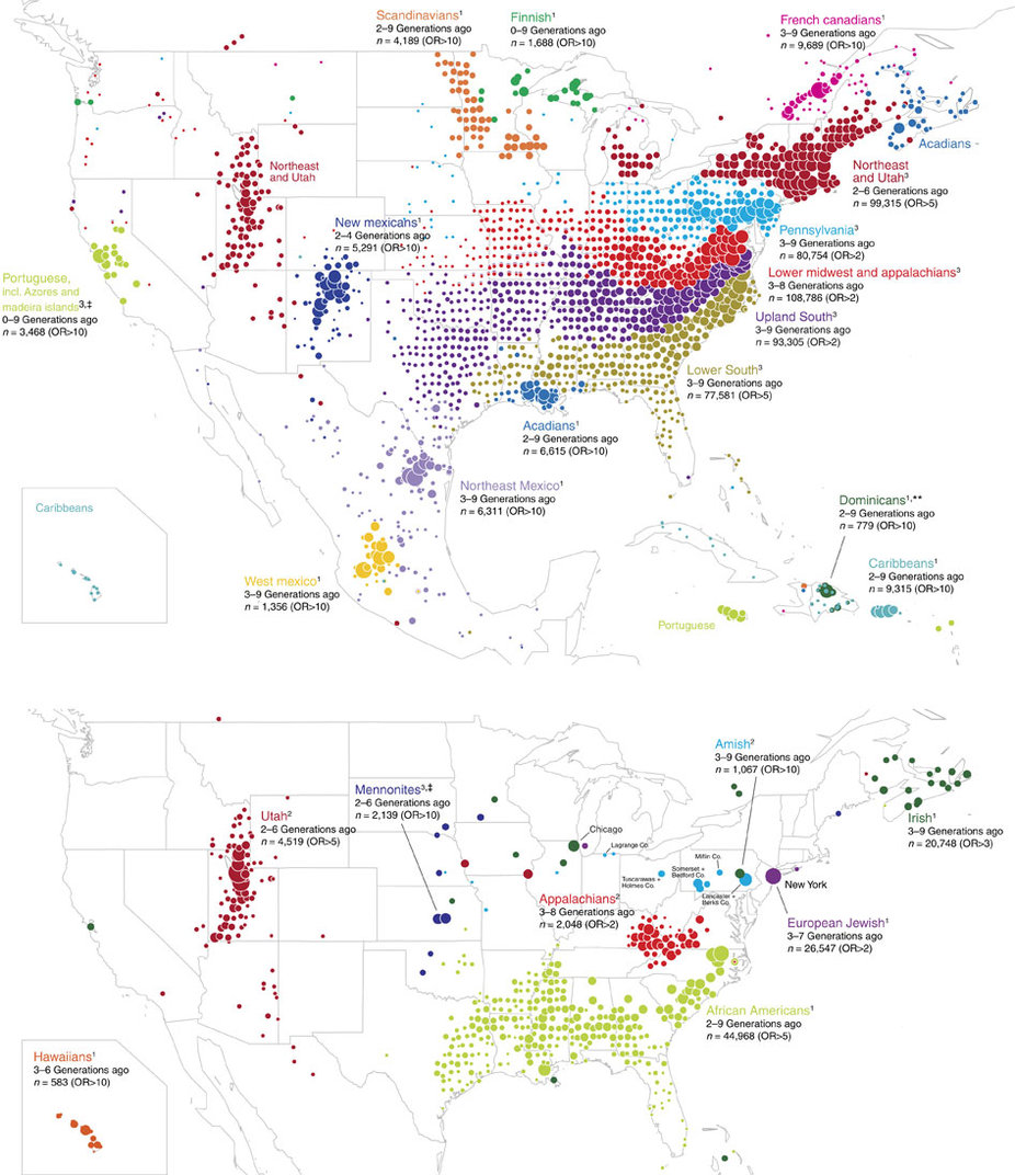
To make these maps, they looked for pairs of people whose DNA showed they were distant relatives, then simplified the resulting network into relatively stable clusters. They then drew the clusters on a map and coloured them according to what part of the world those people’s distant ancestors probably came from.  In theory, this should give something like a map of immigration into the US (and to a lesser extent, of remaining Native populations).  The map is a massive oversimplification, but that’s more or less the point: it simplifies the data to highlight particular patterns (and, necessarily, to hide others).  There’s a research paper, too.


2. In a satire on predictive policing, The New Inquiry has an app showing high-risk neighbourhoods for financial crime. There’s also a story at Buzzfeed.

sub-buzz-24605-1493145131-7

The app uses data from the US Financial Regulatory Authority (FINRA), and models the risk of financial crime using the usual sort of neighbourhood characteristics (eg number of liquor licenses, number of investment advisers).


3. The Sydney Morning Herald had a social/political quiz “What Kind of Aussie Are You?”.

1486745652102

They also have a discussion of how they designed the 7 groups.  Again, the groups aren’t entirely real, but are a set of stories told about complicated, multi-dimensional data.


The challenge in any display of this type is to remove enough information that the stories are visible, but not so much that they aren’t true– and not everyone will agree on whether you’ve succeeded.

January 8, 2017

Briefly

  • Graphics, overquantified life: Andrew Elliott’s graph of his baby’s first six months of sleep
  • Graphics: Bird migrations in the Americas (click for animation)bird_map
  • Public policy: Graeme Edgeler has better numbers on the three-strikes law, and a new post
  • Graphics: Weather forecast around the British Isles, shipping
    from the people who tweet the Shipping Forecast
  • From the Washington Post: more people die between Christmas and New Year than you’d expect. It’s true in NZ, so it’s not the weather.
  • The alt-right movement finds more dumb things to do with genetic testing: the Atlantic
  • A (moderately technical) short course on Fairness and Transparency in Machine Learning.
  • “Missing Datasets”: a partial list of useful and important public datasets that don’t (and won’t) exist.
  • Surash Venkat explains why modern data-based ‘algorithms’ aren’t at all like recipes — which is why they need to be studied statistically, not just by looking at the code or asking if the developers were pure of heart.
  • “The Great AI Awakening”. From the NY Times, on Google, the revolution in machine translation, and big data.
  • Companies Ponder a Rating of Workers’ Health”. From the Wall St Journal.  One one hand, having big companies report summaries of their employees’ health might give them better incentives.  On the other hand, they’d need to get the data, and if you think about what else they might do with it…
September 15, 2016

Briefly

  • From Cardiogram: using the Apple Watch to diagnose abnormal heart rhythms
  • From MIT Technology Review, an analysis of emotional patterns in fiction. “We find a set of six core trajectories which form the building blocks of complex narratives” They don’t really cover the possibility that they find six just because that’s as many as they can align neatly with their current approach..
  • From Hilda Bastian: The quality of a research study is rarely uniformly good across all the things it studies (though it could be uniformly bogus)
  • On diagnosing depression from Instagram photos “But they’ve buried the real story. The depression rate among adults in the United States is 6.7%. The depression rate among the crowdsourced workers who shared their photos is 41.2%” (Medium)
August 20, 2016

Briefly

  • Mining data from Lending Club.  And Matt Levine’s comments: Here are 50 data points about this loan. Do what you want….. And if there’s no field for “does this person have another LendingClub loan,” and if that data point would have been helpful, well, sometimes that happens.
  • It’s just gone Saturday in the US, so it is no longer National Potato Day, and it won’t be National Spumoni Day until Sunday. Nathan Yau has a graphic of the 214 days that are National <some food> Day.
  • Because genetic association studies are (or were) largely done in people of European ancestry, they can overpredict risks in everyone else. (NY Times). (The implication that this is also true of non-genetic research is, at least, exaggerated)
June 15, 2016

Counting refugees

The Immigration Minister, Michael Woodhouse, was on RadioLive

Per capita, New Zealand is ranked about 90th in the world for the number of refugees it accepts. Mr Woodhouse says this low ranking isn’t the Government’s fault — its quota puts New Zealand at “about seventh or eighth”. It’s refugees turning up unannounced that puts other countries ahead — like Jordan taking in refugees from the Syrian civil war, for example.

“I don’t want to get into a game of statistics, but we can be pretty pleased with what. We can say seventh, you can say 90th.”

When you have answers that differ that much, it’s either because someone has the numbers wrong, or (as in this case) because they are answers to different questions. When you have answers to different questions, the right statistical approach isn’t to look at the answers and decide which one you like, it’s to look at the questions and ask which is the right one.  That is, should we regard refugee numbers as basically about resettlement quotas managed through UNHCR, or as including asylum seekers?

People setting off on their own into neighbouring countries is, has always been, and probably always will be the main way they become refugees. The refugee resettlement process is a way for countries who aren’t within walking/driving/sailing distance of a humanitarian disaster to contribute and to perform some of their duty to the international community.  But the refugees who turn up unannounced, not the tidily resettled ones, are the primary and usual case. They should be included in the count unless there’s some special reason occasionally not to.

New Zealand doesn’t accept many refugees — and most countries probably wouldn’t if they could avoid it. Germany and Turkey are currently handling very high numbers because of asylum seeker fleeing the Syrian crisis, but had much lower numbers ten years ago. But German and Turkey really are accepting more refugees now. If you were in Mr Woodhouse’s ‘game of statistics’ and you were handed the ‘no, nothing has changed much’ side of that argument, you would lose.

New Zealand accepts a very low number of refugees either per capita or per unit GDP.  Some people are happy with that. Many people, probably, are happy that it’s not ten or twenty times larger, as in several European countries. But it is a very low number and people who don’t want it to change should be honest about that.

In any case, whether we count qualifying asylum-seekers or just resettled refugees, whether we look per capita or per dollar of GDP, there’s one consistent finding. We accept fewer refugees than Australia.

December 8, 2015

What you do know that isn’t so

The Herald (and others) are reporting an international Ipsos-Mori poll on misperceptions about various national statistics.  Two of the questions are things I’ve written about before: crude wealth inequality and proportion of immigrants.

New Zealanders on average estimated that 37% of our population are immigrants.  That’s a lot — it’s more than New York or London. The truth is 25%, which is still higher than most of the other countries. Interestingly, the proportion of immigrants in Auckland is quite close to 37%, and a lot of immigration-related news seems to focus on Auckland.   I think the scoring system based on absolute differences is unfair to NZ here: saying 37% when the truth is 25% doesn’t seem as bad as saying 10% when the truth is 2% (as in Japan).

We also estimated that 1% of the NZ population own 50% of the wealth. Very similar estimates came from a lot of countries, so I don’t think this is because of coverage of inequality in New Zealand.  My guess is that we’re seeing the impact of the Credit Suisse reports (eg, in Stuff), which say 50% of the world’s wealth is owned by the top 1%.  Combined with the fact that crude wealth inequality is a bogus statistic anyway, the Credit Suisse reports really seem to do more harm than good for public knowledge.

November 3, 2015

Briefly

  • Cancer cure hype: In a five-day period in June, 36 cancer drugs were described in the news as “breakthrough”, “game-changer”, “miracle” or similar words. Five of them had not yet been tested in humans.
  • Similarly , from Vox, on a 2003 study: “They looked at 101 studies published in top scientific journals between 1979 and 1983 that claimed a new therapy or medical technology was very promising. Only five, they found out, made it to market within a decade.” Most promising treatments don’t work: that’s not cynicism, it’s empirical fact. Of course, it’s only with new pharmaceuticals that we find out they don’t work.
  • An XKCD comic on Bill Gates’ blog, talking about the importance of being boring and non-innovative to finally finish off polio
  • London has a smaller proportion of residents born overseas (37%) than Auckland (39%). So does New York (37%). No real conclusion, just that it’s interesting. (via Hayden Glass)
  • “Cartography — what maps reveal about ourselves” from the BBC
  • Typically beautiful use of interactive graphics and maps in a New York Times story about ice melting in Greenland.
July 15, 2015

Bogus poll story, again

From the Herald

[Juwai.com] has surveyed its users and found 36 per cent of people spoken to bought property in New Zealand for investment.

34 per cent bought for immigration, 18 per cent for education and 7 per cent lifestyle – a total of 59 per cent.

There’s no methodology listed, and this is really unlikely to be anything other than a convenience sample, not representative even of users of this one particular website.

As a summary of foreign real-estate investment in Auckland, these numbers are more bogus than the original leak, though at least without the toxic rhetoric.

June 23, 2015

Refugee numbers

Brent Edwards on Radio NZ’s Checkpoint has done a good job of fact-checking claims about refugee numbers in New Zealand.  Amnesty NZ tweeted this summary table

CIJSRW9UMAABRkB

If you want the original sources for the numbers, the Immigration Department Refugee Statistics page is here (and Google finds it easily).

The ‘Asylum’ numbers are in the Refugee and Protection Status Statistics Pack, the “Approved” column of the first table. The ‘Family reunification’ numbers are in the Refugee Family Support Category Statistics Pack in the ‘Residence Visas Granted’ section of the first table. The ‘Quota’ numbers are in the Refugee Quota Settlement Statistics Pack, in the right-hand margin of the first table.

Update: @DoingOurBitNZ pointed me to the appeals process, which admits about 50 more refugees per year: 53 in 2013/4; 57 in 2012/3; 63 in 2011/2; 27 in 2010/11.


May 6, 2014

A picture that changed the world

One of the standard science facts that comes in in polls about general scientific ignorance is that the continents move. More than 80% of people in the US know this, but within living memory it went from loony to controversial to accepted to boring enough for school curriculum.

People noticed the similarity of the African and American coastlines as soon as there were maps of both continents, but the idea of millions of square kilometers of land cruising around the earth seemed rather less plausible than a massive coincidence. This, from NOAA is a modern version of one of the most compelling pieces of evidence. The ocean floor is younger along the mid-Atlantic ridge (and similar lines), and gets older, symmetrically, as you move away from the ridge

crustageposter


[the sea turtle migration/continental drift story, though? That’s a myth]