Not the news
Both the Herald and Stuff have a new story about men not being interested in dating intelligent women. Stuff does slightly better by not having it on the web front page.
Now, this issue isn’t breaking news. Ask an intelligent woman, or if you’re unfortunate enough not to know any, consider the Glasses Gotta Go listing at TV Tropes. What does the story add to what we know from history, Hollywood, and everyday experience? Well, they have data. From 560 people. Who were all undergraduates. At Columbia University in New York. In speed-dating sessions.
It is difficult to understate the extent to which Columbia undergraduate speed-dating is representative of the romantic diversity of the human race. So why would researchers from Poland do their research there? And while the experiment might be useful in comparing scientific theories of mate choice, why would it be news in New Zealand?
It’s news because a research paper just came out using the data — and presumably someone put out a press release. The paper is paywalled, but the original research report from 2014 is available.
If you look at the description of the data, one striking feature is that they come from a (highly recommended) 2007 statistics textbook (here they are). Andrew Gelman writes about the source of the data here. His link to the research where the data were collected (from 2002 to 2004) is dead, but another link is here. The original researchers were at Columbia, so for them Columbia undergraduates were a natural choice to study.
There’s nothing wrong with reanalysing the data, and Iyengar and Fisman are to be commended for making them available. And I suppose the line
As part of a new speed dating study, scientists from the Warsaw School of Economics, analysed the results from more than 4000 speed-dates.
isn’t actually untrue. But it sure is open to misinterpretation.
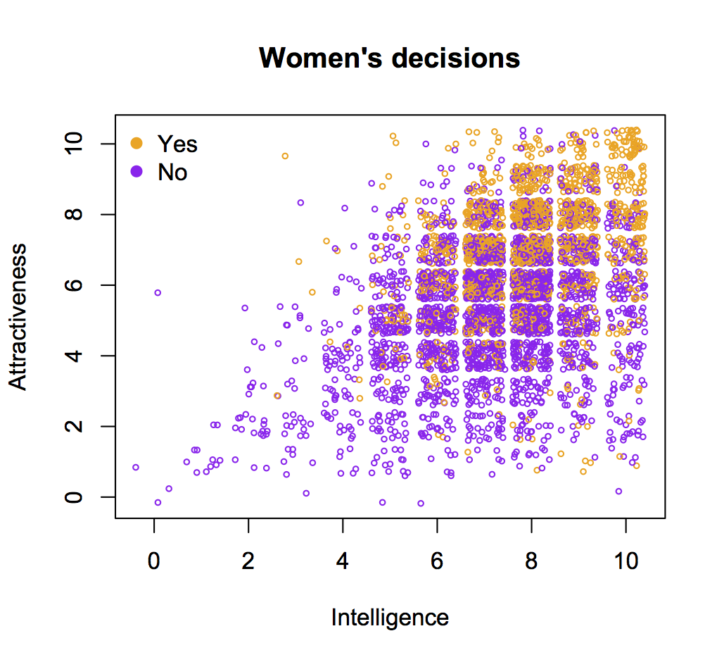
Anyway, while I’ve got the data, let’s us have a look. Here are graphs I drew for men’s and women’s decisions (similar to the ones in the report)
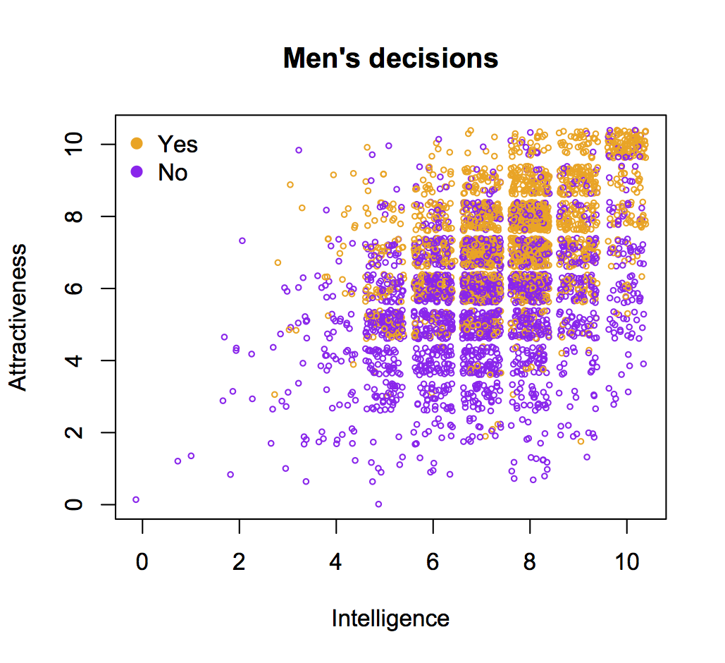
The effect is there: the probability of a positive decision is highest when men rated intelligence as either 8 or 9, not as 10. But it’s weaker than I think the story suggests — what’s more dramatic is that men were unlikely to rate women as ’10’ in intelligence.
More importantly, if the correlation wasn’t there, we wouldn’t believe the data and it wouldn’t end up on the front page — this is news to confirm our beliefs, not to inform us.
Thomas Lumley (@tslumley) is Professor of Biostatistics at the University of Auckland. His research interests include semiparametric models, survey sampling, statistical computing, foundations of statistics, and whatever methodological problems his medical collaborators come up with. He also blogs at Biased and Inefficient See all posts by Thomas Lumley »
For the benefit of any stats nerds that wander past, one of the things I didn’t like about the analysis was the use of quadratics. As I’ve noted a bunch of times before, fitting a quadratic doesn’t let you distinguish non-linearity from non-monotonicity — anything that’s non-linear has to be non-monotone. Given the relatively sparse data with Intelligence=10 in men’s ratings, this was a concern in the data. I think the conclusions do still hold up, but I don’t like the approach.
8 years ago
When I see these stories in newspapers, I think of the physics experiments at places like CERN. For proof of, say, the existence of the Higg’s Boson, researchers demand a five sigma result.
Imagine how that would work with the social sciences?
Most of the newspaper stories we see wouldn’t rate a single sigma.
8 years ago
It is always fascinating to see what authors believe they can see in graphics and what readers are told they should be able to see. Are the conclusions from these plots so clearcut?
For a dataset of this size (over 8000 cases) coloured scatterplots are an unsatisfactory choice: it is difficult to judge how many points are in each group in total and the group drawn second (in these plots the yellow ones for yes) obscure the group drawn first. As well as replicating the authors’ plots you could have suggested something better. A mosaicplot variant* would do well here.
I took a quick look at the data myself and have plots showing that the rate of positive decisions increases sharply with attraction given the level of intelligence, but the rate of positive decisions is relatively flat against intelligence given the level of attraction. This is true for both sexes individually.
It’s excellent that you emphasise the value of researchers making their data and definitions available, that can’t be said often enough.
*cf my book “Graphical Analysis of Data with R”
8 years ago