Posts from August 2011 (37)

August 22, 2011

Spooky action at a distance?

In this week’s Stat of the Week the misinterpretation is not primarily the fault of the individual media outlet, since it was present in the original source.  Still, if a press release or a wire service story told you that the Wallabies had a new training regimen that would improve their game without making them fitter, faster, tougher in the scrum, more accurate with kicking, or better at putting in the elbow, you’d ask questions.  We’d like to see science journalism eventually get up to the standard of sports journalism.

The Herald reported “a new study suggests [TV’s] damaging effects may even rank alongside those from smoking and obesity”. If you look at the British Journal of Sports Medicine, that’s what the authors actually say. They go on to say “TV viewing time may have adverse health consequences that rival those of lack of physical activity, obesity and smoking; every single hour of TV viewed may shorten life by as much as 22 min”. The implication that TV has an effect separate from physical activity and obesity, just as it is separate from the effect of smoking, is reinforced when they say that the associations were adjusted for a whole bunch of cardiovascular risk factors: cholesterol, blood pressure, age, gender, weight, blood glucose, etc.   The implied claim is that TV kills in a way that isn’t explained by any of these risk factors: it’s not that TV-watching uses up fewer calories, or that you are more likely to snack while watching.  Perhaps the mechanism is that watching too much TV makes you believe all the health-related advertising and medical news? (more…)
Stat of the Week Winner: August 13-19 2011

Thanks to all who added nominations for our second Stat of the Week competition.

This week we’ve chosen Tony Cooper’s nomination of NZ Herald’s article (reprinted from The Independent) on television’s “lethal” impact.

I (sadly) enjoy the way newspapers take a statistical correlation from scientific journals and turn them into cause-and-effect producing the “television kills” conclusion. A Nobel prize for the Herald, please.

Entertaining for statisticians but perhaps not for the lay public. Very disappointing for someone who watches TV after going for a run and now learns that the TV has undone the benefits of the run.

The nomination was also seconded by Eric Crampton:

Tons of places have been reporting on the “This hour of TV Watching costs you 22 minutes of life” study. But It’s nonsense. Here’s why.

The paper they’re referencing, out of Australia, just extrapolates to some life expectancy tables the results from Dunstan et al, available here: http://t.co/CZZxF36

What do Dunstan et al find? Controlling for some health-related covariates, there may be an increased risk of mortality with TV watching. But have a look at their confidence intervals. First off, their baseline risk is watching less than 2 hours of TV per week. So it’s complete nonsense to talk about an hour costing 22 minutes. Then, the RR for 2-4 hours of watching per day, after controlling for confounds, has a 95% confidence interval that always includes 1.0. To me, that means there’s no statistically significant relationship even if the point estimates on RR are >1.

They’re able to get CIs that don’t include 1.0 on all-source mortality for >4 hours daily watching, but boy do I worry about baseline characteristics of that group being far worse than for the lower watching groups. Yeah, they control for that, and controlling for it reduces the relative risk. But when you can substantially reduce the RR for the health confounds for which you CAN adjust, how much would you additionally reduce the RR for those unobservable health characteristics for which you cannot adjust?

The whole thing just seems sensationalistic. The most you could pull out of the study is that folks watching more than four hours of tv per day may have higher risk of all-source mortality, but that a lot of it may well be due to unobservable health differences between the kind of folks who watch 6 hours of TV per day and the kind of folks who don’t.

Congratulations Tony!

(PS: Bryan Clarke’s nomination about 2 degrees Celsius not being half of 4 degrees Celsius is something which irks various members of the department too but isn’t really statistics.)

Stat of the Week Competition: August 20-26 2011

Each week, we would like to invite readers of Stats Chat to submit nominations for our Stat of the Week competition and be in with the chance to win an iTunes voucher.

Here’s how it works:

  • Anyone may add a comment on this post to nominate their Stat of the Week candidate before midday Friday August 26 2011.
  • Statistics can be bad, exemplary or fascinating.
  • The statistic must be in the NZ media during the period of August 20-26 2011 inclusive.
  • Quote the statistic, when and where it was published and tell us why it should be our Stat of the Week.

Next Monday at midday we’ll announce the winner of this week’s Stat of the Week competition, and start a new one.

The fine print:

  • Judging will be conducted by the blog moderator in liaison with staff at the Department of Statistics, The University of Auckland.
  • The judges’ decision will be final.
  • The judges can decide not to award a prize if they do not believe a suitable statistic has been posted in the preceeding week.
  • Only the first nomination of any individual example of a statistic used in the NZ media will qualify for the competition.
  • Employees (other than student employees) of the Statistics department at the University of Auckland are not eligible to win.
  • The person posting the winning entry will receive a $20 iTunes voucher.
  • The blog moderator will contact the winner via their notified email address and advise the details of the $20 iTunes voucher to that same email address.
  • The competition will commence Monday 8 August 2011 and continue until cancellation is notified on the blog.

Stat of the Week Nominations: August 20-26 2011

If you’d like to comment on or debate any of this week’s Stat of the Week nominations, please do so below!

August 19, 2011

Why is the US driving less?

A post today on Ezra Klein’s ordinarily-reliable blog at the Washington Post looked at statistics for miles driven in the US, and asked why this recession had led to a decrease in driving when previous recessions hadn’t. The post noted that fewer teenagers are getting driving licenses, and speculated that the internet may be replacing car-dependent ways of socializing.  Which could be true.

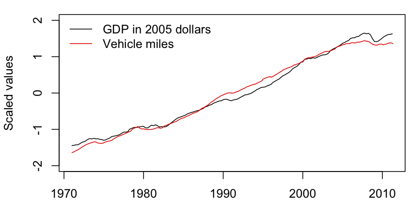
On the other hand, when you look at a longer time series, it seems there’s nothing special about this recession except its depth.

The graph shows US GDP (in 2005 dollars) and vehicle-miles driven in the US, since the driving data started to be collected in 1971.  The two series have been rescaled to the same range, and they track each other very well. Each dip in GDP is matched by a dip in driving.

The only anomaly in the graph is that the most recent dip in driving started before the fall in GDP, and that is easily explained by the spike in petrol prices at that time.

In fact, it looks as though the current Great Recession has had proportionately less impact on US driving than previous recessions.  The absolute dip is larger this time, but so is the economic mess.  Social media may be going save the planet, but it’s not showing up in these time series.


August 18, 2011

All suicides are tragic — but is the suicide rate at the iPhone factory unusual?

Over the last few years, Chinese manufacturer Foxconn has attracted attention from the international media for a spate of suicides in its factories. Foxconn makes products for Apple, including the iPhone and iPad, and manufactures for Sony, Zoostorm, Dell, and Nokia. It employs 1.2 million people in China, with its factory in Shenzhen employing 300,000 people alone.

Articles such as “Another Foxconn worker commits suicide” (NZ Herald 21 July 2011) blame working conditions and long hours of work for the number of suicides. Last year, 14 Foxconn employees committed suicide – most jumped to their deaths – resulting in the company installing netting around the factory and dormitory buildings.

Undoubtedly the working conditions are tough at Foxconn, but what do we make of this suicide rate? Is the suicide rate at Foxconn a lot higher than the suicide rate in the whole population? You’d think so, from all the media attention.

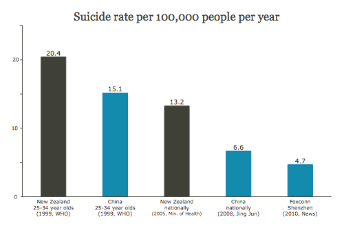
What is the suicide rate in China? It’s actually quite difficult to get a sense of the actual rate, as official figures and independent sources vary wildly from 6.6 to 30.3 per 100,000 per year. (Jing Jun, 2008, Samuel Law and Pozi Liu, 2008) For comparison, New Zealand’s suicide rate is roughly 13 suicides per 100,000 people per year (WHO, 1999, Ministry of Health, 2005).

Even if we take the lowest reported rate of 6.6 per 100,000 people per year, the Foxconn suicide rate among its mammoth workforce of 1.2 million is well below this rate. Taking a conservative view, if the 14 suicides in 2010 occurred amongst Foxconn’s 300,000 workers in Shenzhen, the rate works out to 4.7 per 100,000 people per year.

Another factor that could be at play is age. The people working at Foxconn would be young, say in the 25-34 year old group, and we know that this age group in New Zealand has a higher suicide rate than others. Surprisingly, this does not appear to be the case in China, where elderly people tend to have a higher suicide rate. (Jing Jun, 2008, WHO, 1999)

While each Foxconn suicide is a tragedy, with such a large workforce 14 suicides in 2010 is neither unexpected nor unusual. If anything, Foxconn’s workers have a lower suicide rate than could be expected, on average, amongst their peers.

The newspaper reports infer that there is a link between suicides and working conditions, and that the number of suicides is unusual.


Suicide rate per 100,000 people per year

Suicide rate per 100,000 people per year: China nationally 6.6, Foxconn Shenzhen 4.7


Disclaimer: There are many complex cultural and sociological factors at work, as well as pressures that inflate or deflate reported data from China.

August 16, 2011

If the world lived in one city, how large would that city be?

Per Square Mile is a fascinating blog about population density with plenty of research, statistics, graphics and food for thought.

See how much space the people of the world would fit in if they lived in one big city which was as densely populated as cities such as London, Paris or New York:

More mean than average

As we all know, mean people suck. But do they earn more?

A US study presented at a management conference today looked at measurements of agreeableness, and found that people (or, at least, men) who rated themselves as less agreeable, cooperative, and flexible earned more money.  This isn’t precisely about `mean’ people, but headline writers around the world spontaneously went for the four-letter word (or just copied each other). (more…)

August 15, 2011

Stat of the Week Nominations: August 13-19 2011

Here’s the nominations so far for this week’s Stat of the Week competition.  If you’d like to comment on or debate any of these, please do so below! There’s still time for you to add your nomination too.

  1. “Statistics gathered by police show from January 1 to the…”

Why useful genetic testing is hard.

The NZ Herald reports (from a Cancer UK press release): A single genetic fault in a gene that normally helps the body to repair its DNA increases a woman’s risk of ovarian cancer six-fold, a study has found.   That sounds as if it might be useful as a way of detecting women at high risk, until you look at the numbers in more detail.

In the UK, where the study was conducted, about 6500 women per year are diagnosed with ovarian cancer, and 40-50 of these women will have the genetic fault.  New Zealand has about 15 times fewer people than the UK, so that would be about 3 women per year in the whole country who develop ovarian cancer because of this genetic variant.