Posts from April 2014 (60)

April 24, 2014

Drinking age change

There’s a story in the Herald about the impact of changes in the drinking age. It’s a refreshing change since it’s a sensible analysis of reasonable data to address an interesting question; but I still want to disagree with some of the interpretation.

As those of you who have lived in NZ for longer will remember, the drinking age was lowered from 20 to 18 on December 1, 1999. One of the public-health questions this raises is the effect on driving.  You’d expect an increase in crashes in 18-20 year olds, but it’s not obvious what would happen in older drivers. You could imagine a range of possibilities:

  • People are more at risk when they’re learning to manage drinking in the context of needing to drive, but there’s no real difference between doing this at 18 or at 20
  • At eighteen, a significant minority of people still have the street smarts of a lemming and so the problem will be worse than at twenty
  • At eighteen, fewer people are driving, so the problem will be less bad
  • At eighteen, fewer people are driving so there’s more pressure on those with cars to drive, so the problem will be worse
  • At eighteen, drivers are less experienced and are relying more on their reflexes, so the problem will be worse.

Data would be helpful, and the research (PDF,$; update: now embedded in the story) is about the relative frequency of serious crashes involving alcohol at various ages for 1994-1999, 2000-2004, 2006-2010, ie, before the change, immediately after the change, and when things had settled down a bit. The analysis uses the ratio of crashes involving alcohol to other crashes, to try to adjust for other changes over the period.  That’s sensible but not perfect: changing the drinking age could end up changing the average number of passengers per car and affecting the risk that way, for example.

The research found that 18-20 year olds were at 11% lower risk than 20-24 year olds when 20 was the drinking age, and 21% higher risk when 18 was the drinking age (with large margins of uncertainty). That seems to fit the first explanation: there’s a training period when you’re less safe, but it doesn’t make a lot of difference when it happens — the 20% increase for two years matches the 11% increase for four years quite closely. We certainly can’t rule out the problem being worse at 18 than at 20, but there doesn’t seem to be a strong signal that way.

The other thing to note is that the research also looked at fatal crashes separately and there was no real sign of the same pattern being present. That could easily just be because of the sparser data, but it seems worth pointing out given that all three of the young people named in the story were in fatal crashes.
Quarter of a million meth labs? (updated)

3 News saysTests find meth traces in 40pc of houses“.

Now, this is only rentals, but according to the Census there are 563000 rental dwellings in the country, so 40% would be nearly quarter of a million.  If you’re marketing the test as detecting meth labs, this statistic implies either a hugely unrepresentative sample or a test with a high false-positive rate.

In fact it’s probably potentially both. The sample is dwellings where the landlord bought a test from the company MethSolutions, so you’d hope they were higher-risk than average. and the

[MethSolutions] director Miles Stratford told 3 News the results varied from low-level meth use to high-end meth manufacturing.

So the test is picking up both traces of use and unrelated activity in additional to actual manufacture of methamphetamine. Mr Stratford believes [via email to me] that low-level traces of use are still a health risk. I am unconvinced and would count them as false positives, but it’s  not invalid for him to count them as true positives.

[This next quote was about the surveillance product MethMinder, not about the tests: I shouldn’t have conflated them]

“Some of the instances that we’ve found are people using industrial cleaner inside of properties. We’ve had instances where there have been low-grade plastics fires that have produced a whole bunch of volatile gases into the air that have been picked up.”

The company website doesn’t give any information, as far as I can tell, about either the false positive or false negative rate of the tests — they mention Ministry of Health guidelines, but these guidelines are for remediation of known meth labs, not for screening. [Mr Stratford’s subsequent email says that his lab tests have essentially no analytic false positives — ie, if they say there is meth, there is at least some meth present]

And if you’re thinking about using this service you should, of course, read their terms and conditions, which disclaim any guarantees of any level of accuracy, disclose that the service is subsidised by referrals of positive tests to clean-up companies

Where an indicative test is undertaken on behalf of or for the benefit of the owner of a property and that owner or their insurer chooses not to utilise MethSolutions dedicated service providers in quantifying and/or decontaminating and/or reinstating a property, an additional charge of $200 + GST will be due and payable for each of these services that is not utilised but which is required in order to ensure a property is fit to be lived in.

and have other interesting section headlines such as “MethSolutions Is not an Environmental Testing or Security Company” and “No Guarantees on Cost of Sampling.”

NRL Predictions for Round 8

Team Ratings for Round 8

The basic method is described on my Department home page. I have made some changes to the methodology this year, including shrinking the ratings between seasons.

Here are the team ratings prior to this week’s games, along with the ratings at the start of the season.

Current Rating Rating at Season Start Difference
Roosters 7.58 12.35 -4.80
Bulldogs 6.81 2.46 4.30
Rabbitohs 5.83 5.82 0.00
Sea Eagles 5.67 9.10 -3.40
Cowboys 3.17 6.01 -2.80
Storm 1.71 7.64 -5.90
Broncos 1.12 -4.69 5.80
Titans 0.17 1.45 -1.30
Knights -0.10 5.23 -5.30
Sharks -2.77 2.32 -5.10
Panthers -2.84 -2.48 -0.40
Wests Tigers -3.86 -11.26 7.40
Dragons -4.82 -7.57 2.80
Raiders -4.93 -8.99 4.10
Warriors -5.06 -0.72 -4.30
Eels -9.47 -18.45 9.00


Performance So Far

So far there have been 56 matches played, 29 of which were correctly predicted, a success rate of 51.8%.

Here are the predictions for last week’s games.

Game Date Score Prediction Correct
1 Rabbitohs vs. Bulldogs Apr 18 14 – 15 4.70 FALSE
2 Knights vs. Broncos Apr 18 6 – 32 9.20 FALSE
3 Sea Eagles vs. Cowboys Apr 18 26 – 21 7.60 TRUE
4 Dragons vs. Warriors Apr 19 20 – 10 3.40 TRUE
5 Sharks vs. Roosters Apr 19 18 – 24 -5.80 TRUE
6 Raiders vs. Storm Apr 20 24 – 22 -3.20 FALSE
7 Eels vs. Wests Tigers Apr 21 18 – 21 -0.60 TRUE
8 Panthers vs. Titans Apr 21 14 – 12 1.30 TRUE


Predictions for Round 8

Here are the predictions for Round 8. The prediction is my estimated expected points difference with a positive margin being a win to the home team, and a negative margin a win to the away team.

Game Date Winner Prediction
1 Dragons vs. Roosters Apr 25 Roosters -7.90
2 Storm vs. Warriors Apr 25 Storm 11.30
3 Broncos vs. Rabbitohs Apr 25 Rabbitohs -0.20
4 Sharks vs. Panthers Apr 26 Sharks 4.60
5 Cowboys vs. Eels Apr 26 Cowboys 17.10
6 Bulldogs vs. Knights Apr 26 Bulldogs 11.40
7 Sea Eagles vs. Raiders Apr 27 Sea Eagles 15.10
8 Wests Tigers vs. Titans Apr 27 Wests Tigers 0.50


Super 15 Predictions for Round 11

Team Ratings for Round 11

The basic method is described on my Department home page. I have made some changes to the methodology this year, including shrinking the ratings between seasons.

Here are the team ratings prior to this week’s games, along with the ratings at the start of the season.

Current Rating Rating at Season Start Difference
Sharks 7.28 4.57 2.70
Crusaders 7.24 8.80 -1.60
Chiefs 4.07 4.38 -0.30
Brumbies 4.06 4.12 -0.10
Waratahs 3.37 1.67 1.70
Bulls 2.68 4.87 -2.20
Hurricanes 1.41 -1.44 2.80
Stormers 1.09 4.38 -3.30
Reds -0.84 0.58 -1.40
Blues -2.23 -1.92 -0.30
Force -2.85 -5.37 2.50
Highlanders -3.83 -4.48 0.70
Cheetahs -4.05 0.12 -4.20
Rebels -4.77 -6.36 1.60
Lions -5.65 -6.93 1.30


Performance So Far

So far there have been 61 matches played, 39 of which were correctly predicted, a success rate of 63.9%.

Here are the predictions for last week’s games.

Game Date Score Prediction Correct
1 Hurricanes vs. Blues Apr 18 39 – 20 4.30 TRUE
2 Rebels vs. Force Apr 18 22 – 16 -0.20 FALSE
3 Chiefs vs. Crusaders Apr 19 17 – 18 -0.60 TRUE
4 Waratahs vs. Bulls Apr 19 19 – 12 4.30 TRUE
5 Sharks vs. Cheetahs Apr 19 19 – 8 14.30 TRUE
6 Stormers vs. Lions Apr 19 18 – 3 8.40 TRUE


Predictions for Round 11

Here are the predictions for Round 11. The prediction is my estimated expected points difference with a positive margin being a win to the home team, and a negative margin a win to the away team.

Game Date Winner Prediction
1 Blues vs. Waratahs Apr 25 Waratahs -1.60
2 Brumbies vs. Chiefs Apr 25 Brumbies 4.00
3 Sharks vs. Highlanders Apr 25 Sharks 15.10
4 Hurricanes vs. Reds Apr 26 Hurricanes 6.30
5 Force vs. Bulls Apr 26 Bulls -1.50
6 Cheetahs vs. Stormers Apr 26 Stormers -2.60


April 23, 2014

Citation needed

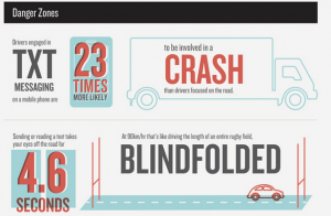
I couldn’t have put it less clearly myself, but if you follow the link, you do get to one of those tall, skinny totem-pole infographics, and the relevant chunk of it saystxt

What it doesn’t do is tell you why they believe this. Neither does anything else on the web page, or, as far as I can tell, the whole set of pages on distracted driving.

A bit of Googling turns up this New York Times story from 2009

The new study, which entailed outfitting the cabs of long-haul trucks with video cameras over 18 months, found that when the drivers texted, their collision risk was 23 times greater than when not texting

That sounds fairly convincing, though the story also mentions that a study of college students using driving simulators found only an 8-fold increase, and notes that texting might well be more dangerous when driving a truck than a car.

The New York Times doesn’t link, but with the name of the principal researcher we can find the research report and Table 17, on page 44 does indeed include the number 23. There’s a pretty huge margin of error: the 95% confidence interval goes down to 9.7. More importantly,  though, the table header says “Likelihood of a Safety-Critical Event”. 

A “Safety-Critical Event” could be a crash, but it could also be a near-crash, or a situation where someone else needed to alter their behaviour to avoid a crash, or an unintentional lane change. Of the 4452 “safety-critical events”, 21 were crashes.  There were 31 safety-critical events observed during texting.

So, the figure of 23 is not actually for crashes, but it is at least for something relevant, measured carefully.  Texting, as would be pretty obvious, isn’t a good thing to do when you’re driving. And even if you’re totally rad,hip, and cool like the police tweetwallah, it’s ok to link.  Pretend you’re part of the Wikipedia generation or something.


Visualising bad things: axes down or up?

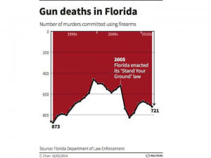
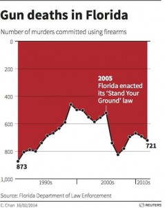
There’s a good chance you’ve seen this graph and formed an opinion about it already

GunDeaths


There certainly hasn’t been any shortage of comment about it, blaming the Florida Department of Law Enforcement for trying to reverse the apparent impact of the law change.

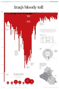
Andy Kirk, at Visualizing Data, has a couple of posts about the chart that you should read. It turns out that the designer of the chart wasn’t the Florida government, it was the C. Chan whose name appears at the bottom left. She designed the chart to try to show the big increase after 2005. She just likes having the y-axis increase downwards for bad things, inspired by this example

Unnamed_CCI_EPS

It’s interesting to look at why it’s obvious that the red area is the data in this graph, but not obvious in the first graph.  Part of it is the title reference to blood, and the fact that the bars can be seen as dripping. Another important clue is that the labels and additional graphs are on the white part of the graph, making it look like background; in the Florida graph the label is on the red section. Finally, the Iraq graph is not tied down at the bottom; the Florida graph has the x-axis at the bottom. The Florida graph is like those faces/goblet ambiguous pictures; for many people it doesn’t have strong enough visual cues for foreground and background to overcome the basic expectation that up is up.   A previous example of thoughtful design conflicting with prior expectations about the zero-line for the y-axis was ‘attack of the 14ft cat‘ from last year

I played around with these ideas, and came up with this revision, using a shadow and moving the x-axis to the top (I tried moving the label to the white section, but it didn’t seem to help)

Slide1


I think it’s a bit easier to see that the red is the foreground here, but it still isn’t really compelling that the red is the data.


Visualising income inequality

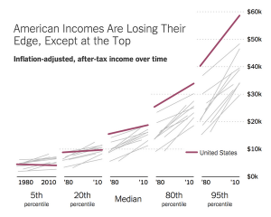
From the New York Times, a set of slope graphs comparing countries over a 30-year period at five points in the distribution.

Bl3go3_IUAApnRj


The headline is a bit exaggerated — the US seems to be retaining its lead at the 80th percentile — but the graph is good.


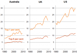
From Jim Savage (on Twitter), income of top 1% or top 5% as multiple of income for bottom 90%

BG5uZwMCUAAVCYV


Looking into the top few percent is tricky because the definition of ‘income’ becomes flexible.  As Matt Nolan pointed out a few years ago, there was a big increase in the 1%’s share of US income in 1986, which is due at least in part to the Tax Reform Act making tax evasion less advantageous and so increasing reported taxable income.

April 21, 2014

How much does a wedding cost?

From The Wireless, because that’s where I happened to notice it, not because they did anything wrong

But the average wedding costs about $30,000 – equivalent to a down payment on a house, another comparable goal for a couple in their twenties.

That is the stylised number: you can find it in Stuff and the Herald and lots of other places. But what does it mean? Could it really be true that a typical couple spends about half their annual income on a marriage?

A One News story last year said

Nicky Luis, owner of Lavish Events in Auckland, said while there were no official statistics on the average cost in New Zealand, perceptions within the industry put the figure at $30,000.

That is, people working in the lavish-weddings industry perceive there to be lots of lavish weddings and think it’s normal to spend a lot of money getting married.

Even when the number is supposedly based on surveys there are problems, as Will Oremus wrote last year at Slate

The first problem with the figure is what statisticians call selection bias. One of the most extensive surveys, and perhaps the most widely cited, is the “Real Weddings Study” conducted each year by TheKnot.com and WeddingChannel.com. (It’s the sole source for the Reuters and CNN Money stories, among others.) They survey some 20,000 brides per annum, an impressive figure. But all of them are drawn from the sites’ own online membership, surely a more gung-ho group than the brides who don’t sign up for wedding websites, let alone those who lack regular Internet access.

To make matters worse, the summary quoted from the surveys is the mean, but the way the figure is used, a median would be more appropriate. Oremus extracts the information that  the median is about 2/3 of the mean in those surveys, so we’re getting a 50% increase on top of the selection bias.

When you’re thinking about weddings you’ve been to, there is a different sort of bias. Expensive weddings tend to have more guests, so the average wedding you get invited to is larger than the average wedding you might have got invited to but didn’t.

Reefer madness brain scan panic roundup

On the recent paper claiming brain changes from low-level cannabis use, you’ve already seen the StatsChat post (I hope)

There’s also


Stat of the Week Competition: April 19 – 25 2014

Each week, we would like to invite readers of Stats Chat to submit nominations for our Stat of the Week competition and be in with the chance to win an iTunes voucher.

Here’s how it works:

  • Anyone may add a comment on this post to nominate their Stat of the Week candidate before midday Friday April 25 2014.
  • Statistics can be bad, exemplary or fascinating.
  • The statistic must be in the NZ media during the period of April 19 – 25 2014 inclusive.
  • Quote the statistic, when and where it was published and tell us why it should be our Stat of the Week.

Next Monday at midday we’ll announce the winner of this week’s Stat of the Week competition, and start a new one.

(more…)